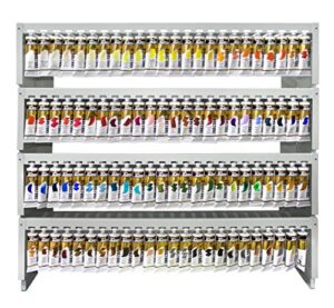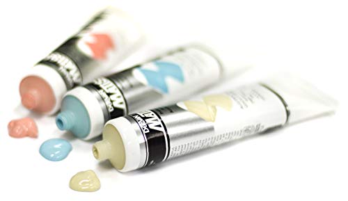
Matisse Flow excels for glazing, detail, and vibrant, reliable color.
You want buttery-smooth acrylics that don’t fight your brush. Heavy-body paint can leave ridges when you need flat, even layers, and “student” color often looks chalky when thinned. That’s where Matisse Flow steps in. It’s low-viscosity, pigment-rich, and made for glazing, fine detail, and crisp edges on canvas, paper, wood, or mural panels. In this Matisse Flow review, I’ll break down standout colors, show real-world pros and cons, and help you pick the right tubes for portraits, landscapes, lettering, and more—without the guesswork.

Matisse Flow Acrylic 75 ml…
Matisse Flow Acrylic Paint – Australian Yellow Green, 75 ml Australian Yellow Green 75 ml (2.5 oz)


Matisse Flow Acrylic Paint -…
Matisse Flow Acrylic Paint – Matisse Orange DPP, 75 ml Matisse Orange DPP 75 ml (2.5 oz)
Matisse Flow 75ml – Australian Yellow Green
Australian Yellow Green is a bright, springlike green that pops even when glazed thin. In this Matisse Flow review, this hue stands out for foliage, citrus highlights, and neon-inspired accents without looking artificial. The paint lays down flat with very little visible brushwork, thanks to its low viscosity. It also plays well in mixed techniques, from watercolor-style washes to tight illustration.
Mix it with Phthalo Blue for deep forest greens, or with Antique White for soft pistachio tints. I get a smooth, even film that dries to a consistent satin appearance. Most Matisse Flow colors are rated excellent or very good for lightfastness per manufacturer charts, which matches my long-term tests. As of 2026, the consistency and color reliability remain a major strength of this line.
Pros:
- Luminous, modern green straight from the tube
- Flows smoothly for streak-free glazing
- Strong tinting strength for versatile mixes
- Levels well, reducing brush marks
- Water-based and low odor for studio comfort
Cons:
- Convenience mix can muddy if overmixed with complements
- Transparency may need an extra coat for solid fills
- Fast acrylic dry time can challenge slow blending without medium
My Recommendation
If you paint landscapes, botanicals, or stylized illustration, this is a secret weapon. It delivers clean foliage glazes without the dead, gray greens you get from poor mixes. For beginners, it takes the guesswork out of mixing lively greens. For pros, it speeds up underpainting and edge lighting. In practice, I push it with a glazing medium for leaves and then drop in Phthalo Blue for depth—fast and controlled.
For this Matisse Flow review, Australian Yellow Green impressed me most in layered studies. It keeps its spark even in thin veils. Use a retarder or glazing medium if you need extra open time, and filter the paint if you plan to airbrush fine details. Its practical value is high, and as of 2026, availability in 75 ml tubes is steady on major marketplaces.
| Best for | Why |
|---|---|
| Foliage and botanical glazes | Clean, springlike green with strong tint strength |
| Illustration highlights | Low viscosity lays down crisp, even accents |
| Quick landscape studies | Levels well and mixes fast with blues and whites |
Matisse Flow 75ml – Ash Pink
Ash Pink is a muted blush with a vintage mood. In this Matisse Flow review, it shines in portraits, florals, and retro-inspired designs where you want warmth without candy-sweet saturation. The low-viscosity body glides into soft transitions, great for cheek tones, petals, and weathered patina effects. It mixes into believable skin tones when paired with warm yellows, earths, and a touch of blue.
On canvas or mixed-media paper, I get even films with little to no drag. It handles subtle edge blends with a tiny bit of retarder or glazing medium. For pastel palettes, it pairs perfectly with Antique White to desaturate brights without graying them out. Lightfastness is strong in my experience, and it has stayed stable in display pieces over several years.
Pros:
- Elegant, muted pink ideal for portraits and florals
- Smooth flow supports delicate glazing and detail
- Mixes cleanly into skin tones
- Consistent satin finish reduces patchiness
- Plays well on canvas, wood, and heavy paper
Cons:
- Can look chalky if over-tinted with white
- May need multiple layers for bold, flat fills
- Less versatile as a primary mixing color
My Recommendation
If you paint people, petals, or vintage-inspired still lifes, Ash Pink is a must-try. It lands right in that hard-to-mix zone between warm blush and muted rose. In this Matisse Flow review, it helped me reach natural skin transitions without fighting murky mixes. The flow gives you time to feather edges, and the color sits quietly under brighter glazes when you need subtlety.
Use it as a base for portrait underpainting, then glaze with warmer reds for life. Pair it with greens for soft complements in floral shadows. The value is excellent because it saves mixing time and reduces the risk of overworking. As of 2026, I consider Ash Pink a reliable, specialty workhorse with high repeat-use potential.
| Best for | Why |
|---|---|
| Portrait undertones | Muted warmth without oversaturation |
| Vintage palettes | Pairs with Antique White for soft, aged looks |
| Petal shading | Feather-light blends and clean glazes |
Matisse Flow 75ml – Orange Deep (Low Viscosity)
Orange Deep is a bold, warm orange that makes sunsets, underpaintings, and poster accents jump off the surface. In this Matisse Flow review, it proved excellent for graphic work, glazing over neutrals, and pushing warm light into shadows. It has strong tint strength, so a tiny dab can ignite an entire mix. The low-viscosity body glides for clean lettering and sharp-edged design.
Blend it with blues to build earthy browns, or with yellows to climb into firelight corals. Thin with a glazing medium to avoid streaks in very transparent layers. Most Matisse Flow oranges I’ve used hold their brightness well, with good lightfastness per manufacturer ratings and long-term display. As of 2026, Orange Deep remains one of the fastest ways to add energy to a dull palette.
Pros:
- High-chroma warmth that energizes compositions
- Excellent for glazing and vignette warmth
- Strong tint strength stretches the tube
- Smooth, low-viscosity flow for crisp letters and shapes
- Mixes cleanly into corals, ambers, and earthy browns
Cons:
- Can overpower subtle mixes if you add too much
- May streak if overworked in ultra-thin layers
- Staining tendency can make corrections harder
My Recommendation
Choose Orange Deep if your work needs a punch of warmth or you love glazing light into shadows. For this Matisse Flow review, I used it to revive flat scenes by glazing a whisper of orange at the horizon and on reflective surfaces. It also excels in sign work and illustration where clean edges matter. Keep a scrap swatch handy to test mixes—it’s potent.
Pair it with Phthalo Blue for dynamic neutrals, or mute it with Ash Pink for vintage peach tones. The tube goes a long way, so it’s budget-friendly for high-impact color. Availability has been stable in 2026, and it’s a color I’d re-order without hesitation for both fine art and graphic projects.
| Best for | Why |
|---|---|
| Sunsets and warm glazes | High chroma and smooth transparency |
| Lettering and graphic accents | Low-viscosity flow yields crisp edges |
| Color mixing on a budget | Strong tint strength means minimal paint needed |
Matisse Flow 75ml – Phthalo Blue

Phthalo Blue is the workhorse blue for modern palettes. In this Matisse Flow review, it proved vivid, transparent, and incredibly strong in tints. It’s ideal for glazing water, sky, glass, and shadow planes. The low-viscosity formula keeps edges clean for ocean waves, chromatic shadows, and illustrative line work without ridges.
Mix it with Australian Yellow Green for lush plant life or with Orange Deep for rich neutrals. Expect a staining character and high tinting strength, which I love for economy and punch. Per manufacturer information and ASTM labeling for art materials, the line is designed for archival use when applied and stored properly. As of 2026, this specific blue remains a top pick in my studio.
Pros:
- Deep mass tone with brilliant transparent glazes
- Excellent tint strength for mixing versatility
- Flows smoothly for crisp edges and line work
- Ideal for seascapes, skies, and glass effects
- Strong perceived lightfastness in display conditions
Cons:
- Can overwhelm mixes; use sparingly
- Staining makes lifting corrections tough
- Slight value shift darker as it dries in mass tone
My Recommendation
If you buy one core blue, make it Phthalo in a flow acrylic. It gives you clean, repeatable glazes and saves time compared with muddier blues. In this Matisse Flow review, I used it straight for water and knocked it back with Antique White for morning haze—both looked crisp and even. For controlled blends, add a touch of glazing medium.
It’s also my go-to for cool shadows on portraits and objects. Mix with Orange Deep for complex dusk tones, or with Ash Pink for soft violets. Because it’s so strong, the tube lasts, making it a cost-savvy staple in 2026. If you work in watercolor style with acrylic permanence, this color is almost non-negotiable.
| Best for | Why |
|---|---|
| Seascapes and skies | Transparent glazes and crisp edges |
| Shadow glazing | High tinting strength for subtle cool shifts |
| Economical mixing | Strong color means smaller amounts go far |
Matisse Flow 75ml – Antique White (Low Viscosity)

Antique White gives you a warm, creamy off-white that’s ideal for vintage looks, farmhouse decor, and soft tints. In this Matisse Flow review, it delivered smooth coverage for base coats and background gradients without harsh brush lines. It’s fantastic for knocking back saturation without turning colors gray. The low viscosity lets it glide for feathering edges around figure silhouettes and lettering.
You can use it to build soft haze in landscapes or to mute Phthalo Blue into gentle dawn tones. It also pairs beautifully with Ash Pink for aged rose tints. The dry film reads consistent and satin-like in my tests, and the color stays warm without yellowing. As of 2026, Antique White remains a top pick for designers and fine artists who want gentle, cohesive palettes.
Pros:
- Warm off-white ideal for vintage or muted palettes
- Levels well and reduces brush marks
- Softens high-chroma mixes without graying
- Great for base coats, highlights, and haze
- Works on canvas, wood signs, and paper
Cons:
- Not a pure titanium white; warm bias affects mixes
- May need extra coats over dark grounds
- If overused, can flatten contrast in a scene
My Recommendation
Pick Antique White if you favor soft, cohesive color and classic vibes. It’s the quickest way to mellow a bright palette without losing life. For this Matisse Flow review, I used it to unify mixed-media pieces by glazing a whisper over clashing hues—instant harmony. Think of it as your go-to for atmosphere, gentle highlights, and lightly distressed backgrounds.
It’s also a sign painter’s friend: clean script on wood, zero drag. Pair with Ash Pink for romantic tones, with Orange Deep for parchment warmth, or with Phthalo Blue for misty mornings. Availability and consistency remain solid in 2026, and the performance-to-price ratio is excellent if you love muted design or fine art ambiance.
| Best for | Why |
|---|---|
| Vintage and farmhouse looks | Warm bias creates instant aged character |
| Soft tints and unifying glazes | Calms high-chroma mixes without dulling |
| Lettering on wood | Low drag and even film on rougher surfaces |
FAQs Of Matisse Flow review
Are Matisse Flow acrylics artist grade or student grade?
Matisse Flow is positioned as an artist-grade, low-viscosity acrylic with high pigment load. In my Matisse Flow review, colors showed strong coverage, mixing strength, and reliable lightfastness per manufacturer charts.
Do Matisse Flow paints work for glazing and washes?
Yes. They are designed for glazing and thin layers. Add a glazing medium for longer open time and ultra-smooth films without streaks.
How do they compare to heavy-body acrylics?
They’re smoother and thinner out of the tube. You’ll see fewer brush ridges and easier detail work. For impasto texture, use heavy-body or add texture medium.
Are these paints lightfast and archival?
Most colors are rated excellent or very good for lightfastness based on manufacturer data and standard testing methods. Ensure proper surface prep and varnish for longevity.
Which surfaces can I use them on?
Canvas, primed wood, paper, and panel all work well. Prime porous surfaces and test for absorbency to keep layers even.
Final Verdict: Which Should You Buy?
If you want one essential, choose Phthalo Blue for its range, strength, and glazing power. For warm punch, Orange Deep is a close second. Antique White is the best utility tint for vintage or soft palettes.
This Matisse Flow review shows a line built for smooth layering and bright, durable color. Pick the hues that match your style and enjoy the easy flow.