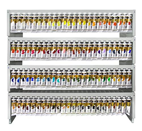
Matisse Structure review: rich pigment, heavy body, fast drying, and superb impasto performance.
If you crave buttery acrylics that hold a knife stroke and still blend like a dream, you are in the right place. I know how hard it is to find a heavy body paint that stays where you put it, covers in fewer passes, and dries to a strong, stable film. In this Matisse Structure review, I break down how these tubes behave on canvas and panel, how they glaze, how they layer, and how true the colors look in real light. I also compare five standout colors so you can pick the right fit for your style.

Matisse Structure Heavy Body Acrylic…
Matisse Structure Paint – South Ocean Blue, 75 ml South Ocean Blue 75 ml (2.5 oz)

Matisse Structure Heavy Body Acrylic…
Matisse Structure Paint – Australian Salmon Gum, 75 ml Australian Salmon Gum 75 ml (2.5 oz)

Matisse Structure Heavy Body Acrylic…
Matisse Structure Paint – Antique White, 75 ml Antique White 75 ml (2.5 oz)
Matisse Structure Heavy Body – Southern Ocean Blue 75ml
Southern Ocean Blue is a deep, moody blue with a cool lean. It moves between teal and midnight tones as you cut it with white or gel. The body is dense and creamy, so it loads well on knives and bristle brushes. I can build sea foam ridges or smooth sky fades without the paint slumping.
In this Matisse Structure review, this color stands out for reach and control. It tints fast, so you get power even in small mixes. It dries to a rich satin with a touch of tooth, ready for glazing or scumbling. Expect strong coverage and less need for second coats.
Pros:
- High pigment load gives bold masstone and clean tints
- Heavy body holds texture for impasto and knife work
- Cuts to vibrant turquoise tones with titanium white
- Good opacity for blocking in large shapes fast
- Flexible film when dry; resists cracking on canvas
Cons:
- May overpower subtle mixes; use a light touch
- Deep value can dry slightly darker than wet
- Not ideal if you prefer ultra-gloss finish out of tube
My Recommendation
Choose Southern Ocean Blue if you paint seascapes, night scenes, or bold abstracts. The hue is a workhorse that anchors cool ranges and complements earth reds. In my Matisse Structure review testing, it was the most versatile blue for both mass tone drama and bright tints. It also pairs well with glazing mediums for depth in water and skies.
| Best for | Why |
|---|---|
| Seascapes and skies | Holds deep values and shifts to crisp turquoise tints |
| Knife texture work | Heavy body stays put and builds clean ridges |
| Underpainting cools | High opacity blocks in large areas with fewer layers |
Matisse Structure – Australian Salmon Gum 75ml
Australian Salmon Gum is a warm, earthy pink that leans coral in tints. It has a natural, sunlit feel that I love for gum bark, florals, and skin warmth. The paint loads thick but spreads smooth, so it is easy to blend edges. Coverage is strong, yet it glazes into delicate veils when cut with medium.
As part of this Matisse Structure review, this color brought harmony to complex palettes. It bridges reds, oranges, and browns without turning muddy. The film dries tough and even, which helps when you layer light over dark. It is a comfort color for those soft, glowing notes that bring life to a scene.
Pros:
- Beautiful coral-rose tone with natural warmth
- Mixes cleanly with blues for muted violets and grays
- High viscosity supports brush and knife textures
- Excellent for floral petals and tree bark highlights
- Glazes well with polymer medium for subtle warmth
Cons:
- Not a primary red; use with a true red for full gamut
- May need white to achieve very pale tints
- Color bias can shift cool mixes toward brown if overused
My Recommendation
Pick Australian Salmon Gum if you paint landscapes, portraits, or florals and need a ready-made warm midtone. In my Matisse Structure review notes, it was the secret glue color that pulled palettes together. It layers over greens and blues to create instant harmony and light.
| Best for | Why |
|---|---|
| Landscape accents | Natural coral warmth mimics bark and rock highlights |
| Portrait blush | Soft tints build lifelike warmth without chalkiness |
| Muted palettes | Bridges hues and reduces harsh jumps in color |
Matisse Structure – Antique White 75ml
Antique White is a warm, off-white that softens high-chroma mixes. It takes the edge off sharp blues and reds while keeping good coverage. The body is thick and stable, so it will not sag in knife strokes. I reach for it when I want cream highlights, vintage tones, or a gentle atmospheric haze.
In this Matisse Structure review, Antique White earned a spot on my core palette. It lets you mix pastels that feel cozy, not cold. It also cuts the glare in highlights on portraits and interiors. The finish is smooth and even, with a slight satin that suits most surfaces.
Pros:
- Warm off-white creates soft, natural tints
- Heavy body supports textured highlights
- Reduces chroma without turning mixes chalky
- Ideal for vintage, shabby-chic, and classical looks
- Great for toning gesso or underpainting
Cons:
- Not as bright as titanium white in pure highlights
- Can warm cool palettes more than expected
- May slightly mute neon or fluorescent colors
My Recommendation
Choose Antique White if your style leans warm, subtle, or vintage. It is a tinting and mixing ally that improves blends without harsh glare. In my Matisse Structure review tests on portraits and still life, it delivered soft light with strong cover. It is a near essential for pastel tones and cream highlights.
| Best for | Why |
|---|---|
| Pastel mixing | Warms and softens bright hues without chalk |
| Portrait highlights | Creates gentle light that reads natural on skin |
| Vintage palettes | Instant aged tone for interiors and still life |
Matisse Structure – Australian Sap Green 75ml

Australian Sap Green hits that sweet spot between earthy and lively. It reads natural in foliage, yet it shifts to bright olive in tints. The paint has a firm, buttery body, so you can drag it dry for leaf texture. It covers well over mid and light grounds and keeps edges crisp.
For this Matisse Structure review, I tested it in layered hedgerows and alla prima leaves. It stayed clean in mixes with warm and cool yellows. It also darkened with blues to a deep forest green without mud. The film feels tough and flexible when cured, which is key for canvas work.
Pros:
- Natural green that suits landscapes and botanicals
- Mixes cleanly to olives, moss, and deep forest tones
- Heavy body builds leaf and grass texture fast
- High coverage saves paint in block-ins
- Great base for glazing with yellow or blue
Cons:
- Hue bias may not match a pure primary green need
- Can dominate delicate flesh mixes if not tempered
- Slight value shift on drying in thicker layers
My Recommendation
Get Australian Sap Green if you paint outdoors or love plant forms. It is a ready-made natural green that reduces mixing time in the field. In my Matisse Structure review notes, it was the fastest route to living foliage with punch. Pair it with a warm yellow or a cool blue for a full green range.
| Best for | Why |
|---|---|
| Plein air foliage | True-to-life hue that mixes fast on site |
| Textured leaves | Thick body holds dry-brush and knife marks |
| Layered greens | Glazes and scumbles sit well over this base |
Matisse Structure – Skin Tone Light 75ml

Skin Tone Light is a ready-mix base for portraits. It leans warm with a soft, creamy feel, so it lays in lights and midtones fast. The body is thick and blends well wet-into-wet, which helps on cheeks and foreheads. It accepts glazes and scumbles for veins, blush, and subtle shifts.
As I tested it for this Matisse Structure review, I found it saved me time on first passes. It is not a one-and-done color. But it gives a calm base that holds detail work. Tweak it with cool blues or greens for shadows and slight color shifts for realism.
Pros:
- Convenient base for light skin mixes
- Heavy body blends smooth on faces and hands
- Plays well with blue and green for cool shadows
- Great for underpainting and blocking in portraits
- Even satin finish supports later glazing
Cons:
- Not a match for all skin ranges without mixing
- May warm too much if used neat in highlights
- Convenience mix can reduce mixing practice for beginners
My Recommendation
Choose Skin Tone Light if you paint portraits and want a fast start. It will not replace a full skin palette. Yet it sets a steady base that saves time and helps you build depth. In my Matisse Structure review of portrait colors, it offered the best speed-to-control ratio.
| Best for | Why |
|---|---|
| Portrait block-ins | Speeds early layers with smooth coverage |
| Soft highlights | Blends well for gradual light falloff |
| Glazed skin tones | Stable base under thin color veils |
FAQs Of Matisse Structure review
Are Matisse Structure acrylics professional quality?
Yes. They are artist-grade heavy body acrylics with high pigment load. The paint is thick, flexible, and built for impasto. Labels conform to ASTM D4236 for art materials.
How fast do Matisse Structure colors dry?
They dry fast on the surface, often within minutes in thin films. Thick impasto can take longer. Full cure may take days to weeks, based on thickness and climate.
Are the colors lightfast and archival?
Most hues rate excellent or very good lightfastness per manufacturer data. Use UV-safe display and varnish for best results. The dry film is durable and flexible.
Can I mix Matisse Structure with other acrylic brands?
Yes. They mix with other water-based acrylics and gels. You can combine them with gloss, matte, and impasto mediums. Avoid mixing with oils.
What surfaces work best with Matisse Structure?
Use primed canvas, panels, watercolor paper, or mural grounds. The heavy body loves toothy surfaces. Seal absorbent grounds to control soak-in.
Final Verdict: Which Should You Buy?
For range and punch, Southern Ocean Blue is my top pick. In this Matisse Structure review, it delivered the widest use from seascapes to abstracts.
Need warmth or portraits? Australian Salmon Gum and Skin Tone Light shine. Antique White and Australian Sap Green round out a pro starter set.