Quick answer: To paint Winnie the Pooh, sketch him as a pear-shaped body with a round head, block in a warm yellow-orange base, add the red shirt and the darker tan shading, and finish with black details for the eyes, nose and mouth. Acrylic on a primed canvas is the easiest route because it dries fast and covers well. Work from large shapes to small ones and keep the outline work for last.
Pooh is one of the friendliest characters to paint because he is built from a handful of soft, rounded shapes. If you can draw a circle, a pear and a few small ovals, you can build him. The real challenge is not the drawing. It is getting a warm, even yellow-gold that does not look streaky, and placing the face so he looks gentle instead of lopsided.
This guide shows how to paint Winnie the Pooh step by step on canvas, from choosing colors to sketching proportions, layering the fur, and adding the final details. It also covers the most common problems and a few ways to turn the finished painting into nursery or kids’ room decor. If you are planning a finished piece for a wall, the Winnie the Pooh canvas painting guide goes deeper on sizes, styles and display ideas.
What You Need Before You Start
Pooh uses a very small palette, which keeps the project affordable. You do not need professional-grade supplies to get a clean result, but a few choices make the process smoother.
- Canvas: A pre-primed stretched canvas around 8×10 or 11×14 inches is a comfortable size for a first Pooh. Smaller canvases make the face details harder to control.
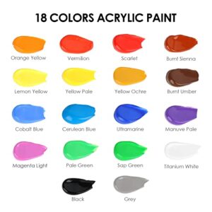
- Acrylic colors: Yellow ochre or golden yellow, cadmium-style orange or a warm orange, a medium red, burnt sienna or a brown, black, white, and a pale cream for highlights.
- Brushes: A flat or filbert brush (about 3/4 inch) for the background and body, a small round (size 2 or 4) for details, and a fine liner or size 0 round for the eyes and mouth lines.
- Pencil and eraser: A soft pencil for the sketch. Harder pencils can dent the canvas weave.
- Palette and water: A flat palette, a jar of water and a paper towel.
- Reference: A simple printed outline or your own thumbnail sketch to check proportions.
The Pooh you see on classic storybook pages and the one on modern merchandise are slightly different designs. The classic version has a more golden, slightly muted tone and a softer line. The modern version is brighter, with a flat orange-yellow and a bolder red shirt. Decide which look you want before mixing colors, because that choice drives every other decision.
Choose Your Pooh Style First
Because Pooh is a licensed character, most people paint him as fan art or home decor rather than for sale. Keep the painting for personal use, gifts or your own wall, and do not sell prints or merchandise of the character without checking licensing rules.
Classic storybook look
This style uses a softer, slightly desaturated honey color, thin brown outlines and a red shirt that looks a little faded. It suits vintage-style nursery art. Mix your yellow with a touch of ochre and a tiny amount of brown to calm it down.
Modern cartoon look
This style uses a brighter yellow-orange, clean shapes and a saturated red. It looks good in playful kids’ rooms. You can use the colors almost straight from the tube, adding white only to lighten.
Simplified minimalist look
If you are painting this as an easy project, you can drop the background detail and even the shading and use flat shapes only. Many people searching for simple, cute subjects find this the most approachable route, and the simple cute easy painting ideas for beginners collection has other subjects built on the same flat-shape approach.
Mix the Pooh Colors
Getting the colors right early saves a lot of fixing later. Mix more than you think you need, because matching a custom yellow a second time is harder than it sounds.
| Part | Mix | Notes |
|---|---|---|
| Main fur | Golden yellow + a little orange + a drop of white | Aim for a warm honey tone, not lemon yellow |
| Fur shadow | Fur mix + burnt sienna or a touch of brown | Add brown in tiny amounts to avoid mud |
| Fur highlight | Fur mix + cream or white | Use sparingly on the head and belly |
| Shirt | Medium red + a touch of orange | Add a dab of brown for the shaded folds |
| Muzzle and ear insides | Cream or light tan | Mix white with a bit of fur color |
| Nose, eyes, mouth | Black or very dark brown | Dark brown looks softer than pure black |
Yellow is a translucent color in many acrylic lines, which means it can look patchy over white. The simplest fix is to put down a thin orange or ochre underlayer first, then paint the yellow over it. The underlayer warms the final color and hides canvas texture.
How to Paint Winnie the Pooh Step by Step
Step 1: Prepare the canvas
If your canvas is already primed, you can start straight away. For a softer background, paint the whole surface with a pale color such as cream, soft blue, light green or a warm off-white. Use a wide flat brush and long, even strokes in one direction. Let it dry fully, which usually takes 15 to 30 minutes for a thin coat.
A light background makes Pooh’s yellow stand out. Very dark backgrounds make yellow look vivid but will show through if you have to correct the outline later.
Step 2: Sketch the basic shapes
Draw lightly. Start with the head, a slightly wide circle or rounded oval in the upper third of the canvas. Below it, draw a pear shape for the body, wider at the bottom than at the top. The body is roughly one and a half times the height of the head.
Add two small half-circle ears on top of the head, one on each side. Add short, rounded arms coming off the upper body and two short, stubby legs at the bottom. Pooh’s feet are small rounded ovals pointing slightly outward.
Check the proportions by squinting. The head should look big relative to the body, and the limbs should look short. If he looks tall and thin, enlarge the belly and shorten the legs.
Step 3: Place the face guidelines
Draw a faint vertical line down the center of the head and a faint horizontal line a little below halfway. The eyes sit on or just above the horizontal line, set fairly wide apart. The nose sits at the center, a little below the eyes. Mark the muzzle as a small rounded shape around the nose and mouth area.
Pooh’s eyes are simple black dots, which makes them easy to place but also easy to get wrong. Eyes set too close together make him look anxious. Eyes set too far apart can make him look sleepy. Try to keep the gap between them about the width of one and a half eyes, and adjust to taste.
Step 4: Block in the body color
Mix your main fur color and use the flat brush to fill the head, arms, legs and the visible parts of the belly. Do not fill the area where the shirt will go yet. Work in thin coats, and let the first coat dry before adding the second. Two thin coats look smoother than one thick one.
Keep your brush strokes following the shape of the form. On the head, curve your strokes around the circle. On the legs, stroke along the length.
Step 5: Paint the red shirt
Pooh’s shirt is short, ending above the belly. It covers the upper body and the tops of the arms. Paint it with the red mix, using the smaller flat or filbert brush. Cleanly cut the lower edge of the shirt, which sits at about the middle of the body. The edge should be slightly curved to follow the shape of the belly.
The neckline is a gentle curve below the head. Leave the shirt color a bit flat. Later, a darker red along the folds and under the arms gives it dimension.
Step 6: Add the muzzle and ear details
Paint the muzzle in the cream or light tan color. Keep the edges soft by feathering them into the fur with a slightly damp brush. Add the same cream tone inside each ear, leaving a little yellow border.
Step 7: Add shading
Shading is what makes a flat cartoon feel like a soft toy. Choose one light direction, such as top left, and keep it consistent. Apply the shadow color on the opposite side of every form: the right side of the head, the right edge of the arms and legs, and under the head where it meets the shirt.
Use a small, slightly damp brush and blend the edge of the shadow into the base color while it is still workable. Acrylic dries quickly, so work in small areas. If it dries before you blend, glaze a thin layer of the base color over the edge to soften it.
Step 8: Add highlights
Dab a small amount of the lighter fur color on the top of the head, the cheek nearest the light and the top of the belly. Keep highlights small. Too many make the fur look shiny rather than soft.
Step 9: Paint the face details
Switch to the small round or liner brush. Thin the black paint slightly with water so it flows, but not so much that it turns gray.
Paint the nose first as a small, slightly wide oval, a bit like a rounded triangle. Add the eyes as small solid ovals. Then add the mouth: a small curved line extending down from the nose and then curving up into a gentle smile on each side. Finish with a tiny curved line for each cheek or brow if you want him to look more expressive.
Add a very small white dot in each eye for a catchlight if your style allows it. It adds life without changing the character’s design.
Step 10: Outline and clean up
If you are using the classic look, add thin brown lines around the main shapes with the liner brush. For a modern flat look, skip outlines or only use them around the shirt and face. Check for patches where the canvas shows through, and touch them up with the base color.
Painting the Background and Extras
Pooh is often shown with props, and a few simple extras change the whole mood of the painting.
- Honey pot: A rounded pot shape in warm brown with a cream label and a few drips down the side. Keep the label blank or add a simple “Hunny” lettering with the liner brush.
- Balloon: A single red or blue balloon with a thin string is quick to paint and works well for baby rooms.
- Bees: Small yellow ovals with black stripes and tiny white wings. Keep them small so they do not compete with Pooh.
- Forest or meadow: Soft green hills and a few simple trees in a flat, stylized form fit the storybook feel.
- Pastel clouds: A pale blue sky with soft white clouds gives a clean, quiet background.
Paint the background before or after Pooh? For a flat background, do it first. For props that overlap Pooh, such as the honey pot, paint Pooh first so you can keep his edges clean and tuck the prop in front.
Common Mistakes and How to Fix Them
The yellow looks streaky
This is usually caused by painting yellow directly onto white in one thin coat. Add an orange or ochre underlayer, then apply two thin yellow coats. Avoid heavily scrubbing the brush back and forth, which pulls the paint into ridges.
Pooh looks too orange or too lemony
Adjust the balance. Add a small amount of yellow to the orange-leaning mix, or a small amount of orange to the lemon-leaning one. Test on a scrap of paper and let it dry first, because acrylic often dries slightly darker than it looks wet.
The face looks off
Most face problems come from eye placement and the mouth curve. Compare the eye height to the center of the head. If the painting is already dry, paint over a misplaced eye with the fur color, let it dry and repaint the eye in the right spot.
Edges look rough
Use a smaller brush for the final edges and turn the canvas so you can pull the brush toward you. Steady your painting hand by resting the side of your palm on a clean piece of paper, not on the wet canvas.
The red bleeds into the yellow
Wait until the yellow is fully dry before painting the red next to it. If a bleed has already happened, paint over the area with the yellow and redo the red edge with a smaller brush.
Easier Ways to Paint Pooh
Not everyone wants to freehand a full figure. A few shortcuts keep the result tidy.
- Trace a reference: Print a simple outline, rub pencil on the back, and transfer the lines onto the canvas.
- Paint only the face: A close-up of Pooh’s head fills a small canvas and skips the body proportions.
- Use a silhouette style: Paint a flat yellow figure with the red shirt and only a few black features.
- Use a grid: Draw a light grid over your reference and the canvas, then copy square by square.
Tips by Skill Level
Beginners
Choose a flat style, work from large shapes to small ones, and let each layer dry. Do not try to blend everything. A clean, simple Pooh looks better than an over-worked one.
Intermediate painters
Try adding a soft fur texture by dabbing the edge of the fur with a dry, slightly splayed brush. Add a subtle glaze of orange in the shadows to make the shading feel warm instead of gray.
Advanced painters
Work in a more painterly style with visible brush marks, build the lighting with thin glazes, and experiment with a textured background using a palette knife or modeling paste.
Finishing and Displaying Your Painting
Let the painting dry for at least 24 hours before handling it. If you want a protective finish, apply a thin coat of acrylic varnish with a wide, soft brush. A matte or satin varnish suits soft subjects better than a high gloss because it avoids glare on the yellow.
For display, a nursery painting should hang out of reach of small children. Use a secure hanging system, and avoid placing it where direct sun will hit the paint for hours each day, because strong sunlight can fade some pigments over time.
If you want a framed look, a wooden float frame or a simple unframed gallery-wrapped edge both work well. If the sides of the canvas will be visible, paint the edges in the background color so the piece looks finished from every angle.
FAQs
What colors do I need to paint Winnie the Pooh?
You need golden yellow, orange, red, brown, black, white and cream. You can mix the fur color from yellow, a little orange and white, then darken it with brown for shading.
Can I paint Winnie the Pooh with acrylic paint?
Yes. Acrylic is a good choice because it covers well, dries quickly and works on canvas, wood and paper. Use thin coats to avoid streaks in the yellow.
How do I make the yellow look smooth?
Start with a thin orange or ochre underlayer, then add two thin coats of yellow, letting each one dry. Use a soft, flat brush and keep your strokes going in one direction.
What size canvas is best for a first Pooh painting?
An 8×10 or 11×14 inch canvas is a good starting point. It gives you enough space for the face details without needing very large brushes.
How long does it take to paint Winnie the Pooh?
A simple version can be finished in a couple of hours, including drying time between layers. A more detailed piece with shading and a full background may take a few sessions.
Can I sell a Winnie the Pooh painting?
Pooh is a licensed character, so selling paintings, prints or products of him can raise copyright and trademark issues. Painting him for personal use or as a gift is the safer route. Check the rules for your situation before selling anything.
Final Thoughts
Painting Winnie the Pooh comes down to a few reliable habits: sketch simple shapes first, build the yellow in thin layers, keep your light direction consistent, and leave the black details for last. Once the process feels comfortable, you can change the pose, the background and the props to make the piece your own.
When you are ready to turn your painting into room decor, or want ideas for sizes, color schemes and arrangements, see this full guide to cute Winnie the Pooh wall art on canvas for the next step.