Want to make your digital artwork pop with just the right mood and feel? Mastering color temperature in Procreate is the key.
Whether you want to add warmth that makes your piece feel cozy or cool tones that give a calm, distant vibe, understanding how to adjust color temperature will transform your creations. In this guide, you’ll learn simple, clear steps to control color temperature like a pro—no complicated jargon, just straightforward tips you can apply right away.
Ready to unlock the full potential of your art? Let’s dive in and make your colors come alive exactly how you imagine.
Color Temperature Basics
Understanding color temperature is key to creating vibrant art in Procreate. It helps you choose colors that bring life and emotion to your work. Color temperature divides colors into warm and cool tones. Each tone affects how your artwork feels and looks. Learning these basics makes your digital painting more expressive and balanced.
Procreate offers simple tools to adjust color temperature. You can shift hues to warmer or cooler shades quickly. This control lets you set the mood and highlight details in your art.
Warm Vs Cool Colors
Warm colors include reds, oranges, and yellows. They remind us of fire, sunlight, and heat. These colors often feel cozy, energetic, or intense. Cool colors are blues, greens, and purples. They suggest water, sky, and calmness. Cool tones give a peaceful, fresh, or distant feeling.
In Procreate, use the Hue, Saturation, and Brightness sliders to tweak these colors. Moving the hue slider toward red or yellow warms the image. Moving it toward blue or green cools the scene. This simple step changes the whole vibe of your artwork.
Impact On Artwork Mood
Color temperature shapes the mood and story of your painting. Warm colors create excitement and closeness. They pull the viewer in and add energy. Cool colors bring calm and space. They can make scenes feel quiet or mysterious.
Artists use color temperature to guide attention. Warm colors highlight important parts. Cool colors recede into the background. This contrast helps balance your composition and focus.
Changing temperature also affects light and shadow. Warm light feels like sunrise or firelight. Cool light feels like moonlight or shade. Experimenting with these tones in Procreate adds depth and realism.
Setting Up Procreate
Setting up Procreate correctly is key for working with color temperature. It helps create smooth, vibrant art. Start by choosing the right canvas and brushes. These choices affect how colors blend and appear on your screen.
Preparing your workspace makes adjusting color temperature easier. It also improves your overall painting flow and results.
Choosing The Right Canvas
Select a canvas size that fits your project needs. Larger canvases offer more detail but use more iPad memory. A common choice is 3000 x 3000 pixels at 300 DPI. This size balances quality and performance well.
Set the color profile to RGB for bright, vivid colors. RGB works best for digital art and screen display. Avoid CMYK unless you plan to print your artwork.
Selecting Brushes For Color Work
Pick brushes that blend colors smoothly. Soft airbrushes and smudge tools work well for adjusting color temperature. These brushes help mix warm and cool tones naturally.
Try brushes from Procreate’s default set or download custom brushes made for color blending. Test different brushes to find what feels best for your style.
Using Color Balance Tool
The Color Balance tool in Procreate helps you change the color temperature of your artwork. It adjusts the colors in highlights, midtones, and shadows separately. This tool gives you control over the warm and cool tones in your image. You can create mood and depth by shifting color tones easily.
Adjusting Highlights
Start by selecting the Color Balance tool from the Adjustments menu. Focus on the highlights first. Drag the sliders to add warm colors like red and yellow or cool colors like blue and cyan. This change affects the brightest parts of your image. Small shifts can brighten or cool the light areas quickly.
Tweaking Midtones
Next, move to the midtones section. These are the middle brightness colors in your artwork. Use the sliders to adjust the tone balance here. Warmer midtones give a cozy feel, while cooler midtones create a calm atmosphere. Adjust slowly to keep skin tones natural and colors balanced.
Modifying Shadows
Finally, work on the shadows. Shadows control the darkest parts of your image. Adding cool colors to shadows can add depth and mystery. Warmer shadows can make the image feel softer and more inviting. Keep an eye on contrast while adjusting to avoid muddy colors.
Hue, Saturation, And Brightness Controls
The Hue, Saturation, and Brightness (HSB) controls in Procreate allow you to adjust colors easily. These sliders help you change the color’s tone, intensity, and lightness. Adjusting these settings affects the overall color temperature of your artwork. Using the HSB controls, you can warm up or cool down your colors with precision. This makes your digital paintings feel more natural and balanced.
Fine-tuning Color Temperature
Start by selecting the Hue slider to shift the color angle. Moving it slightly can turn a cool blue into a warm teal. Use the Saturation slider to control the color’s strength. Lower saturation creates soft, muted tones. Higher saturation makes colors bold and bright. The Brightness slider adjusts how light or dark the color appears. Darker colors add depth, while lighter ones bring highlights. Fine-tuning these settings helps create a perfect color balance.
Creating Vibrant Effects
Push the Saturation higher for lively and vivid colors. Bright colors catch the eye and make your artwork pop. Increase Brightness to add glow and energy to your piece. Experiment with Hue to blend warm and cool shades. This mix adds interest and mood to your design. Vibrant effects make your art stand out on any screen.
Applying Color Jitter
Applying color jitter in Procreate adds lively variation to your strokes. It helps create natural, dynamic effects by slightly changing colors as you draw. This technique enhances artwork depth and texture without complex steps.
Color jitter works by randomly shifting the hue, saturation, or brightness of each stroke. This subtle randomness avoids flat, uniform colors. It makes your digital painting feel more organic and rich.
Enabling Stroke Color Jitter
Open your brush settings in Procreate. Scroll to the “Color Dynamics” section. Find the option labeled “Stroke Color Jitter.” Toggle it on to activate color jitter for your brush strokes. This step allows Procreate to vary colors as you paint.
Customizing Jitter Intensity
After enabling stroke color jitter, adjust the slider to control intensity. Move it right to increase color variation. Move it left for subtle changes. Experiment with different levels to see what fits your style best. Small jitter gives gentle shifts, while higher jitter creates bold color changes.
Credit: www.mlecznymlecz.com
Tips For Warmth Enhancement
Enhancing warmth in your Procreate artwork makes it feel cozy and inviting. Warm tones bring life and energy to your designs. This section shares simple tips to increase warmth effectively. Use these methods to add depth and emotion to your pieces.
Using Warm Color Palettes
Choose colors that naturally feel warm. Reds, oranges, yellows, and soft browns work well. Start with a base of warm hues to set the mood. Avoid cold colors like blues or greens in your main palette. Experiment by mixing warm tones for variety. This creates harmony and richness in your work.
Layering Techniques For Warmth
Add layers with different warm colors to build warmth gradually. Use low opacity brushes to blend layers smoothly. Try overlay or multiply layer modes to intensify warmth. Lightly paint warm glows around light sources or edges. This technique adds depth and a natural warmth effect. Keep layers subtle to avoid overpowering the piece.
Balancing Rgb And Cmyk Modes
Balancing RGB and CMYK modes is crucial for accurate color temperature in Procreate. Each mode affects how colors display and print. RGB is best for digital screens, while CMYK suits printing needs. Understanding their differences helps you keep colors consistent. Adjusting color temperature means working within the right mode for your project.
Choosing Color Modes For Vibrancy
RGB mode uses red, green, and blue light to create colors. It shows bright and vibrant colors on screens. Procreate defaults to RGB, making it ideal for digital art. CMYK uses cyan, magenta, yellow, and black inks. It works well for printed materials but limits color brightness. Choose RGB for vivid digital artwork. Switch to CMYK when preparing for print to avoid surprises.
Adjusting Color Output
In Procreate, adjusting color output means tuning colors for the final use. Use RGB for projects viewed on monitors or devices. Adjust brightness and saturation to match your screen’s display. For print, convert your artwork to CMYK. Check colors against print profiles to ensure accuracy. Softening or warming colors shifts the temperature. This adjustment prevents colors from looking dull or off-tone after printing.

Credit: www.reddit.com
Advanced Techniques
Advanced techniques in Procreate let you control color temperature with precision. They help create mood and depth in your artwork. These methods go beyond basic color adjustments to give your pieces more life.
Using layer masks and gradient maps allows for subtle changes. These tools can shift warm and cool tones selectively. The result is more natural and appealing color effects.
Color Temperature With Layer Masks
Layer masks help apply color temperature changes only where needed. Paint warm or cool tones on the mask to control the effect. This avoids changing the entire image at once.
Start by creating a new layer set to a color blend mode. Use a soft brush with warm or cool colors. Then, add a mask to this layer to refine where the colors show.
This technique allows smooth transitions between warm and cool areas. It works well for portraits, landscapes, and any detailed artwork. You keep full control over intensity and placement.
Using Gradient Maps
Gradient maps adjust colors based on brightness levels. They can shift shadows, midtones, and highlights differently. This creates a balanced color temperature effect across the image.
Choose a gradient that moves from warm to cool colors or vice versa. Apply it as an adjustment layer above your artwork. Adjust opacity to blend the effect softly with the original colors.
This method is great for dramatic lighting changes. It enhances the atmosphere and mood without repainting. Gradient maps provide a fast way to experiment with color temperature.
Common Mistakes To Avoid
Understanding common mistakes in color temperature helps improve your Procreate art. Avoiding these errors saves time and enhances your final image. Color temperature affects mood and depth, so handle it with care.
Over-saturation Pitfalls
Too much saturation can make colors look unnatural. Bright colors may hurt the eyes and lose detail. Keep saturation balanced to maintain realism. Use subtle changes to create smooth transitions. Check your work on different screens for consistency.
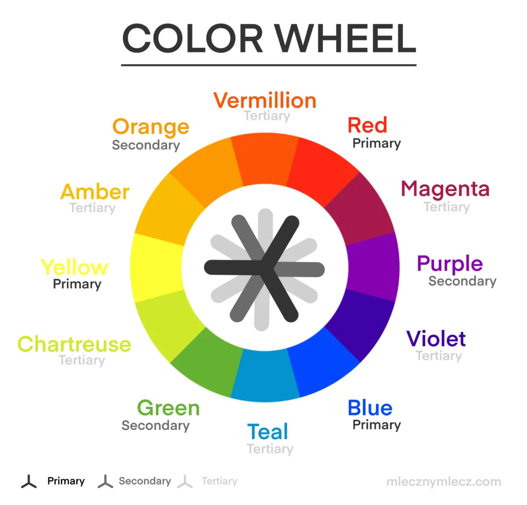
Ignoring Color Harmony
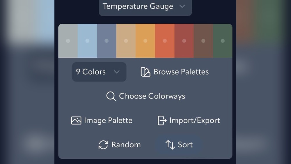
Colors must work well together for a pleasing effect. Clashing colors can confuse the viewer and ruin the artwork. Choose warm or cool tones that complement each other. Use Procreate’s color wheel to find harmonious shades. Always test your palette before applying changes.

Credit: www.youtube.com
Frequently Asked Questions
How To Do Color Jitter On Procreate?
Open Brush Settings in Procreate, select Color Dynamics, then increase Stroke Color Jitter to add color variation while painting.
Should I Use Rgb Or Cmyk For Procreate?
Use RGB in Procreate for digital art and screen display. Choose CMYK only if printing professionally.
How To Change Hue Saturation In Procreate?
Open your artwork in Procreate. Tap Adjustments > Hue, Saturation, Brightness. Use sliders to adjust hue and saturation as desired. Tap outside to apply changes.
How To Do Color By Number In Procreate?
Open Procreate and import your line art. Use the color picker to assign numbers to colors. Outline each area with the Selection tool, then fill with the corresponding color using the Brush or Fill tool. Repeat for all sections until the artwork is complete.
Conclusion
Color temperature in Procreate helps set your artwork’s mood and feel. Use the Hue, Saturation, and Brightness sliders to adjust colors easily. Warmer tones bring energy, while cooler tones add calmness. Experiment with these settings to find what suits your style best.
Practice often to improve your color skills. This simple technique will enhance your digital art projects greatly. Keep exploring Procreate’s tools for more creative effects.