Are you ready to bring your digital artwork to life with perfect color vibes? Understanding how to control color temperature in Procreate is the key to making your illustrations feel warm, cool, or just right.
Whether you want to create a cozy sunset glow or a crisp, cool morning scene, mastering color temperature will transform your art instantly. In this guide, you’ll discover simple, clear steps to adjust and balance colors in Procreate, so your work stands out with vibrant, professional-looking tones.
Keep reading to unlock the secrets that will make your colors pop and captivate anyone who sees your creations!

Credit: www.youtube.com
Color Temperature Basics
Understanding color temperature is key to improving your art in Procreate. It helps you choose colors that fit your design and mood.
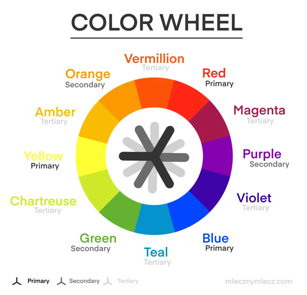
Color temperature divides colors into warm and cool tones. Each type changes the feel of your artwork.
Warm Vs Cool Colors
Warm colors include reds, oranges, and yellows. They remind us of sunlight and fire.
Cool colors are blues, greens, and purples. These colors feel calm and soothing like water or shade.
Using warm or cool colors can balance your drawing. It guides the viewer’s eye and emotion.
Impact On Artwork Mood
Warm colors create energy and excitement. They make scenes look lively and inviting.
Cool colors bring calmness and peace. They suit quiet or sad moments well.
Mixing both can add depth and interest. It helps your art tell a stronger story.
Setting Up Procreate For Color Temperature
Setting up Procreate correctly is important for working with color temperature. This ensures your colors appear as intended. Proper setup helps you control warm and cool tones easily.
Start by choosing the right color profile for your artwork. Then, learn how to access Procreate’s color tools. These steps will prepare you to adjust color temperature confidently.
Choosing The Right Color Profile
Open your canvas settings in Procreate before starting your project. Select a color profile that matches your output needs. For digital work, use the RGB profile. It supports a wide range of colors and brightness.
For print projects, choose the CMYK profile. It better represents printed colors. Picking the right profile avoids color shifts later. This step is key to accurate color temperature control.
Accessing Color Tools
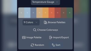
Tap the color circle on the top-right of the screen. This opens the color panel. Here, you find various tabs for color selection and adjustment.
Use the ‘Disc’ tab to pick colors visually. The ‘Value’ tab allows numeric input for precision. The ‘Harmony’ tab suggests complementary colors. These tools help you balance warm and cool tones effectively.
Using Color Balance In Procreate
Applying hue, saturation, and brightness in Procreate changes the look and feel of your colors. These settings help adjust color temperature effectively. Adjusting these three elements can make your artwork warmer or cooler. It also enhances mood and depth.
Using The Hsb Interface
Open the Adjustments menu in Procreate and select Hue, Saturation, Brightness. Three sliders appear for easy control. The Hue slider shifts colors around the color wheel. Move it left or right to find the perfect tone.
The Saturation slider controls color intensity. Slide it to increase or decrease color vibrancy. Lower saturation makes colors look faded or soft. Higher saturation makes colors bold and bright.
The Brightness slider adjusts lightness. Slide it to brighten or darken the color. Bright colors feel lively and fresh. Darker colors add depth and shadow to your work.
Fine-tuning Colors
Fine-tuning colors means small, precise changes. Use subtle moves on the sliders for natural results. Watch your image closely while adjusting. Stop when the color feels balanced and pleasing.
Try adjusting one slider at a time. This helps understand how each affects color temperature. Hue changes warmth or coolness. Saturation controls strength of color. Brightness adds light or shadow.
Keep your adjustments simple for clear, clean colors. Overdoing it may cause unnatural tones. Experiment with small steps to get the best effect. Your artwork will look more professional and polished.
Applying Hue, Saturation, And Brightness
Enhancing warmth in your Procreate artwork helps create a cozy and inviting feel. Warm colors like reds, oranges, and yellows bring energy and life. Using specific techniques, you can adjust the color temperature easily. These methods help you control warmth without losing detail or balance.
Warmth enhancement improves the mood and depth of your digital paintings. It also guides the viewer’s eye to important areas. Let’s explore two effective ways to adjust warmth in Procreate.
Using Adjustment Effects
Adjustment effects offer quick and precise warmth control. Start by tapping the magic wand icon in the top menu. Select “Hue, Saturation, Brightness” from the list. Slide the Hue bar slightly toward the red or orange spectrum. This adds warmth to the entire image.
Increase the Saturation to make warm colors more vivid. Adjust Brightness to keep the image balanced. These tweaks keep your artwork lively without overdoing it. You can preview changes in real time for accuracy.
Layer-based Warmth Control
Layer-based warmth control gives more flexibility. Duplicate the layer you want to warm up. On the new layer, use the Color Balance adjustment under the magic wand menu. Shift midtones and highlights toward warm colors.
Set the layer blend mode to “Soft Light” or “Overlay.” These modes enhance warmth naturally without harsh changes. Adjust the layer opacity to fine-tune the effect. This method lets you target warmth on specific areas easily.
Incorporating Color Jitter For Vibrancy
Creating vibrant art in Procreate involves more than picking bright colors. It requires smart use of color temperature to bring life and depth to your work. Practical tips help balance colors and create harmony. These tips make your art look lively and appealing.
Combining Warm And Cool Tones
Mixing warm and cool tones creates contrast and interest. Warm colors like red and orange bring energy. Cool colors such as blue and green add calmness. Use warm tones for highlights and cool tones for shadows. This contrast makes your art pop. Try layering warm colors over cool backgrounds for a rich effect.
Balancing Saturation And Brightness
Saturation controls the intensity of colors. Brightness changes how light or dark a color appears. High saturation with moderate brightness grabs attention. Too much saturation can look harsh. Lower saturation with high brightness softens the look. Adjust these settings in Procreate’s Hue, Saturation, Brightness tool. Balance them to keep colors vivid but natural.

Credit: www.reddit.com
Credit: www.mlecznymlecz.com
Frequently Asked Questions
How To Do Color Jitter On Procreate?
Open Brush Settings in Procreate, go to Color Dynamics, and increase Stroke Color Jitter. Adjust the slider for desired effect.
Should I Use Rgb Or Cmyk For Procreate?
Use RGB in Procreate for digital art and screen display. Convert to CMYK only when printing your artwork.
How To Saturate A Color In Procreate?
To saturate a color in Procreate, tap the Adjustments icon (magic wand). Select Hue, Saturation, Brightness. Slide the Saturation bar right to increase color intensity. Adjust until you achieve the desired vibrancy.
How To Do Color By Number In Procreate?
Create a new layer and sketch your design. Assign numbers to each color area. Use the selection tool to outline sections. Pick the matching color and fill each numbered area. Repeat for all colors until the image is complete.
Conclusion
Color temperature in Procreate shapes your artwork’s mood and feel. Adjust warm and cool tones to create depth and balance. Use the Hue, Saturation, and Brightness sliders for easy control. Experiment with these settings to find the right look for your piece.
Practice often to improve your color skills quickly. Enjoy the process and watch your digital art come alive.