Quick answer: The key to how to paint large flowers is to work from big to small: choose one or two blooms and let them fill or overflow the canvas, block in the overall silhouette and the darkest shadow shapes first with a wide brush, then build petals as simple overlapping shapes in three values (shadow, mid-tone, light) before adding any edges or detail. Keep the center of the flower as the sharpest, most detailed area and let outer petals stay soft. Large flowers succeed on shape and value, not on botanical accuracy.
Oversized blooms are one of the most rewarding subjects in acrylic. A single magnified rose or peony on a 16×20 canvas has instant wall presence, and because the forms are big and simple, the technique is more forgiving than small, detailed floral work. This guide walks through how to paint large flowers step by step: choosing and composing a bloom, the brush sizes that make the scale work, a blocking-in sequence that keeps petals from turning to mush, and the finishing choices that separate a bold painting from a flat one. The steps assume acrylic, though the sequence transfers to oil with longer drying times.
What “large” changes about flower painting
Scaling a flower up is not the same as painting a small flower with a bigger brush. Three things shift.
- The flower becomes an abstract composition. At life size a bloom is an object. At five times life size the petals become shapes, the shadows become color fields, and the eye reads it as design first and flower second. That means composition rules matter more than botany.
- Edges carry the realism. With fewer petals and larger shapes, the viewer’s eye looks for information in the transitions. Where one petal meets another, whether that edge is crisp or soft tells the eye how the form turns.
- Value does more work than color. A large pink flower painted in a single pink reads as a flat cutout. The same flower in three or four values of pink reads as a form with depth, even if the drawing is loose.
Materials for large-scale florals
You do not need many supplies, but the ones you use should match the scale.
| Item | Recommendation | Why |
|---|---|---|
| Surface | 16×20 to 24×36 canvas or panel; 11×14 minimum | Smaller surfaces lose the “large” effect |
| Brushes | 1 to 2 inch flat, size 10-12 filbert, size 6-8 round, size 2 round for the center | Big brushes force big shapes; the small round is only for the final stage |
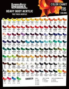
| Paint | Heavy body acrylic: one main flower color, one deeper version of it, white, a green, a yellow, a neutral dark | Six to seven tubes cover most single-bloom paintings |
| Palette | Large disposable palette sheet or a stay-wet palette | You will mix bigger piles than usual |
| Extras | Spray bottle, paper towels, charcoal or watercolor pencil for sketching, slow-drying medium (optional) | Acrylic dries fast at large scale; mist and medium keep blends workable |
If you are new to the medium itself, the broader guide to painting flowers with acrylic paint covers color mixing for petals, basic brush handling and paint consistency before you tackle the big format.
Step 1: Choose a flower that scales well
Some flowers look better magnified than others. Good candidates have a few large, clearly shaped petals and a readable center.
- Easiest: poppies, tulips, magnolias, hibiscus, cosmos, anemones, single-petal dahlias. Few petals, strong silhouettes.
- Moderate: roses, peonies, ranunculus, lotus. Many petals, but they spiral predictably from the center.
- Harder: hydrangea, lilac, baby’s breath, carnations. Dozens of small units with no single focal structure; they tend to become texture rather than form at large scale.
Sunflowers and daisies sit in between: the center is easy and striking, but the ring of near-identical petals needs variety in angle and value to avoid looking like a clock face.
Step 2: Compose the bloom on the canvas
Composition decides most of the result before you mix paint. Work with a reference photo or a real flower and make three or four small thumbnail sketches in the canvas proportion.
- Let the flower break the frame. Crop so one or two petals run off at least two edges. A flower floating in the center with space all around looks like a botanical illustration, not a large-scale painting.
- Place the center off-center. Put the flower’s eye roughly one third in from a side and one third down or up. The spiral of petals then leads the viewer across the canvas.
- Tilt it. A bloom seen slightly from the side, with the center turned about 20 to 40 degrees from the viewer, shows depth. A perfectly face-on flower flattens.
- Decide the background relationship. A dark background makes light petals glow; a light background makes saturated petals pop. Mid-value backgrounds close to the flower color create a quieter, tonal look. Choose one deliberately.
- Keep one or two blooms maximum. Three large flowers start to compete. If you want a second, make it smaller, partly hidden, or cut off by the edge.
Step 3: Sketch big shapes, not petals
Using charcoal, a watercolor pencil or very dilute paint, draw the outer silhouette of the entire flower as one blob, then the center as a circle or oval, then the three or four largest petal divisions. Stop there. Do not draw every petal; you will lose them under paint anyway, and drawing them tempts you to fill in outlines instead of painting shapes.
Check the silhouette from across the room. If it reads as a flower from ten feet away as a single shape, the composition will hold.
Step 4: Tone the canvas and block in the background
A white canvas makes every color look darker than it will be and causes beginners to paint too light. Cover the whole surface with a thin wash of a mid-value neutral: a mix of the background color with a touch of the flower’s complement, thinned with water. Let it dry (five to ten minutes for acrylic).
Then paint the background fully, right up to and slightly under the flower silhouette. With a 1 to 2 inch flat, lay it in with loose, varied strokes. Vary the background value subtly, darker on the side where the flower’s shadow falls and lighter on the opposite side, so it does not look like a cut-out backdrop. Painting the background first lets you paint petal edges on top of it later, which gives cleaner, more natural edges than painting background around petals.
Step 5: Block in the flower in three values
This is the stage that makes or breaks a large flower, so take it in order.
Mix your three petal values
From your main flower color, mix three generous piles:
- Shadow value: the flower color plus a small amount of its complement or a neutral dark. For a pink rose, that is pink plus a touch of green or a violet-gray. Avoid black; it deadens petal color.
- Mid-tone: the flower color as it appears in normal light, usually straight from the tube or slightly toned.
- Light value: the flower color plus white and, for warm flowers, a touch of yellow. Mix more of this than you think you need.
Lay in shadow shapes first
With the size 10-12 filbert, paint every area of the flower that is in shadow using the shadow value: the deep center, the undersides of petals, the gaps between petals, the parts turning away from the light. Squint at the reference to find them. This creates the structure. At this point the flower should read as a convincing form even though only one color is on it.
Add the mid-tone
Fill the remaining petal areas with the mid-tone, letting it butt against the shadow shapes. Where a petal curves from shadow into light, drag the brush gently across the boundary once to soften it. Leave edges between separate petals crisp.
Place the lights
Add the light value only to the parts of petals facing the light source, generally the tops of upward-facing petals and the rolled edges catching light. Resist covering more than about a third of the flower in the light value. Too much light flattens the form again.
Step back. You should now have a recognizable, dimensional flower with no detail at all. If it does not read, fix values now; nothing later will save it.
Step 6: Refine petal edges
Switch to the size 6-8 round. Walk around the flower and decide, petal by petal, which edges should be sharp and which should be soft.
- Sharp edges belong where a petal is in front of a darker shadow, near the center, and on the side of the flower facing the viewer. Paint them by cutting the lighter petal color cleanly against the darker one.
- Soft edges belong on petals turning away, at the outer rim, and on the shadow side. Blend them by stroking across the boundary while both colors are wet, or by glazing a thin transparent layer of the darker color over the join once dry.
- Lost edges, where a petal and background are nearly the same value, add realism. Allow one or two petals to melt into the background.
A useful ratio: about one third of edges crisp, two thirds soft or lost. Beginners usually make everything crisp, which produces a paper-cutout look.
Step 7: Build the center as the focal point
The center is where detail lives. Everything else can stay loose if the center is convincing.
- Paint the center’s darkest shadow with your neutral dark mixed into the flower color.
- Add the structural elements: for a rose, the tight spiral of small petals; for a poppy, the dark stamens radiating from a pale center; for a sunflower, the seed head with its spiral pattern suggested by dabs of two or three browns.
- Place the brightest and purest highlight in the painting here, usually a dot or short stroke of nearly pure light color on a stamen or an inner petal edge.
- Keep detail confined to a circle roughly one fifth of the flower’s width. Outside that circle, let strokes stay broad.
Step 8: Add stems, leaves and supporting elements
At large scale, leaves and stems are supporting actors. Paint them with less contrast and less detail than the flower.
- Mix the green from your yellow and your neutral dark plus a touch of the flower color so it harmonizes.
- Keep leaves darker and duller than the petals; a bright green leaf will steal attention.
- Let a stem or leaf run off the canvas edge to anchor the flower.
- Soften leaf edges more than petal edges so they recede.
Step 9: Final adjustments and glazing
Let the painting dry fully, then look at it in a mirror or upside down to judge it as shapes. Common fixes at this stage:
- Flower looks flat: deepen the shadow shapes with a thin glaze of the shadow value mixed with glazing medium.
- Petals look chalky: the light value had too much white. Glaze a very thin layer of the pure flower color over the lights to restore saturation.
- Too many hard edges: glaze the background color thinly over the outer petal edges to lose them.
- Center does not pop: add one stronger dark beside the highlight.
Finish with an isolation coat or varnish once the acrylic has cured for a few days; it evens out the sheen between thick and thin passages.
Three style variations
Loose and painterly
Stop at the end of step 5 or 6. Keep brushstrokes visible and edges broken. Use the 1 inch flat for petals and never pick up the small round. The result is energetic and modern.
Soft and realistic
Add a slow-drying medium to extend blending time, work the petal transitions more carefully, and use glazes to build depth in the shadows. Spend most of the extra time on the center.
Graphic and flat
Use only two values per petal with crisp edges everywhere, plus a solid background. This poster-like style suits bold flowers like tulips, poppies and hibiscus and works well in sets of three canvases.
Common mistakes with large flower paintings
- Painting each petal as an outlined object. Petals overlap and share edges; paint them as masses of value, not as separate items.
- Using too small a brush too early. If you can see individual bristle marks in the first hour, the brush is too small.
- Centering the bloom with a margin around it. It reads as a sticker. Crop into it.
- Equal detail everywhere. The eye needs a place to rest and a place to look. Keep detail in the center only.
- Pure white highlights on colored petals. White chalks out color. Tint highlights with the flower hue and a touch of yellow or blue depending on the light.
- Bright green leaves. Dull and darken the greens so the flower stays dominant.
- Working on a white canvas. Tone it first; your value judgments will be far more accurate.
Tips by skill level
Beginners
Start with a single poppy or tulip on a 16×20 canvas with a dark background. Use only the 1 inch flat and the size 10 filbert until the very end. If you want an even simpler warm-up to practice petal placement and color, the tutorial on painting flowers with Q-tips is a low-pressure way to get a feel for building blooms from dabs before scaling up.
Intermediate painters
Try a rose or peony with a spiraling center, and work deliberately on the one third crisp, two thirds soft edge ratio. Experiment with a mid-value background close to the flower hue for a tonal, sophisticated look.
Advanced painters
Paint a pair of blooms with one partially hidden, or a flower lit from behind so the petals glow with transmitted light. Backlit petals are lighter and more saturated at their thin edges and darker at their thick bases, the opposite of front-lit form, and are a strong test of value control.
FAQs
What size canvas is best for large flower paintings?
Sixteen by twenty inches is the practical minimum for the “oversized bloom” effect; 18×24, 24×30 and 24×36 are common. On anything smaller than 11×14, the flower reads as life-size rather than magnified.
What brushes do you use to paint big flowers?
A 1 to 2 inch flat for background and initial blocking, a size 10-12 filbert for petal masses, a size 6-8 round for edges, and a size 2 round for the center. Most of the painting should be done with the two largest brushes.
How do you make painted flower petals look three-dimensional?
Paint each petal in at least three values, keep the shadow shapes connected and large, place lights only on surfaces facing the light source, and vary edges: sharp where a light petal overlaps a dark one, soft where a petal turns away.
Should I paint the background before or after the flower?
Before. Painting the background first and then bringing petals over it produces cleaner edges and avoids the awkward halo that comes from painting background around finished petals.
Which flowers are easiest to paint large?
Poppies, tulips, magnolias, hibiscus, cosmos and anemones. They have few, large, clearly shaped petals and a simple center, so the big shapes carry the painting.
How do I keep acrylic from drying too fast on a large canvas?
Work in sections, mist the canvas and palette lightly with water, use a stay-wet palette, and consider adding a small amount of slow-drying (retarder) medium to blends. Blocking in with big brushes also means each passage is finished before it dries.
Final Thoughts
Large flowers reward painters who think in shapes and values rather than petals and details. Compose boldly, tone the canvas, lay in shadows before anything else, keep two thirds of your edges soft, and spend your detail budget on the center. Everything else can stay loose and will look better for it.
For the fundamentals that sit underneath this process, from mixing clean petal colors to controlling acrylic consistency, the full guide to acrylic flower painting for beginners fills in the techniques this large-format walkthrough builds on.