
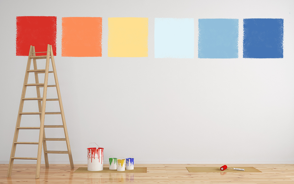
Walk down the paint aisle of any art store and you’ll see hundreds of tubes, many with nearly identical names. It’s tempting to buy a big set and hope for the best, but more colors rarely mean better paintings. Painters who choose a small, well-balanced set of colors usually mix cleaner hues and produce more harmonious work. This guide explains how to choose paint colors as an artist: which tubes to buy, how to read the label, and how to pick a color scheme for each painting.
Quick answer: Choose paint colors by starting with a limited palette: a warm and a cool version of each primary (red, yellow, blue) plus titanium white, and optionally an earth color like burnt umber or yellow ochre. Prefer single-pigment paints with high lightfastness ratings (ASTM I or II), check the pigment codes on the label, and for each painting pick a simple color scheme, such as complementary or analogous, that supports the mood you want.
The principles apply to acrylic and watercolor too, but the examples here focus on oils. If you’re shopping, our review of the best oil colors and paint sets for artists puts these ideas into practice with specific sets.
Start with the Right Mindset: Fewer Colors, Better Mixing
Every tube you add to your palette is another variable. With a large set, it’s easy to grab a premixed green or purple that clashes with everything else. With a small set, every color in the painting comes from the same few parents, which naturally creates harmony. You’ll also learn color mixing far faster when you’re forced to make your own secondaries and neutrals.
Most experienced painters work with somewhere between 5 and 12 colors. Beginners do well at the low end of that range.
How to Choose a Color Palette: Four Proven Starting Points
1. The Split-Primary Palette
This is the most widely recommended beginner palette because it can mix clean versions of nearly any hue. You choose a warm and a cool version of each primary:
| Primary | Warm version | Cool version |
|---|---|---|
| Yellow | Cadmium yellow medium or a warm hansa yellow | Lemon yellow or cadmium yellow light |
| Red | Cadmium red light or pyrrole red | Alizarin crimson (or a permanent alternative) or quinacridone magenta |
| Blue | Ultramarine blue | Phthalo blue or cerulean blue |
Add titanium white, and you have a seven-color palette. The logic: to mix a clean green, use the yellow and blue that both lean toward green (lemon yellow and phthalo blue). To mix a dull, earthy green, use the ones that lean away from each other (cadmium yellow medium and ultramarine). Knowing which way each tube leans lets you control saturation precisely.
2. The Earth-Extended Palette
Add burnt umber, burnt sienna and yellow ochre to the split-primary set. Earth colors are inexpensive, typically very lightfast and quick to dry, and they make natural landscape and skin tones much easier to mix. Burnt umber with ultramarine also makes a rich chromatic black.
3. The Zorn-Style Limited Palette
Named after Swedish painter Anders Zorn, this palette uses only yellow ochre, a red such as cadmium red light, ivory black and titanium white. Ivory black acts as a cool, dull blue when mixed with white. It’s a classic for portrait practice because it forces you to think in values and temperature rather than vivid hues.
4. Single-Painting Limited Palettes
For an individual piece, you might pick just three colors plus white, such as ultramarine, burnt sienna and yellow ochre for a moody landscape. This approach guarantees harmony and is a great exercise for any skill level.
Reading a Paint Tube: What the Label Tells You
The color name on the front can be misleading. Two brands’ “sap green” might contain completely different pigments. The details that matter are usually in the small print.
Pigment Codes
Pigments are identified by Colour Index codes: PB for pigment blue, PR for red, PY for yellow, PG for green, PV for violet, PBr for brown, PBk for black and PW for white. Some common examples:
- PB29: ultramarine blue
- PB15: phthalocyanine (phthalo) blue
- PY42 or PY43: yellow ochre (iron oxide)
- PR101: red iron oxides, such as burnt sienna and Indian red
- PW6: titanium white
- PBk9: ivory black
Checking codes helps you avoid buying two tubes that contain the same pigment under different names.
Single-Pigment vs Multi-Pigment Paints
Single-pigment paints contain one pigment. They mix more cleanly because you know exactly what’s in each tube. Convenience mixes, often labeled “hue” or given fanciful names, contain two or more pigments. They aren’t bad, but mixing two multi-pigment paints can quickly add up to four or five pigments in one pile, which tends to turn muddy.
The word “hue” (for example, “cadmium red hue”) usually means the paint imitates the color of a traditional pigment using a substitute. Hues can be cheaper and less toxic, though their mixing behavior may differ from the original.
Lightfastness
Lightfastness describes how well a color resists fading in light. Many manufacturers use the ASTM rating system, where I is excellent and II is very good. Ratings of III or lower suggest the color may fade noticeably over time. Some brands use their own star or letter systems; check the brand’s chart for what each symbol means.
Transparency and Opacity
Labels often show a square that’s filled, half-filled or empty to indicate opaque, semi-transparent or transparent. Transparent colors such as phthalo blue and alizarin crimson are ideal for glazing. Opaque colors such as cadmiums and titanium white cover well and are useful for correcting mistakes and painting light over dark.
Tinting Strength
Some pigments are extremely strong. Phthalo blue and phthalo green can overpower a mix with a tiny amount, while yellow ochre is relatively gentle. Knowing this helps you add strong colors in small increments.
Choosing Colors for a Specific Painting
Once you have a core palette, decide which colors to emphasize for each piece. These classic color schemes give you a structure.
| Scheme | How it works | Mood and uses |
|---|---|---|
| Monochromatic | One hue in many values and saturations | Calm, unified; great for value studies |
| Analogous | Three or four neighbors on the color wheel (e.g., yellow, yellow-green, green) | Harmonious, natural; landscapes and florals |
| Complementary | Two opposites (e.g., blue and orange) | Vibrant, high energy; sunsets, focal contrast |
| Split complementary | One color plus the two neighbors of its complement | Lively but less harsh than straight complements |
| Triadic | Three evenly spaced hues (e.g., red, yellow, blue) | Balanced, playful; works best with one dominant color |
Let One Color Dominate
A painting usually feels more resolved when one hue or temperature dominates and others play supporting roles. A common guideline is a rough 60-30-10 split: about 60 percent dominant color family, 30 percent secondary, and 10 percent accent. The accent, often a complement of the dominant color, is perfect for your focal point.
Decide on Temperature
Ask whether the light in your scene is warm or cool. Warm light (sunset, candlelight) usually produces cooler shadows by contrast, while cool light (overcast, north light) tends to produce warmer-looking shadows. Choosing your light temperature early helps you select which side of each primary to lean on.
Value Comes First
Color gets the credit, but value does most of the work. Before choosing colors, make a quick black-and-white thumbnail. If the values are clear, almost any harmonious color scheme will work. If the values are muddled, no color choice will save the painting.
Step-by-Step: Building Your Palette
- Pick your medium. Oil, acrylic and watercolor have different pigment behaviors and drying times, but the palette logic is the same.
- Choose six primaries. One warm and one cool of each, using single pigments where possible.
- Add a white. Titanium white is opaque and bright. Some oil painters also keep a softer, more transparent white for subtle mixes.
- Add one or two earths. Burnt umber and yellow ochre are versatile choices.
- Make a mixing chart. Paint a grid with each color across the top and down the side, and mix every pair. This shows you which combinations go clean and which go dull.
- Paint a few studies. Use only your new palette for several small paintings before adding anything.
- Add colors only to fill a gap. If you consistently can’t mix a color you need, such as an intense violet, add a tube that solves it.
For a deeper dive into mixing once your palette is set, see our guide on how to mix oil paint colors.
Colors That Are Worth Adding Later
- Viridian or phthalo green: clean, cool greens and useful for neutralizing reds.
- Dioxazine purple: strong, dark violet that’s hard to mix from red and blue.
- Cadmium orange or pyrrole orange: brighter oranges than you can mix from red and yellow.
- Raw umber: cool brown for neutral grays and fast-drying underpaintings.
- Payne’s gray or a premixed neutral: convenient for quick darks, though easy to overuse.
Common Mistakes When Choosing Paint Colors
- Buying every color in a set. Large sets often include convenience colors you’ll rarely use and can encourage muddy mixes.
- Relying on tube black. It can deaden colors. Many painters prefer mixed darks.
- Ignoring lightfastness. Fugitive colors fade and can change the balance of a painting over time.
- Choosing by tube name. Always check the pigment code; names vary between brands.
- Using colors at full saturation everywhere. Saturated color has more impact when surrounded by muted tones.
- Skipping the swatch. Paint looks different on the palette than it does dry on canvas, especially when thinned or mixed with white.
Student vs Artist Grade: Does It Affect Color Choice?
Artist-grade paints generally contain a higher concentration of pigment and offer more single-pigment options. Student-grade paints use more filler and often substitute hues for expensive pigments like cadmiums and cobalts. A practical compromise is to buy artist-grade versions of the colors you use most, especially white and your primaries, and student grade for colors used sparingly.
Choosing Paint Colors by Subject
Your core palette stays the same, but the colors you lean on change with the subject. These pairings are common starting points, not rules.
- Landscapes: ultramarine, a cool yellow, burnt sienna and yellow ochre handle most skies, foliage and earth. Greens mixed from these look more natural than many tube greens.
- Seascapes: phthalo blue or cerulean for clear water, ultramarine for depth, and a touch of burnt umber to gray down the sea near the horizon.
- Portraits: yellow ochre, a warm red, burnt sienna, ultramarine and white cover a wide range of skin tones. A cool red such as alizarin helps with lips and shadow accents.
- Florals: add a clean magenta or quinacridone rose and a strong violet, since vivid pinks and purples are hard to mix from basic primaries.
- Still life: a split-primary palette plus earths gives enough range for fruit, ceramics and cloth.
For portrait work specifically, our guide on mixing colors for portrait painting shows how these choices play out on the palette.
FAQs
How do I choose a color palette for a painting?
Decide on the mood and light temperature, make a value thumbnail, then select a simple scheme such as analogous or complementary. Let one color family dominate and use its complement as an accent at the focal point.
What are the basic paint colors every artist needs?
A warm and cool version of red, yellow and blue, plus titanium white. Many artists also include burnt umber and yellow ochre for natural mixes.
Should beginners use a limited palette?
Yes. A limited palette teaches mixing, prevents clashing colors and is more affordable. You can add colors once you understand what you’re missing.
What does “hue” mean on a paint tube?
It typically means the paint replicates the color of a traditional pigment using substitute pigments. Hues are often cheaper but may mix differently from the original pigment.
How can I tell if a paint will fade?
Check the lightfastness rating on the tube or the manufacturer’s color chart. ASTM I and II ratings indicate excellent to very good lightfastness.
Is it better to buy single-pigment paints?
Generally, yes, for your core palette. Single-pigment paints mix more predictably and are less likely to create mud.
Next Step
Knowing how to choose paint colors comes down to a small, balanced palette, careful label reading and a clear color scheme for each painting. Build your core set, make a mixing chart and paint a handful of studies before adding anything else. When you’re ready to buy, our comparison of the top oil paint sets for beginners and working artists highlights sets with solid primaries and reliable lightfastness.




One Comment