Are you ready to take your digital artwork to the next level? Mastering color temperature in Procreate can completely transform your illustrations, making them feel more vibrant, realistic, and emotionally powerful.
But how do you control warmth and coolness in your colors with precision? In this guide, you’ll discover simple, effective steps to adjust color temperature in Procreate. Whether you want to create a cozy sunset glow or a chilly winter scene, you’ll learn how to make your colors work harder for your art.
Keep reading, and watch your creations come alive with perfect color harmony!

Credit: www.youtube.com
Color Temperature Basics
Understanding color temperature is key to creating striking art in Procreate. It influences how colors appear and feel in your work. Knowing the basics helps you choose colors that fit your design and message.
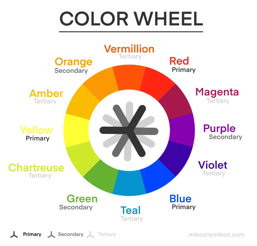
Color temperature divides colors into warm and cool groups. Each group changes the mood and depth of your artwork differently. This guide explains these effects simply.
Warm Vs Cool Colors
Warm colors include red, orange, and yellow shades. They remind us of sunlight and fire. These colors feel energetic and inviting.
Cool colors cover blues, greens, and purples. They evoke water, sky, and calm places. Cool colors create a peaceful or distant feeling.
Mixing warm and cool colors adds balance and interest. Use warm colors to highlight and cool colors to shade.
Impact On Mood And Depth
Warm colors bring excitement and closeness. They push forward in a picture, making areas look nearer.
Cool colors calm and create space. They seem to move back, adding depth to your art.
Color temperature shapes the viewer’s emotion and focus. Adjust it to guide the story your art tells.

Credit: www.reddit.com
Navigating Procreate Color Tools
Navigating the color tools in Procreate is essential for adjusting color temperature effectively. These tools let you fine-tune colors with precision. Understanding each tool helps you create the mood and light you want in your artwork.
Color Panel Overview
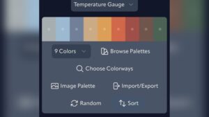
The Color Panel is where you start. It shows a wheel and sliders for color selection. You can pick any hue by touching the wheel. This panel also saves your recent and favorite colors. It keeps your workflow smooth and fast.
Hue, Saturation, Brightness Sliders
Hue changes the color itself. You can slide to find the exact shade you want. Saturation controls the color’s intensity. Move the slider to make colors stronger or softer. Brightness adjusts how light or dark the color appears. These sliders work together to shape the perfect tone.
Color Balance Settings
Color Balance lets you tweak shadows, midtones, and highlights separately. This tool is useful for warming up or cooling down your image. Shifting the balance changes the color temperature subtly or strongly. It gives you control over the overall feel of your artwork.
Adjusting Color Temperature
Adjusting color temperature in Procreate changes the mood and feel of your artwork. It affects how warm or cool your colors appear. This process helps to create depth and harmony in your painting. You can easily refine your colors by shifting hues, adjusting saturation and brightness, and balancing highlights, midtones, and shadows.
Using Hue Shifts
Hue shifts move the colors along the color wheel. This changes the overall tone without losing detail. Warm colors like red and orange can become cooler blues or greens. Use the Hue slider under Adjustments to experiment with different color moods. Small changes often create the best results.
Tweaking Saturation And Brightness
Saturation controls the intensity of the colors. Higher saturation makes colors more vivid, while lower saturation softens them. Brightness adjusts the lightness or darkness of colors. Increasing brightness makes colors lighter and more vibrant. Decreasing it creates a muted or moody effect. Use these sliders together for balanced color temperature.
Balancing Highlights, Midtones, And Shadows
Highlights, midtones, and shadows each carry different color information. Adjust highlights to warm or cool the brightest parts. Change midtones for the main color feel in your artwork. Modify shadows to add depth and contrast. Balancing these three areas ensures a natural and visually appealing color temperature.
Brush Settings For Temperature Effects
Brush settings in Procreate offer powerful ways to create temperature effects. Adjusting these settings changes how colors behave in your strokes. This helps mimic warm or cool light naturally. Understanding these options gives you control over color temperature in your art.
Color Dynamics And Jitter
Color Dynamics lets you add variation to brush colors. Stroke Color Jitter changes the hue slightly with each stroke. Increasing jitter creates a mix of warm and cool tones automatically. It adds depth and interest without extra effort. You can adjust jitter to control how much the color shifts. This feature is useful for blending colors smoothly on the canvas.
Customizing Brush Colors
Procreate allows you to set multiple colors for a single brush. You can customize a color palette with warm and cool hues. Assign these colors within the brush settings for easy access. This helps to switch between temperature tones quickly while painting. Experiment with different combinations to find what fits your style. Custom colors make your brush strokes more lively and natural.
Techniques To Enhance Vibrancy
Enhancing vibrancy in Procreate brings your artwork to life. It creates a strong impact by making colors pop. Using simple techniques can boost your color temperature effectively. These methods help balance warm and cool tones. They also add depth and richness to your painting.
Layer Modes And Blending
Layer modes change how colors interact in your artwork. Multiply darkens colors and adds shadows. Screen lightens areas and brightens your image. Overlay combines multiply and screen for vivid contrast. Experiment with these modes on different layers. Adjust opacity for subtle or strong effects. Blending modes help control warmth and coolness easily. They make colors appear more natural and dynamic.
Applying Warm And Cool Overlays
Warm overlays use colors like orange, red, and yellow. Cool overlays include blues, greens, and purples. Add a new layer above your painting. Fill it with a warm or cool color. Change the layer mode to Soft Light or Overlay. Reduce opacity to soften the effect. This technique shifts the color temperature quickly. It enhances mood and guides viewer focus. Overlays add vibrancy without repainting your work.
Practical Tips For Artwork
Understanding color temperature can change the mood and depth of your artwork in Procreate. Using practical tips helps you apply this skill smoothly. These tips guide you through selecting colors and testing ideas before finalizing your piece.
Applying color temperature correctly enhances light and shadow effects. It also creates harmony and contrast that catch the viewer’s eye. Let’s explore some useful ways to improve your art with color temperature.
Choosing The Right Color Palette
Select colors that show warm or cool tones clearly. Warm colors include reds, oranges, and yellows. Cool colors cover blues, greens, and purples. Pick palettes that balance these tones well for your scene.
Use Procreate’s color wheel or palettes from other artists. Avoid colors that clash or feel unnatural together. Think about the light source and environment in your artwork. This helps keep your palette consistent and believable.
Using Reference Images
Reference images help you see real-life color temperature in action. Find photos with strong warm or cool lighting. Study how shadows and highlights change color under different lights.
Import these references into Procreate to compare as you paint. This practice improves your eye for temperature shifts. It also trains you to recreate natural lighting effects confidently.
Testing Temperature On Sketches
Apply color temperature on rough sketches first. Use simple shapes and blocks of warm or cool colors. This lets you see the overall effect before adding details.
Change hues and saturation quickly with Procreate’s adjustment tools. Experiment with different contrasts to find the best mood. Testing early saves time and improves your final artwork.
Credit: www.mlecznymlecz.com
Frequently Asked Questions
How To Do Color Jitter On Procreate?
Open Brush Settings in Procreate, go to Color Dynamics, and increase Stroke Color Jitter to add color variation to your brush strokes.
Should I Use Rgb Or Cmyk For Procreate?
Use RGB in Procreate for digital artwork and screens. Choose CMYK if your work will print professionally.
How To Change Hue Saturation In Procreate?
Open your artwork in Procreate. Tap Adjustments, select Hue, Saturation, Brightness. Use sliders to adjust hue, saturation, or brightness as needed.
How To Do Color By Number In Procreate?
Open Procreate and import your color by number template. Use the selection tool to outline each numbered area. Pick the corresponding color from your palette. Fill the outlined sections using the brush or fill tool. Repeat for all numbers until the artwork is complete.
Conclusion
Understanding color temperature in Procreate helps your artwork feel alive. Adjust warm and cool tones to set the mood clearly. Use simple tools like Hue, Saturation, and Brightness sliders often. Experiment with these settings to see what fits your style best.
Practice brings confidence and improves your digital painting skills. Keep exploring and enjoy creating vibrant, balanced colors every time.