Are you ready to make your digital art in Procreate pop with the perfect mood and vibe? Understanding how to master color temperature is the key to adding warmth or coolness that brings your creations to life.
Whether you want to create a cozy sunset or a chilly winter scene, controlling color temperature will transform your work from flat to fantastic. In this guide, you’ll learn simple, effective steps to adjust color temperature in Procreate, even if you’re just starting out.
Stick with me, and by the end, you’ll have the tools to create stunning artwork that captures exactly the feeling you want. Let’s dive in and warm up—or cool down—your art the right way!
Color Temperature Basics
Understanding color temperature is key to creating striking art in Procreate. It defines whether a color feels warm or cool. This affects how viewers see your work. Adjusting color temperature helps set the right tone and atmosphere.
Color temperature changes the mood and depth of your illustrations. Knowing the basics lets you control these effects with ease. Let’s explore the core ideas behind color temperature.
Warm Vs Cool Colors
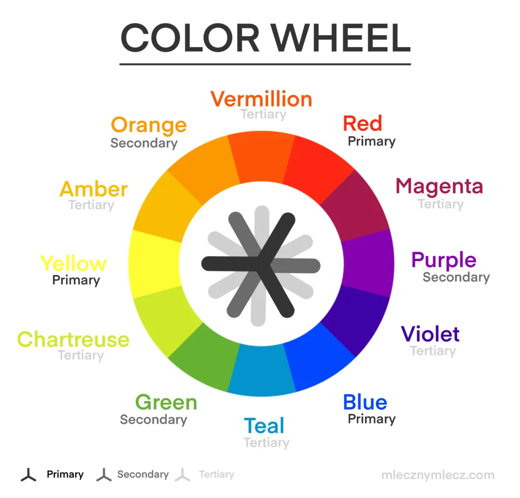
Warm colors include reds, oranges, and yellows. They remind us of sunlight and fire. These colors often feel energetic and cozy. Cool colors are blues, greens, and purples. They evoke water, sky, and shade. Cool tones feel calm and distant. Using warm and cool colors together creates balance in your art.
Impact On Mood And Depth
Warm colors can make parts of your drawing feel closer. They add energy and excitement. Cool colors push areas backward. They create calmness and space. Mixing both types adds depth and interest. Changing temperature changes how viewers feel about your art. This simple trick makes your illustrations more dynamic.
Setting Up Procreate
Setting up Procreate correctly lays the foundation for effective color temperature work. It ensures your colors display and behave as expected. This setup phase helps you control the warmth or coolness of your artwork with precision.
Before adjusting color temperature, you need to prepare your canvas and color tools. Proper setup makes the process smoother and the results more accurate. The following steps guide you through key settings in Procreate.
Choosing The Right Color Profile
Selecting the correct color profile affects how colors appear on your screen and in prints. Procreate supports several profiles, including sRGB, Display P3, and CMYK. For digital work, sRGB or Display P3 work best because they cover a wide color range.
Start by opening the Gallery, then tap the “+” icon to create a new canvas. Next, tap “Edit Details” to see the color profile options. Choose Display P3 for more vibrant colors, especially for iPad screens. Use sRGB for web-friendly colors and general use.
Setting the right profile helps maintain color accuracy when adjusting temperature. This step ensures your warm and cool tones appear as intended across devices.
Navigating Color Settings
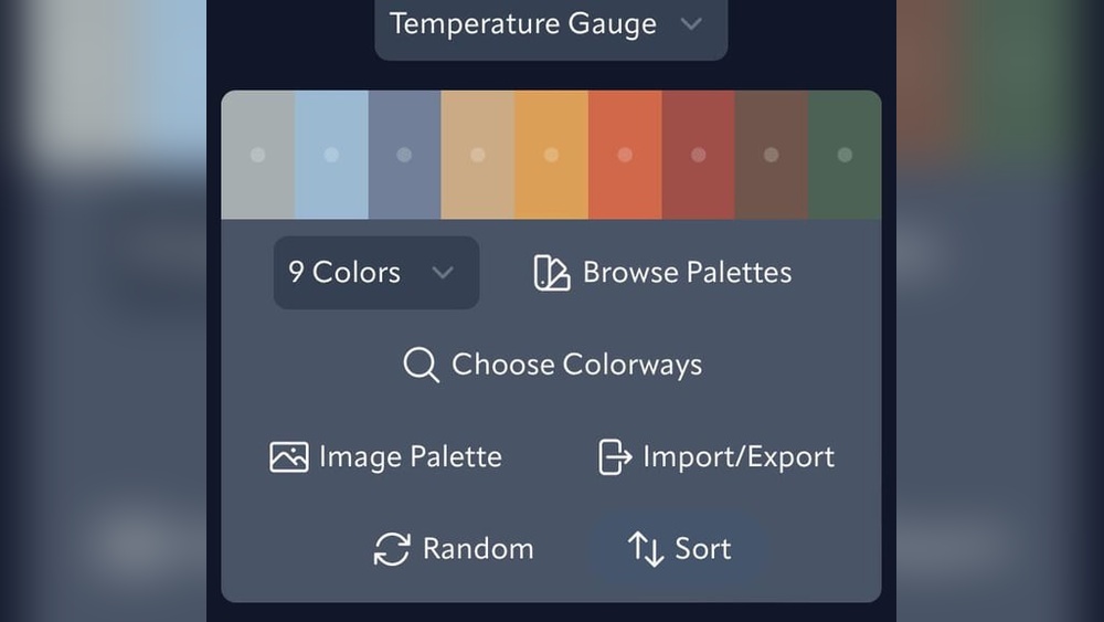
Procreate offers a user-friendly color interface to manage hues, saturation, and brightness. Access it by tapping the color circle in the top-right corner of the screen. The Color Panel includes four tabs: Disc, Classic, Harmony, and Value.
The Disc tab is the easiest place to pick and fine-tune colors. Adjust sliders for hue, saturation, and brightness to change the color’s warmth or coolness. Warmer colors lean towards red, orange, or yellow, while cooler colors shift to blue or green.
Use the Harmony tab to explore color schemes that balance warm and cool tones. This helps create pleasing color temperature contrasts in your artwork. The Value tab shows numeric values for precise color adjustments.
Familiarize yourself with these settings before you start painting. Knowing where to find and change colors speeds up your workflow and improves your color temperature control.
Adjusting Hue And Saturation
Adjusting hue and saturation in Procreate is key to setting the right color temperature. These adjustments help shift colors toward warm or cool tones. They also make your artwork more vivid or muted. Simple slider controls make these changes easy to apply and preview. Understanding how to use them enhances your color control in Procreate.
Using The Hsb Sliders
HSB stands for Hue, Saturation, and Brightness. Each slider controls a different color aspect.
The Hue slider changes the color itself. Drag it left or right to shift colors along the spectrum. This can create warmer reds or cooler blues.
Saturation adjusts the intensity of the color. Moving it up makes colors richer. Moving it down makes colors more gray or washed out.
Use these sliders by tapping Adjustments > Hue, Saturation, Brightness in Procreate. Slide each control slowly to see subtle changes in real time.
Balancing Brightness For Vibrancy
Brightness controls how light or dark your colors appear. It affects the overall mood of your piece.
Increasing brightness can make colors pop and feel more lively. Decreasing brightness can create shadows and deeper tones.
Finding the right brightness level keeps your colors balanced and vibrant. Too bright can wash out colors. Too dark can hide details.
Adjust brightness together with hue and saturation. This trio creates the perfect color temperature for your artwork.
Using Color Balance Tool
The Color Balance tool in Procreate is perfect for adjusting color temperature. It lets you shift colors in your artwork to look warmer or cooler. This tool works by changing the balance of colors in highlights, midtones, and shadows. You get precise control over your image’s mood and tone.
Using the Color Balance tool is simple. Open the Adjustments menu and select Color Balance. You will see sliders for shadows, midtones, and highlights. Moving these sliders shifts the colors toward red, green, blue, cyan, magenta, or yellow. This helps you fix or enhance the color temperature easily.
Tweaking Highlights
Highlights are the brightest parts of your image. Adjusting color in highlights changes the lightest tones. Move the sliders gently to add warmth or coolness. For warmer highlights, increase red and yellow tones. For cooler highlights, add blue and cyan. Small changes make your artwork feel natural and balanced.
Adjusting Midtones And Shadows
Midtones cover most of your artwork’s color range. Adjusting midtones affects the overall color feel. Use sliders to warm up or cool down these colors. Shadows are the darkest areas. Changing shadow colors adds depth and contrast. To warm shadows, add red or yellow. For cool shadows, shift toward blue or cyan. Balancing midtones and shadows improves color harmony.
Applying Color Jitter
Applying color jitter in Procreate adds natural variation to your strokes. It creates lively, dynamic colors that avoid flatness. Color jitter changes the hue, saturation, or brightness slightly with each stroke. This technique helps simulate real brush behavior and enhances your artwork’s depth.
Using color jitter is simple once you know where to find the settings. Procreate offers customization to control how much the color varies. This feature works best with brushes that support color dynamics.
Enabling Color Dynamics In Brushes
Open the Brush Library and select your brush. Tap the brush again to open Brush Studio. Scroll down to the “Color Dynamics” section. Turn on the toggle to enable color dynamics. This setting activates color jitter options for your brush. Without enabling this, color jitter will not work.
Enabling color dynamics allows Procreate to adjust colors as you draw. It responds to pressure, tilt, or speed depending on your settings. This makes colors shift naturally during your strokes.
Customizing Stroke Color Jitter
Inside Color Dynamics, find the “Stroke Color Jitter” slider. Slide it to increase or decrease color variation. Higher jitter values create more noticeable color shifts. Lower values keep colors more consistent.
You can also adjust Hue Jitter, Saturation Jitter, and Brightness Jitter. Each controls a different aspect of color change. Experiment with these sliders to get the effect you want. Small adjustments can add subtle life to your lines.
Test your brush on the canvas to see the jitter effect. Adjust settings until the color changes feel natural. This step helps avoid colors that look random or chaotic.

Credit: www.reddit.com
Tips For Vibrant Art
Creating vibrant art in Procreate depends a lot on how you handle color temperature. Colors can feel flat or alive based on how warm or cool tones mix. Using color temperature well can bring energy and mood to your artwork.
Understanding some simple tips helps you use these tones effectively. This makes your art stand out with more life and depth.
Combining Warm And Cool Tones
Mix warm and cool colors to create contrast and interest. Warm tones like reds and yellows bring energy. Cool tones such as blues and greens calm the eye. Placing them side by side makes colors pop and feel balanced.
Try using warm colors in highlights and cool colors in shadows. This adds natural lighting effects. It also helps your artwork look more three-dimensional.
Layering Colors For Depth
Build color slowly by layering multiple shades. Start with a base color, then add warmer or cooler tones on top. This layering gives your painting richness and texture.
Use low opacity brushes to blend colors smoothly. Layering lets light and color interact in a realistic way. Your art will look more vibrant and alive.
Common Mistakes To Avoid
Working with color temperature in Procreate can transform your artwork. Yet, many artists make simple mistakes that affect the final look. Avoiding these errors helps keep your colors natural and balanced. Below are some common pitfalls to watch out for during your creative process.
Over-saturation
Applying too much saturation can make colors look fake. Bright colors may seem harsh or glowing in an unnatural way. Keep saturation levels moderate to preserve realism. Use subtle shifts in color temperature instead of extreme changes. This keeps your artwork pleasing and easy on the eyes.
Ignoring Light Source
Color temperature depends on the light source in your scene. Ignoring it causes inconsistent color tones. Warm light casts warm shadows; cool light creates cool shadows. Study your light source carefully before adjusting colors. Match color temperature to the light for a believable image.

Credit: www.youtube.com
Credit: www.mlecznymlecz.com
Frequently Asked Questions
How To Do Color Jitter On Procreate?
Open your brush settings in Procreate, go to Color Dynamics, then increase Stroke Color Jitter to add color variation.
Should I Use Rgb Or Cmyk For Procreate?
Use RGB in Procreate for digital art, as it supports vibrant colors on screens. Convert to CMYK for print projects.
How To Change Hue Saturation In Procreate?
Open your artwork in Procreate. Tap Adjustments (magic wand icon). Select Hue, Saturation, Brightness. Use sliders to change hue and saturation. Adjust until satisfied.
How To Do Color By Number In Procreate?
Create a new layer and sketch your design. Assign numbers to each color section. Use the color picker to fill areas by matching numbers. Outline each section for clarity. Repeat for all colors until complete. This method simplifies color-by-number in Procreate efficiently.
Conclusion
Adjusting color temperature in Procreate improves your artwork’s mood and depth. Use warm tones to create cozy, inviting scenes. Cool tones add calmness and distance. Experiment with Hue, Saturation, and Brightness sliders for best results. Keep practicing to find your unique style.
Simple steps can make your colors look more natural. This skill helps your art stand out and feel alive. Try different settings and enjoy the creative process.