Are you looking to bring your oil paintings to life with more depth and emotion? Understanding color temperature is the secret weapon that can transform your work from flat to vibrant.
When you master how warm and cool colors interact, you control what grabs attention and what fades into the background. This guide will help you unlock the power of color temperature, showing you simple yet effective techniques to create mood, space, and focus in your paintings.
Keep reading, and you’ll discover how to make your art not just seen—but truly felt.
Color Temperature Basics
Understanding color temperature is key in oil painting. It affects mood, depth, and balance. Color temperature divides colors into warm and cool groups. This basic concept helps artists create harmony and contrast in their work.
Learning how temperature changes perception lets you control the viewer’s focus. It also gives paintings a sense of space and life. The following sections explain these ideas clearly.
Warm Vs Cool Colors
Warm colors include reds, oranges, and yellows. They remind us of sunlight and fire. Cool colors are blues, greens, and purples. These feel like water, sky, or shade. Warm colors often feel energetic or cozy. Cool colors tend to feel calm or distant.
How Temperature Affects Perception
Color temperature changes how we see objects. Warm colors seem closer and bigger. Cool colors look farther away and smaller. This shift tricks the eye and adds depth. Temperature also influences emotion. Warm hues can create excitement or warmth. Cool hues can bring calm or sadness.
Advancing And Receding Colors
Advancing colors appear to move forward in a painting. These are usually warm colors. They catch attention and highlight areas. Receding colors seem to move back. Cool colors often recede. Using this idea helps shape space and focus. Balancing advancing and receding colors guides the viewer’s eye smoothly.
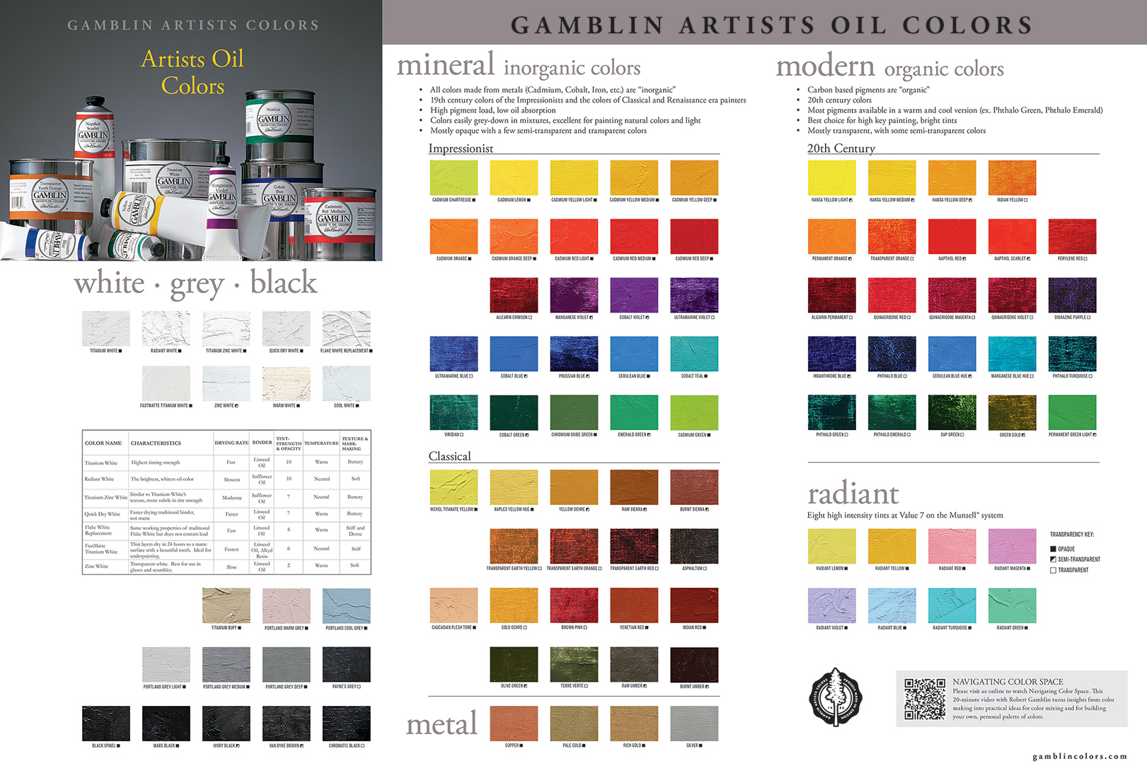
Credit: gamblincolors.com
Choosing Colors For Impact
Choosing colors for impact shapes the mood and focus of your oil painting. Color temperature guides this choice. Warm and cool colors create different feelings. Using them well adds depth and interest. The right balance makes your artwork inviting and lively.
Understanding how to select and mix colors helps you control the painting’s energy. This section explains how to use warm and cool colors. It also covers keeping vibrancy and harmony in balance.
Selecting Warm Colors
Warm colors include reds, oranges, and yellows. They feel energetic and draw attention. Use warm colors to highlight important areas. These colors seem to come forward in a painting. They create a sense of warmth and excitement. Warm tones suit sunlight, fire, and lively scenes well.
Incorporating Cool Colors
Cool colors are blues, greens, and purples. They give calm and distance. Cool colors tend to recede, making space in your painting. Use them for shadows or backgrounds. These tones suggest quiet, peace, or sadness. Cool colors balance the heat of warm tones.
Balancing Vibrancy And Harmony
Too many bright colors can overwhelm the viewer. Too few make the image dull. Balance vibrant warm and cool colors for harmony. Use warm colors for focus points. Surround them with cool colors for contrast. This balance keeps the painting lively and pleasing. Soft transitions between colors avoid harsh clashes.
Techniques For Oil Painting
Techniques for oil painting play a key role in using color temperature effectively. Understanding how to manipulate warm and cool colors can change the mood and depth of your work. These techniques help bring life and realism to your paintings.
Mixing Colors For Temperature
Mix colors carefully to control temperature. Combine warm colors like red and yellow for a heated feel. Use blue and green to cool down your palette. Experiment with ratios to find the perfect balance. This approach helps you create a natural temperature contrast.
Layering And Glazing Effects
Layering adds richness to your painting’s temperature. Apply thin glazes of warm or cool colors over dried layers. This builds subtle shifts in temperature and light. Glazing creates depth and vibrancy without harsh transitions. It enhances the overall atmosphere of the scene.
Using Temperature To Create Depth
Temperature guides the viewer’s eye and adds depth. Warm colors tend to come forward, while cool colors recede. Place warm tones in the foreground to highlight details. Use cool tones in the background to suggest distance. This technique creates a three-dimensional effect on a flat surface.
Applying Color Temperature In Composition
Applying color temperature in composition helps oil painters control how viewers experience their artwork. It affects how colors interact and how the eye moves across the canvas. Using warm and cool tones cleverly makes paintings more dynamic and engaging. This section explores practical ways to use color temperature in composition.
Guiding The Viewer’s Eye
Color temperature directs attention naturally. Warm colors like red, orange, and yellow appear closer and catch the eye first. Cool colors such as blue and green tend to recede into the background. Artists place warm colors in key areas to lead viewers through the painting. This creates a path for the eye to follow. It helps avoid confusion and keeps the focus clear.
Creating Focal Points
Focal points stand out by contrasting color temperatures. A warm spot in a mostly cool composition draws immediate attention. Similarly, a cool element in a warm scene can create interest. This contrast makes the focal point pop without extra detail. It highlights the main subject and adds visual drama. Color temperature is a simple but powerful tool to emphasize important parts.
Enhancing Mood And Atmosphere
Color temperature shapes the feeling of a painting. Warm colors suggest warmth, energy, or happiness. Cool colors evoke calmness, sadness, or distance. Mixing temperatures adds depth to the mood. For example, a warm sunset sky with cool shadows feels peaceful and rich. Artists use temperature to support the story or emotion behind the work. It connects viewers to the scene on a deeper level.
Realism And Representational Art
Realism and representational art aim to depict scenes and subjects as they appear in real life. Capturing true-to-life colors, light, and atmosphere is essential. Color temperature plays a key role in achieving this authenticity. It helps artists create the illusion of natural light and space, giving paintings depth and mood. Understanding how to manipulate warm and cool tones can make representational art more believable and engaging.
Temperature For Natural Light
Natural light changes color temperature throughout the day. Morning light tends to be cool with blue tones. Afternoon light becomes warmer with yellows and oranges. Artists use cooler colors to mimic shade or cloudy skies. Warmer colors suggest sunlight and warmth. Balancing these temperatures creates a lifelike environment. It helps viewers feel the time and place of the scene.
Capturing Time Of Day
The color temperature shifts as time passes. Sunrise and sunset show warm, golden hues. Midday light is cooler and brighter. Night scenes often use cool blues and purples. Choosing correct temperatures sets the time clearly. It adds emotion and atmosphere to the painting. Color temperature guides the viewer’s sense of moment and mood.
Portraying Air And Space
Cool colors suggest distance and atmosphere. They make objects appear farther away. Warm colors bring objects forward and add weight. Artists use temperature contrast to create depth. This technique enhances realism in landscapes and interiors. It helps separate foreground, middle ground, and background. Color temperature gives paintings a three-dimensional feel.

Credit: www.youtube.com
Common Mistakes To Avoid
Understanding color temperature is key to creating vibrant oil paintings. Many artists make simple mistakes that weaken their work. Avoiding these errors helps maintain balance and interest in your art. Focus on how you use warm and cool tones, temperature contrast, and subject matter.
Overusing Warm Or Cool Tones
Too much warmth can make a painting feel flat or harsh. Excessive cool tones might cause it to look dull or lifeless. Balance is essential. Use warm and cool colors in moderation to keep your painting lively and believable. Mixing both tones creates depth and mood.
Ignoring Temperature Contrast
Temperature contrast adds excitement and focus. Skipping this step makes paintings less dynamic. Contrast between warm and cool colors guides the viewer’s eye. It highlights important areas and builds structure. Always plan how temperature differences will work in your composition.
Failing To Adjust For Subject Matter
Each subject needs a different color temperature approach. A sunset calls for warmer tones, while a snowy scene suits cooler shades. Using the wrong temperature can confuse the viewer. Match your color temperature to the mood and setting of your subject. This creates a stronger, more natural painting.
Advanced Tips For Mastery
Advanced tips enhance your skill with color temperature in oil painting. They push your work beyond basics. These tips help create more engaging and vivid paintings. Understanding subtle uses of temperature adds depth and emotion. Experimenting with temperature can bring unique effects to your art.
Dynamic Temperature Contrast
Use strong contrasts between warm and cool colors for impact. Warm colors seem to come forward, cool colors recede. This contrast guides the viewer’s eye across the painting. Create focal points by placing warm colors next to cool ones. Avoid using equal amounts of warm and cool colors. Uneven balance creates more interest and energy.
Using Temperature To Convey Emotion
Color temperature affects mood deeply. Warm tones suggest happiness, energy, or warmth. Cool tones evoke calm, sadness, or mystery. Combine temperatures to show mixed emotions. Adjust temperature to support the story you want to tell. Cooler shadows can add tension or quietness. Warmer highlights can suggest hope or excitement.
Experimenting With Unconventional Palettes
Try unusual combinations of warm and cool colors. Mix unexpected colors to surprise the viewer. Use cool hues in areas usually warm, like sunlight. Use warm colors in shadows for creative effects. These experiments can develop your personal style. Keep notes on what works for future paintings.
Tools And Materials
Choosing the right tools and materials is crucial for exploring color temperature in oil painting. The quality and type of paints, brushes, and mediums affect how colors interact on the canvas. Understanding these elements helps you control warmth and coolness in your artwork. Below are some essential tools and materials to consider.
Recommended Paints And Pigments
Select paints with clear warm and cool versions of each color. Cadmium red and alizarin crimson offer warm and cool reds. Ultramarine blue and cobalt blue serve as cool and warm blues. Use titanium white for mixing and softening colors without changing temperature drastically. Choose artist-grade oil paints for better pigment strength and color vibrancy. Avoid student-grade paints as they often lack pure pigments.
Brushes And Mediums For Temperature Effects
Flat and round brushes work well for blending warm and cool tones. Use softer bristles for smooth transitions between colors. Mediums like linseed oil increase paint flow and gloss, enhancing color depth. Stand oil thickens paint and slows drying, allowing more time to adjust temperature effects. Experiment with solvent ratios to control drying time and color intensity.
Resources For Learning And Inspiration
Explore online tutorials focused on color temperature techniques in oil painting. Study works by artists known for their color mastery. Join local art groups or workshops to get hands-on experience. Books on color theory provide deeper understanding of temperature in art. Keep a sketchbook to practice mixing and observing warm and cool colors daily.
Credit: www.oilpaintersofamerica.com
Frequently Asked Questions
What Is The 70/30 Rule In Art?
The 70/30 rule in art means using 70% dominant elements and 30% contrasting ones to create visual balance and focus.
What Is The 80/20 Rule In Painting?
The 80/20 rule in painting means focusing 80% effort on key elements that impact the artwork most, and 20% on details.
How To Use Color Temperature In Painting?
Use warm colors to make objects appear closer and cool colors to push them back. Balance both for depth and focus.
Do Warm Colors Recede Or Advance?
Warm colors advance, appearing closer to the viewer, while cool colors recede, creating depth in artwork.
Conclusion
Color temperature plays a key role in oil painting. Warm colors bring objects closer to the viewer. Cool colors make parts of the painting seem farther away. Using these temperatures well creates depth and mood. Experiment with warm and cool tones to see their effect.
This guide helps you paint with clearer color choices. Keep practicing to improve your skills. Your paintings will become more vibrant and balanced. Enjoy the process and let your creativity flow.