
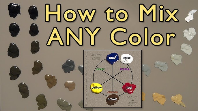
Quick answer: To mix colors in oil painting for realistic effects, judge every color by three properties in order: value (light or dark), temperature (warm or cool) and chroma (intensity). Start each mix from the nearest tube color, adjust value with white or a dark, shift temperature with a neighboring hue, and lower chroma with its complement instead of black. Most real-world colors are far grayer than they appear, so neutralizing is the step that makes paintings look believable.
Bright, clean color is easy to squeeze from a tube. Realistic color is harder, because the colors of real objects under real light are rarely pure. A white shirt in shade is a muted blue-violet. A red apple’s shadow side may be closer to a dull brownish crimson. Learning how to mix colors in oil painting for realistic effects is mostly learning to see those shifts and reproduce them on the palette.
This guide focuses on realism specifically: how to analyze an observed color, the order of adjustments that gets you there fastest, how light and shadow change color temperature, and how to keep mixtures from turning to mud. If you want the mechanics of palette layout, tints and mixing charts, the companion guide to mixing oil paint colors covers that groundwork in detail.
How Do Colors Mix? The Three Properties That Matter
Every color you see can be described with three dimensions. Realistic mixing becomes far easier once you stop thinking in names like “sky blue” and start thinking in these terms.
| Property | What it means | How to change it in oil |
|---|---|---|
| Value | How light or dark the color is | Add white to lighten; add a darker hue, such as ultramarine or burnt umber, to darken |
| Temperature / hue | Where it sits on the color wheel, and whether it leans warm or cool | Add a neighboring hue, for example a little yellow to warm a green |
| Chroma (saturation) | How intense or grayed the color is | Add its complement or a gray of the same value to reduce it |
Of the three, value carries the most weight. A painting with accurate values and odd colors still reads as believable form and light. A painting with beautiful colors and wrong values looks flat. That is why experienced painters often say value does the work and color gets the credit.
Oil paint follows subtractive mixing. Each pigment absorbs some wavelengths of light and reflects others, and combining pigments means more light is absorbed. In practice, every pigment you add makes a mix a little darker and a little duller. That is the root cause of mud, and it is why realistic mixes are best built from as few pigments as possible.
Know the Bias of Each Tube Color
No tube paint is a perfect primary. Each one leans toward a neighbor on the color wheel, and that lean decides what it mixes well with.
- Cadmium yellow light / lemon yellow lean cool, toward green. They mix clean greens.
- Cadmium yellow medium / yellow ochre lean warm, toward orange. They make warmer, earthier greens and good oranges.
- Cadmium red light leans toward orange, which makes bright oranges but dull purples.
- Alizarin crimson or quinacridone red leans toward blue, giving clean violets but weaker oranges.
- Ultramarine blue leans toward violet. It makes rich shadows and soft purples.
- Phthalo blue and cerulean lean toward green, giving intense greens and turquoise.
The rule: when two colors lean toward each other, the mix stays clean. Lemon yellow plus phthalo blue gives a vivid green because both lean green. When they lean away, each carries a hint of the third primary, and the mix grays. Ultramarine plus yellow ochre gives a muted, olive green because ultramarine leans red-violet and ochre leans orange. For realism, that dulled green is often more useful than the vivid one.
This is also where the quality of your paint starts to matter. Pigment load, single-pigment versus convenience mixtures, and tinting strength all change how predictable your mixes are. The roundup of oil color sets worth considering for realistic work explains which pigment lists to look for before you buy.
A Step-by-Step Method for Matching Any Observed Color
Here is a repeatable sequence for mixing a color you see on a subject, whether it is a cheek, a tree trunk or a shadow on a wall.
- Name the family. Ask what hue family the color belongs to. Is that shadow on the white tablecloth blue, violet, or warm gray? Pick the tube color closest to it as your base.
- Set the value first. Squint at the subject and compare the target with a known light and a known dark. Lighten your base with white, or darken it with a deep color of similar hue, until the value matches.
- Adjust the temperature. Compare the mix with the target. If it looks too cool, nudge it with a small amount of a warmer neighbor, such as a touch of red in a violet.
- Lower the chroma. Almost always, the mix will be too intense. Add a small amount of its complement, for example a speck of orange into a blue, until the saturation drops to match.
- Test it in context. Hold a loaded palette knife up against the subject, or dab the mix onto the painting next to its neighbors. Color reads differently depending on what surrounds it.
Doing these steps in order matters. If you adjust chroma before value, you end up correcting value again, which adds more pigment and more risk of mud.
What Colors to Mix for Realistic Shadows
Shadows are where many paintings lose realism, usually because the painter darkened the local color with black. Black tends to dull color in a lifeless way, and black mixed with yellow even turns it green. Realistic shadows behave differently.
Shadows shift temperature
Under a warm light source, such as sunlight late in the day or an incandescent lamp, shadows tend to look cooler by comparison. Under cool light, such as an overcast sky or a north-facing window, shadows tend to look warmer. This warm-light, cool-shadow relationship is a reliable starting point, though bounced light from nearby surfaces can override it.
Build shadows from the local color and a complement
Take the object’s base color and darken it with a darker hue near it on the wheel, then neutralize slightly with its complement. A useful set of starting combinations:
| Object color | Shadow starting mix (no black) |
|---|---|
| Red | Alizarin crimson + a touch of viridian or phthalo green |
| Yellow | Yellow ochre + raw umber + a hint of violet |
| Green foliage | Sap or phthalo green + alizarin crimson, or ultramarine + burnt sienna added to the green |
| Blue | Ultramarine + burnt umber |
| White fabric | White + ultramarine + a touch of burnt sienna, pushed cooler or warmer to suit the light |
| Skin | Base skin mix + a small amount of green or ultramarine, plus burnt sienna |
Ultramarine blue and burnt umber together deserve special mention. In roughly equal amounts they produce a deep, slightly cool near-black that can be pushed warm or cool by adjusting the ratio. Many realist painters use it in place of tube black entirely.
Reflected light lives in shadows
Shadow sides of objects often pick up a glow from nearby surfaces. A white mug beside an orange will show a faint warm tint in its shadow. Add this reflected color subtly, and keep it darker than anything in the light side. Painting it too light is a common mistake that breaks the form.
Mixing Highlights and Light Passages
White lightens a color, but it also cools it and lowers its chroma. Add titanium white to cadmium red and you get a cool, chalky pink rather than a lighter red. To keep lights luminous:
- Lighten with a lighter neighboring hue first, such as yellow into orange, then add white as needed.
- Warm your white slightly with a speck of yellow ochre or cadmium yellow when painting objects under warm light.
- Keep the brightest, purest white for the smallest specular highlights only. If everything bright is pure white, nothing looks bright.
Good Color Mix for Painting Atmosphere and Distance
Objects farther away appear lighter, cooler, bluer and less detailed because of the air between the viewer and the object. This is atmospheric perspective, and getting it right adds instant depth to landscapes.
- Foreground: full chroma, warmest colors, strongest value contrast.
- Middle ground: slightly reduced chroma, colors shifted a little toward blue or violet.
- Background: light, low-contrast, cool mixes. Take the foreground color, add some of the sky color and white, and neutralize.
A practical trick is to mix your sky color first and then add a little of it to every distant color. That keeps the background unified and believable.
How to Avoid Muddy Mixes
Mud is color that has lost both chroma and clarity without becoming a pleasing neutral. It usually comes from a few repeatable habits.
- Too many pigments. Aim for two or three per mixture, plus white. Beyond that, colors cancel out.
- Dirty brushes. Wipe the brush on a rag between colors and rinse in solvent when switching between very different hues.
- Overmixing on the canvas. Mix on the palette, place the stroke, and leave it.
- Painting into wet, dark underlayers. Light paint over wet dark paint picks up the dark. Scrape back, or wait for the layer to dry.
- Using black as the only darkener. Darken with deep chromatic colors instead.
It also helps to understand that a controlled neutral is not mud. A gray mixed deliberately from complements, at the right value and temperature, is one of the most realistic colors you can put on a canvas. Mud is simply a neutral you did not intend.
How to Mix Oil Painting Medium Into Realistic Mixes
Medium changes how a color behaves, not what color it is, but it affects realism through transparency and finish.
- Early layers: thin paint with a little odorless mineral spirits so it dries faster and stays lean.
- Middle and top layers: add a small amount of an oil-based medium, such as linseed oil or an alkyd medium, to increase flow and keep the fat over lean principle.
- Glazes: mix a transparent pigment with a larger proportion of medium to create a thin colored film. Glazing a transparent red over a dried modeled form can deepen color with a glow that opaque mixing cannot match.
Add medium sparingly, a drop or two at a time on the palette knife. Too much makes paint slippery, slow to dry and prone to wrinkling.
Practice Exercises for Realistic Color Mixing
- Single-object studies. Paint an egg, an orange or a white mug under one lamp. Focus only on the light side, the shadow side and the cast shadow.
- Color matching cards. Hold a mixed swatch on a knife beside real objects around you and adjust it until it disappears against the object.
- Value-only paintings. Paint a still life using only white and burnt umber. Accurate values here make color work much easier later.
- Limited palettes. Paint with only a warm and cool version of each primary, plus white. This forces you to neutralize with complements and teaches harmony.
Skin tones are a special case worth practicing separately, because small shifts in temperature read strongly on a face. The guide on mixing colors for portrait painting builds on the method here.
FAQs
How do you make oil paint colors look realistic?
Match value first, then temperature, then chroma. Most real-world colors are more neutral than they appear, so lowering chroma with complements and using warm-light, cool-shadow relationships does most of the work.
What colors to mix to get a realistic black?
Ultramarine blue and burnt umber in roughly equal parts make a rich chromatic dark. Shift it toward blue for cool shadows or toward umber for warm ones. Alizarin crimson with a phthalo green also makes a deep dark.
How do you mix colors without making mud?
Use no more than two or three pigments per mix, keep brushes clean, mix on the palette rather than on the canvas, and avoid painting light colors into wet dark layers.
Can you mix acrylic and oil paint?
Not in the same mixture. They are chemically incompatible and will not bond properly. You can, however, paint oil over a fully dried acrylic underpainting or acrylic ground, but never acrylic over oil.
Should I use black in oil painting?
Black is useful in small amounts and in deliberately limited palettes, but using it as the default darkener tends to deaden color. Mixed chromatic darks usually look more natural in shadows.
Why do my colors look different when they dry?
Some oil passages sink in as the binder is absorbed by underlying layers, making them look dull and slightly lighter. Oiling out during work, and a final varnish once the painting has cured, restores depth and saturation.
Next Step
Realistic color comes from seeing value, temperature and chroma clearly, and from mixing with few, well-understood pigments. Paints with strong single pigments make that far more predictable. When you are ready to upgrade or build a reliable palette, compare the options in our guide to the best oil colors for painting realistic subjects.


One Comment