Quick answer: To blend colors in watercolor painting, work while the paper and paint are still wet so pigments can mingle: lay down the first color, then touch the second color to its wet edge and let water carry them together (wet-in-wet), or tilt the paper to guide the blend. For smooth gradients, keep a consistent amount of water across the wash and work quickly. For controlled transitions on dry paper, soften an edge with a clean, damp brush. Clean blends also depend on choosing colors that mix well, so avoid combining complements unless you want neutral grays.
Blending is what gives watercolor its glow: a sky that drifts from gold to rose, a petal that deepens toward its center, a shadow that turns cool as it moves away from the light. It is also where many painters struggle, because watercolor blends happen in a window of time. Once the paper starts to dry, a smooth transition turns into hard edges and blooms.
This guide explains how to blend watercolors using six techniques, how timing and water control decide the outcome, which color pairings blend cleanly, how to set up a palette for blending, and how to fix common problems. Pigment quality influences how smoothly colors flow and mix, which is why our roundup of the best watercolor paints for artists pays close attention to how each set handles in washes.
Why Watercolor Blends Behave the Way They Do
Watercolor is pigment suspended in gum arabic and water. When you put wet paint on wet paper, water spreads outward and carries pigment particles with it. Where two colors meet, their particles intermingle. As the water evaporates or soaks into the paper, the pigments settle and lock in place.
Three variables control every blend:
- Paper moisture: the wetter the paper, the farther pigment travels and the softer the blend.
- Brush moisture: a brush wetter than the paper pushes water outward, which can cause blooms. A brush drier than the paper pulls paint in.
- Pigment character: some pigments are staining and spread fast; others are granulating and settle into the paper texture; some are heavy and sink quickly.
Six Ways to Blend Watercolors
1. Wet-in-wet blending
The softest blend. Wet the area with clean water until it has an even sheen. Drop in the first color, then the second color nearby. Let them meet and merge on their own, or nudge them gently with the brush tip. Avoid scrubbing.
Best for: skies, backgrounds, flower petals, abstract work.
2. Wet-edge blending (on dry paper)
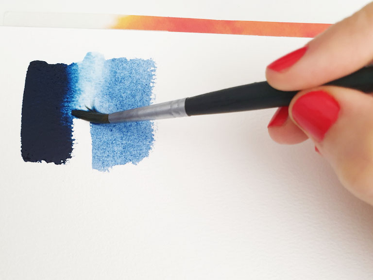
Paint the first color on dry paper. While its edge is still wet, paint the second color so it just touches that edge. The colors flow together only where they meet, giving a controlled transition.
Best for: objects, leaves, fruit and anything with a defined shape.
3. Graded wash (single color fading out)
Tilt your board slightly. Load a large brush and paint a horizontal stroke across the top. Add a little water to your brush and paint the next stroke, overlapping the bead of paint at the bottom of the previous one. Repeat, adding more water each time, until the color fades to almost clear.
Best for: skies fading toward the horizon, water, backgrounds.
4. Variegated wash (two or more colors)
Like a graded wash, but you switch colors partway down. Start with yellow, then add orange, then pink, working while each band is still wet so the edges merge.
Best for: sunsets, ombre effects, rainbow abstracts.
5. Softening edges
Paint a color on dry paper. Rinse your brush, blot it until just damp, and run it along one edge of the wet paint. The color bleeds softly into the damp area, creating a fade.
Best for: shadows, rounded forms, soft highlights.
6. Glazing (optical blending)
Not a physical blend: paint a transparent color, let it dry fully, then paint a second transparent color over it. The eye sees the combination, such as yellow over blue appearing green. Glazes stay luminous because the colors are not physically mixed.
Best for: deepening shadows, adjusting color temperature, building rich color.
Timing: Reading the Paper
The most useful habit for blending is learning to judge how wet the paper is. Look across the surface at an angle toward a light source.
| Paper state | How it looks | What happens when you add paint |
|---|---|---|
| Soaking wet | Puddles, high gloss | Paint spreads widely and loses shape; colors may become pale |
| Shiny wet | Even glossy sheen | Soft, feathery blends; ideal for skies |
| Damp (satin) | Sheen fading to a soft satin look | Controlled soft edges; good for petals and soft details |
| Almost dry | Dull, cool to the touch | Danger zone: wet paint here creates blooms and backruns |
| Bone dry | Matte, room temperature | Crisp edges; ideal for glazing and details |
The almost-dry stage is responsible for most “cauliflower” blooms. If you miss the damp window, wait for the paper to dry completely and then glaze or soften edges instead.
Color Theory for Watercolor Painting Blends
Which colors you blend matters as much as how. On the color wheel:
- Analogous colors (neighbors such as yellow, orange and red, or blue and green) blend cleanly and stay bright.
- Complementary colors (opposites such as orange and blue, red and green, purple and yellow) neutralize each other where they mix, producing browns and grays.
- Color bias matters: a red that leans blue (like a crimson) mixes with a blue to make a clean purple, while a red that leans orange makes a duller purple because it contains a hint of yellow, the complement of purple.
Clean blend pairings
| Blend | Use pigments like | Result |
|---|---|---|
| Sunset | Warm yellow + orange-leaning red | Glowing oranges |
| Spring green | Lemon (cool) yellow + green-leaning blue such as phthalo | Fresh, bright greens |
| Clean purple | Blue-leaning red such as quinacridone rose + ultramarine | Vivid violets |
| Sky | Cerulean or phthalo blue fading to clear | Smooth blue gradient |
| Natural shadow | Ultramarine + burnt sienna | Range of warm and cool grays |
When muddy is useful
Blending complements is not always a mistake. A touch of orange in a blue shadow, or red into a green leaf, creates natural, lively neutrals. Just be intentional about where those mixtures happen.
Basic Watercolor Palette Colors for Blending
A split-primary palette, with a warm and cool version of each primary, gives you the most control over clean and muted blends. A practical set:
- Lemon or hansa yellow (cool yellow)
- New gamboge or a warm yellow
- Pyrrole or cadmium red (warm red)
- Quinacridone rose or magenta (cool red)
- Ultramarine blue (warm blue)
- Phthalo or cerulean blue (cool blue)
- Burnt sienna (earth for neutrals)
Many painters add a green such as phthalo green or sap green and a dark like Payne’s gray for convenience, but these seven can mix nearly everything.
Watercolor palette color arrangement
Arrange colors around your palette in color-wheel order: yellows, oranges, reds, purples, blues, greens, then earths. Neighbors on the palette are then neighbors on the color wheel, which reduces accidental muddy mixes when your brush picks up a little of the adjacent color. Leave the largest mixing wells free for big washes.
Step-by-Step: A Sunset Blending Exercise
- Tape a quarter sheet of 140 lb cold-press paper to a board. Tilt the board slightly toward you.
- Mix three puddles in advance: a warm yellow, an orange and a pink-red. Make each one more than you think you need.
- Wet the top two-thirds of the paper evenly with clean water until it has an even sheen.
- Starting at the top, paint a band of pink-red across the paper.
- Immediately paint orange below it, overlapping the bottom edge of the pink.
- Paint yellow below the orange, fading toward the horizon by adding water.
- Do not go back into it. Let gravity and water finish the blend.
- Once fully dry, paint a dark silhouette of hills or trees along the bottom.
Practice gradients like this on small pieces; they make lovely backgrounds for handmade stationery, as shown in our guide to DIY watercolor greeting cards.
Blending Problems and Fixes
| Problem | Cause | Fix or prevention |
|---|---|---|
| Blooms / cauliflowers | Wetter paint into a drying area | Work in the shiny or damp stage only; or wait until fully dry |
| Hard lines in a gradient | A band dried before the next was added | Mix paint ahead; work faster; use a larger brush |
| Streaky wash | Uneven water or brushing back into it | Keep a wet bead at the bottom edge; avoid overbrushing |
| Muddy blend | Complementary colors met unintentionally | Plan color order; put a neutral buffer between complements |
| Colors dry too pale | Watercolor dries lighter; too much water | Mix stronger; use more pigment in wet-in-wet areas |
| Paper pills or roughens | Scrubbing or weak paper | Use 140 lb cotton paper; touch rather than scrub |
Rescuing a blend that went wrong
- Lift: while still wet, blot with a clean paper towel or a thirsty brush to remove excess color.
- Re-wet and soften: once dry, gently re-wet a hard edge with a clean damp brush and blot to soften it. Staining pigments will not lift fully.
- Glaze over: a transparent glaze can unify a patchy area.
- Turn it into texture: a bloom can sometimes become a cloud, foliage or a flower center.
How Pigment Properties Affect Blends
Paint labels often list properties that predict blending behavior. Learning them saves frustration.
- Staining pigments (for example phthalo blues and greens, quinacridones) penetrate paper fibers and spread quickly. They blend vividly but are hard to lift.
- Granulating pigments (such as ultramarine and many earth colors) settle into the paper’s texture, creating a speckled look in blends. Lovely for skies and stone, less so for smooth petals.
- Transparent pigments keep blends luminous and are best for glazing.
- Opaque pigments (such as cadmiums and cerulean in many brands) can make blends chalky if overused, especially when layered.
Paper and Brush Choices That Help
- 100% cotton paper stays wet longer and accepts color more evenly, which makes blending easier than with cellulose paper.
- Cold-press texture is a good all-round choice; hot-press is smoother and shows blending marks more clearly.
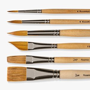
- Large round or mop brushes hold plenty of water so you can cover a wash in fewer strokes.
- Synthetic-natural blend brushes often release water steadily, helping smooth gradients.
Tips by Skill Level
Beginners
Practice graded washes in one color until you can produce a smooth fade, then try two-color variegated washes with analogous colors.
Intermediate
Experiment with dropping color into damp petals and skies at different moisture stages. Keep notes on what each stage produces.
Advanced
Combine wet-in-wet underpainting with glazing on top, and use controlled complementary blends to create luminous neutrals and atmospheric shadows.
FAQs
How do you blend watercolors smoothly?
Work on paper that is evenly wet or damp, use a large brush loaded with plenty of paint, apply colors so their wet edges touch, and avoid going back into the wash once it starts drying.
Why do my watercolor blends get blotchy?
Blotches, or blooms, appear when wetter paint is added to paper that is partly dry. Add paint only while the paper is shiny or evenly damp, or wait until it dries completely.
What colors blend best in watercolor?
Colors next to each other on the color wheel, such as yellow and orange or blue and green, blend cleanly. Complementary colors make neutrals where they mix.
What are basic watercolor palette colors?
A practical basic set is a cool yellow, a warm yellow, a warm red, a cool red, a warm blue, a cool blue and burnt sienna. This split-primary palette mixes most colors cleanly.
Can you blend watercolor on dry paper?
Yes. Paint one color, then touch a second color to its wet edge, or soften an edge with a damp brush. Glazing over dry layers also creates optical blends.
Does paper affect watercolor blending?
Very much. 100% cotton paper stays wet longer and absorbs evenly, making smooth blends easier. Lightweight or cellulose paper dries faster and can cause hard edges.
Final Thoughts
Blending in watercolor is a skill of timing, water control and color choice. Learn to read the shine of the paper, choose pigments that mix cleanly, and resist the urge to go back into a drying wash. With practice, smooth gradients and glowing transitions become second nature. For paints that flow and blend smoothly in washes, see our picks for the top watercolor sets for every skill level.