Brush calligraphy depends on one simple principle: light pressure makes a thin line, heavy pressure makes a thick one. A pointed brush exaggerates that difference beautifully, which is why brush lettering has such lively contrast between hairline upstrokes and bold downstrokes. The catch is that a brush responds to everything, including the amount of paint, the angle of the handle and the speed of your hand. This guide shows how to use brushes for calligraphy with watercolor, gouache or ink, from choosing a brush and setting up to the basic strokes that build every letter.
Quick answer: To use brushes for calligraphy, choose a pointed round brush with a fine tip (sizes 2 to 8 are common), load it with fluid watercolor, gouache or ink, and hold it at about a 45-degree angle. Make upstrokes with light pressure on the tip for thin lines, and downstrokes with firm pressure on the belly for thick lines. Practice the basic strokes slowly before joining them into letters, and lift the brush between strokes rather than writing each word in one motion.
What Brush Calligraphy Is
Brush calligraphy, often called brush lettering in the modern Western style, uses a flexible brush to create letters with contrasting thick and thin strokes. It overlaps with several traditions:
- Modern brush lettering: script letters with thin upstrokes and thick downstrokes, often done in watercolor or with brush pens.
- Pointed brush script: inspired by copperplate and Spencerian forms, translated into brush.
- Broad-edge brush lettering: uses a flat brush, which creates thick and thin strokes by changing direction rather than pressure.
- East Asian calligraphy: traditional Chinese, Japanese and Korean brush writing with specialized brushes, ink sticks and inkstones, with its own long history and techniques.
This guide focuses on modern pointed-brush and flat-brush lettering, which most painters can start with using brushes they already own. Watercolor rounds are especially well suited, and our guide to the best brushes for watercolor painting covers rounds that hold a sharp point and plenty of liquid.
Choosing a Brush for Calligraphy
| Brush | Best for | What to look for |
|---|---|---|
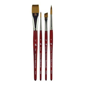
| Pointed round (synthetic) | Modern brush lettering | Sharp point, good snap, sizes 2 to 8 |
| Pointed round (natural hair) | Expressive lettering with high paint capacity | Fine point, holds a lot of liquid |
| Liner or script liner | Long thin strokes, monoline letters | Long hair, consistent line |
| Flat brush | Broad-edge lettering | Crisp, straight edge |
| East Asian calligraphy brush | Traditional calligraphy, expressive strokes | Well-formed tip; size suited to character size |
Size matters
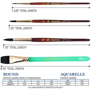
Brush size controls letter size. Small rounds (2 to 4) suit letters about half an inch to an inch tall. Medium rounds (6 to 8) suit larger letters for cards and signs. Very large letters need larger rounds or flats.
Synthetic vs natural hair
Synthetic rounds offer good control and spring, which helps beginners keep consistent strokes. Natural hair rounds hold more paint and can produce very fine hairlines, but they are softer and more responsive, which takes practice.
Paint, Ink and Paper
Paint and ink options
- Watercolor: mixed to a milky consistency, it flows well and creates beautiful gradients.
- Gouache: more opaque, giving solid letters. Thin it to a creamy, fluid consistency.
- Calligraphy or sumi ink: rich black, good flow. Some inks can be hard to wash out of brushes, so use dedicated brushes.
- Liquid watercolor: bright, fluid and easy to load.
Avoid thick paint. If the consistency is too thick, strokes drag and break; too thin, and they bleed or look washed out.
Paper
- Smooth hot-press watercolor paper gives crisp edges and handles water well.
- Smooth mixed-media paper is a good budget option for practice.
- Layout or marker paper works with inks for drills, but may buckle with watercolor.
- Rough paper breaks up hairlines, which can look textured but is harder for beginners.
Use guidelines. Rule baselines, x-height and ascender lines lightly in pencil, or slip a printed guide sheet under translucent paper.
How to Use Brushes for Calligraphy: Setup and Grip
- Set up your space. Paper on a flat or slightly angled surface, water container, paper towel, paint or ink, and guidelines.
- Load the brush. Dip the brush into the paint or ink, then roll it gently on the palette to fill the belly and form a point. Wipe off excess so it does not drip.
- Hold the brush like a pen, but slightly higher on the handle than you would hold a pencil. This gives flexibility.
- Angle the brush about 45 degrees to the paper, pointing in the direction of the letter slant.
- Rest your hand lightly. The side of your hand or little finger can glide on the paper for stability.
- Move from your arm, not just your fingers, for smooth, even strokes.
The Basic Brush Calligraphy Strokes
Most script letters are built from a small set of strokes. Practice each in rows until it feels consistent.
1. Upstroke (thin)
Use only the tip with very light pressure. Move upward at a consistent slant. The line should be a fine hairline.
2. Downstroke (thick)
Press the brush down so the belly flattens, then pull downward at the same slant. Keep pressure even for a consistent width.
3. Underturn
Start with a thick downstroke, ease off pressure as you curve at the bottom, and finish with a thin upstroke. Think of a “u” shape.
4. Overturn
Start with a thin upstroke, curve over the top, and press into a thick downstroke. An “n” shape.
5. Compound curve
Combine an overturn and an underturn: thin up, curve over, thick down, curve under, thin up.
6. Oval
Start at about two o’clock, go up and over counterclockwise with a thin stroke, press into a thick stroke on the left side, then lighten as you curve back up. Ovals are the basis of a, d, g, o and q.
7. Ascending loop
A thin upstroke into a loop above the x-height, followed by a thick downstroke. Used in b, d, h, k, l.
8. Descending loop
A thick downstroke below the baseline, looping into a thin upstroke. Used in g, j, y.
Pressure rule of thumb
| Stroke direction | Pressure | Line |
|---|---|---|
| Up | Light, tip only | Thin |
| Down | Firm, belly | Thick |
| Transitions | Gradual change | Smooth thick-thin shift |
From Strokes to Letters
- Break each letter into strokes. An “a” is an oval plus an underturn. An “m” is two overturns plus an underturn.
- Lift between strokes. Unlike handwriting, brush lettering is usually built stroke by stroke. Lifting helps you control pressure transitions.
- Keep a consistent slant. Draw slant lines on your guide sheet if needed.
- Join letters with upstrokes. The exit stroke of one letter becomes the entry of the next.
- Space evenly. Consistent spacing between letters and words matters as much as letter shapes.
- Slow down. Speed creates shaky or uneven strokes. Slow, deliberate movement gives cleaner results.
Flat Brush Calligraphy
Flat brushes create contrast differently. Instead of pressure, the width depends on the direction of movement relative to the brush edge.
- Hold the flat at a fixed angle, typically about 30 to 45 degrees to the baseline.
- Pull strokes without rotating the brush. Strokes in the direction of the wide edge are thick; strokes along the narrow edge are thin.
- Practice basic shapes: vertical lines, horizontal lines, diagonals and circles, observing how the width changes.
- Build letters from these strokes, using traditional broad-edge alphabets like italic or foundational hand as models.
Flat brush lettering is popular for signs, chalkboard-style designs and large display work.
Capitals, Numbers and Flourishes
Once lowercase letters feel steady, capitals and decorative strokes follow the same pressure rules on a larger scale.
- Capitals are usually two to three times the x-height. Build them from the same basic strokes, with longer downstrokes and more generous ovals. Keep the slant identical to the lowercase so the word reads as one unit.
- Numbers work best when treated like letters: a thick downstroke for each main stem, thin connecting curves. A “2” is essentially an overturn followed by a thin baseline stroke.
- Entry and exit flourishes extend the first or last stroke of a word into a sweeping hairline. Keep pressure very light and move from the shoulder for a smooth curve.
- Crossbars and t-bars can become decorative waves or loops, but leave them for the end so they do not crowd the letters.
Restraint helps. One or two flourishes per word or phrase look deliberate; flourishing every letter tends to look busy and hurts legibility.
Lettering on different surfaces
The same brush technique works on cards, envelopes, wood signs and chalkboards, with small adjustments. On envelopes and thinner paper, use gouache or ink rather than wet watercolor to avoid buckling. On sealed wood, use slightly thicker paint and a firmer synthetic brush. For chalkboard-style signs, chalk paint or paint markers often replace brushes, but brush-painted lettering with white gouache or acrylic gives a crisp, permanent result.
Watercolor Effects in Brush Lettering
- Gradients: load one color, then dip the tip in a second color for a letter that shifts from one to the other.
- Blending as you go: touch a new color into the wet end of a previous stroke so they merge.
- Highlights: add white gouache dots or lines once the lettering is dry.
- Shadows: paint a thin shadow line on one side of each letter after it dries.
Common Problems and Fixes
| Problem | Cause | Fix |
|---|---|---|
| Upstrokes too thick | Too much pressure or paint | Lighten pressure; blot excess paint |
| Downstrokes uneven | Inconsistent pressure | Slow down; move from the arm |
| Shaky lines | Moving too slowly with fingers only, or tension | Relax your grip; use arm movement |
| Brush runs dry mid-letter | Not enough paint, or paint too thick | Reload more often; thin paint slightly |
| Letters bleed | Paint too wet or paper too absorbent | Blot the brush; use smoother, heavier paper |
| Split brush tip | Damaged brush or dried paint in belly | Clean thoroughly, reshape, or replace |
Practice Plan for Beginners
- Week 1: upstrokes, downstrokes and transitions. Fill pages with rows of each.
- Week 2: underturns, overturns and compound curves.
- Week 3: ovals and loops.
- Week 4: lowercase alphabet, one letter at a time.
- After that: connect letters into short words, then add capitals and flourishes.
Short daily sessions of 15 to 20 minutes build muscle memory faster than occasional long sessions. Date your practice sheets and compare them every couple of weeks; progress in stroke consistency is easier to see side by side than from memory.
Brush Care for Calligraphy
- Rinse often while working, especially with ink.
- Clean promptly after each session with water and mild soap.
- Reshape the point and dry flat or hanging head down.
- Keep calligraphy brushes separate from brushes used for rough painting, so the tip stays sharp.
- Use dedicated brushes for waterproof inks, which can be hard to remove fully.
FAQs
What brush is best for brush calligraphy?
A pointed round with a sharp tip and good spring, often a synthetic watercolor round in sizes 2 to 8. Flat brushes suit broad-edge lettering.
Can I use watercolor brushes for calligraphy?
Yes. Watercolor rounds are well suited because they hold fluid paint and form a fine point for hairline upstrokes.
What paint is best for brush lettering?
Fluid watercolor, gouache thinned to a creamy consistency, or calligraphy ink. The key is a smooth, flowing consistency.
How do I make thin upstrokes with a brush?
Use only the tip with very light pressure, hold the brush at about 45 degrees, and blot excess paint so the tip is not overloaded.
Is brush calligraphy hard to learn?
The basics are approachable, but consistent pressure control takes practice. Focusing on basic strokes before full letters speeds progress.
Should I lift the brush between strokes?
Yes, in most brush lettering styles. Lifting between strokes makes it easier to control thick-thin transitions.
Final Thoughts
Using brushes for calligraphy comes down to pressure control: light on the tip for thin upstrokes, firm on the belly for thick downstrokes. Choose a pointed round with a crisp tip, use fluid paint on smooth paper, practice the basic strokes, and build letters stroke by stroke. A responsive round makes the learning curve gentler, so explore our picks for the top watercolor brushes with sharp points for lettering.