
Many beginner paintings look busy not because of the drawing but because of the color. Ten tube colors used at full strength compete for attention, and nothing ties the picture together. A planned color palette fixes that. This guide shows how to make a color palette for painting as a beginner: choosing a small set of paints, picking a color scheme, testing it with swatches, and laying it out so it is easy to use.
Quick answer: To make a color palette as a beginner, start with a limited set of paints, such as a warm and cool version of each primary plus white, then choose a color scheme (monochromatic, analogous, complementary or triadic) that matches the mood you want. Pick one dominant color, one or two supporting colors and a small accent, mix a swatch chart to test them, and arrange the paints on your palette in a consistent order from warm to cool with white in its own corner.
What “Color Palette” Means in Painting
The term has two meanings that overlap:
- The paints you use: the specific tube colors you squeeze out for a painting.
- The color scheme: the group of colors that appear in the finished artwork and how they relate to each other.
A good palette in the first sense makes a good palette in the second sense easier. If your tubes are chosen thoughtfully, harmonious mixes come naturally.
The physical surface you mix on matters too: a neutral white or gray palette with room to mix makes judging colors easier. Our guide to the best palettes for beginners compares mixing surfaces and layouts that suit new painters.
Step 1: Start With a Limited Set of Paints
Beginners often buy large sets and use everything. A limited palette is easier to learn, produces more unified color and teaches mixing.
The split-primary palette
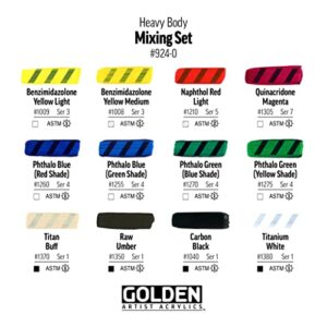
This classic beginner set uses a warm and a cool version of each primary, plus white:
| Color | Warm version (example pigments) | Cool version (example pigments) |
|---|---|---|
| Yellow | Cadmium yellow medium or hue | Lemon yellow, cadmium yellow light or hansa yellow |
| Red | Cadmium red light or pyrrole red | Alizarin crimson or quinacridone magenta |
| Blue | Ultramarine blue | Phthalo blue or cerulean |
| White | Titanium white | |
With these seven tubes you can mix clean greens (cool yellow plus cool blue), vivid oranges (warm yellow plus warm red), clear violets (cool red plus warm blue) and a wide range of neutrals. Adding one earth color, such as burnt sienna or burnt umber, makes muted tones and darks easier.
Why warm and cool versions?
Each pigment leans slightly toward a neighbor on the color wheel. Ultramarine leans toward violet, phthalo blue toward green. Mixing two primaries that both lean toward the target color gives a cleaner, brighter result, while mixing primaries that lean away from each other gives a duller mix. Knowing this helps you control saturation.
Step 2: Choose a Color Scheme
A color scheme gives the painting structure. Here are the main types, from easiest to most challenging.
Monochromatic
One hue plus white and a dark. For example, ultramarine with white and burnt umber. This is the best way to learn values (lightness and darkness), and the results look calm and unified.
Analogous
Three or four neighbors on the color wheel, such as yellow, yellow-orange, orange and red-orange for a sunset. Analogous schemes blend smoothly and feel harmonious.
Complementary
Two opposites on the color wheel: blue and orange, red and green, yellow and violet. They create strong contrast. Use one as the dominant color and the other as an accent, and mix them together to make rich neutrals.
Split-complementary
One color plus the two colors beside its complement, such as blue with yellow-orange and red-orange. Offers contrast with less tension than a direct complement.
Triadic
Three colors evenly spaced on the wheel, like red, yellow and blue, or orange, green and violet. Lively, but it needs one dominant color to avoid chaos.
| Scheme | Mood | Difficulty | Good subjects |
|---|---|---|---|
| Monochromatic | Calm, moody | Easy | Night scenes, value studies |
| Analogous | Harmonious | Easy | Sunsets, forests, seascapes |
| Complementary | Vibrant, dramatic | Moderate | Still lifes, flowers, boats |
| Split-complementary | Balanced contrast | Moderate | Landscapes, portraits |
| Triadic | Playful, bold | Harder | Abstracts, illustrations |
Step 3: Decide on Dominance
Harmonious paintings rarely use colors in equal amounts. A useful guideline from design is roughly 60-30-10: a dominant color covering most of the painting, a secondary color for supporting areas and an accent color in small doses, often at the focal point. The numbers are approximate, but the principle of unequal amounts is what makes it work.
Also decide on temperature dominance: is the painting mostly warm or mostly cool? A mostly cool painting with a small warm accent draws the eye straight to that accent.
Step 4: Make a Palette From One Color
If choosing a scheme feels overwhelming, start from a single color you love and build outward.
- Pick your anchor color, for example a teal.
- Add tints: mix it with increasing amounts of white.
- Add shades: darken it with a complementary color (a touch of red-orange) or a dark earth tone instead of black.
- Add tones: mix it with a gray to soften it.
- Add an accent: choose the complement or a neighbor for small highlights.
This approach produces a cohesive palette quickly and teaches how much variety one hue can hold.
Step 5: Test With Swatches
Before painting, test your palette on scrap paper or canvas.
- Swatch each tube color in a strip, from full strength to lighter tints.
- Mix pairs to see what greens, oranges, violets and neutrals you get.
- Paint a small thumbnail of your planned painting in the scheme, just a few inches wide.
- Label everything so you can repeat successful mixes.
A mixing chart, where each color is mixed with every other color in a grid, is a classic exercise. It takes an hour or two and becomes a reference you will use for years.
Step 6: Lay Out the Palette
A consistent layout means you always know where colors are and keeps mixes cleaner.
- Place white in its own corner, with plenty of it; white gets used more than any other color.
- Arrange warm colors along one edge from light to dark: lemon yellow, cadmium yellow, cadmium red, alizarin crimson.
- Arrange cool colors along another edge: phthalo blue, ultramarine, then earths.
- Keep a large open area in the center for mixing.
- Use the same layout every time.
How to use a color palette while painting
Mix with a palette knife to keep brushes clean. Mix your dominant color in larger amounts, then mix variations from that base so every color shares a family resemblance. Keep a damp paper towel handy to wipe the mixing area when it gets muddy.
Neutrals: The Secret to Good Color
Beginners often avoid gray and brown, but neutrals make bright colors look brighter. Mix neutrals from complements (blue and orange, red and green) rather than reaching for black. These mixed grays and browns relate to the rest of your palette and keep the painting cohesive.
- Ultramarine + burnt sienna = a range of warm and cool grays and a rich dark
- Alizarin crimson + phthalo green (if added) = a deep near-black
- Any complement pair + white = soft colored grays
Building a Palette From a Reference Photo
When painting from a photo, you can derive a palette directly from the image instead of guessing.
- Squint at the reference to see the major color masses rather than details.
- Identify the dominant color family. Is the scene mostly blue-green, warm earth or neutral gray?
- Find the accent. Look for the small area of strongest or most contrasting color, often near the focal point.
- Note the darkest dark and lightest light. These define your value range.
- Match each color to tube paints by mixing small swatches and holding them next to the photo.
- Simplify. Reduce the photo’s dozens of colors to five or six mixes you can repeat across the painting.
This exercise trains you to see color relationships rather than isolated colors, which is one of the biggest steps in learning to paint.
Practice Exercises to Learn Your Palette
- Value scale: Mix a nine-step scale from white to your darkest mix using one color. It shows how far your palette can stretch.
- Temperature pairs: Paint a sphere twice, once with warm light and cool shadows, once the opposite, using the same scheme.
- Same scene, three schemes: Paint a simple landscape thumbnail in analogous, complementary and monochromatic schemes and compare moods.
- Neutral challenge: Paint a still life using only mixed grays and browns plus one accent color.
Example Palettes for Beginners
| Palette | Paints | Best for |
|---|---|---|
| Zorn-style limited | Yellow ochre, cadmium red, ivory black, titanium white | Portraits, warm earthy scenes |
| Landscape basic | Lemon yellow, yellow ochre, ultramarine, burnt sienna, white | Natural greens and skies |
| Seascape | Phthalo blue, ultramarine, burnt sienna, cadmium yellow, white | Water, sky, sand |
| Floral bright | Quinacridone magenta, cadmium yellow, phthalo blue, white | Flowers, vibrant still lifes |
| Moody monochrome | Payne’s gray or ultramarine + burnt umber, white | Night scenes, value practice |
Common Beginner Mistakes With Color Palettes
Using every tube in the set
Too many colors produce chaotic paintings. Limit to six to eight tubes.
Relying on black to darken
Black can dull colors and turn yellows greenish. Darken with complements or dark earth colors.
Using colors straight from the tube
Tube colors are often too saturated for natural subjects. Adjust them with a touch of their complement or an earth color.
Equal amounts of every color
Without a dominant color, a painting feels unfocused. Use the 60-30-10 idea as a guide.
Ignoring values
A beautiful scheme fails if all the colors are the same lightness. Check values by squinting or photographing in grayscale.
Digital Tools for Planning Palettes
Free online color wheel and palette generators can help you visualize schemes, and some apps extract palettes from photos. They are useful for brainstorming, but remember that screen colors do not match paint exactly. Always test with real swatches.
How Color Palettes Change With Medium
The same scheme behaves slightly differently depending on the paint you use. In watercolor, white usually comes from the paper rather than a tube, so lighter tints are made by adding water, and transparent pigments are favored for clean glazes. In acrylic, colors often dry slightly darker than they look wet, so mix light passages a touch lighter than you think. In oil, colors stay true as they dry and blend easily, which makes subtle temperature shifts easier to achieve. Gouache tends to dry a little lighter or darker depending on the pigment, so swatches are especially useful.
When you move between media, start with the same core palette, such as the split-primary set, and note how each paint type changes the result. That continuity makes it easier to transfer what you learn.
FAQs
How do you make a color palette for painting?
Choose a limited set of paints, pick a color scheme, decide on a dominant color with supporting and accent colors, test mixes with swatches and lay out the paints in a consistent order.
What colors should a beginner palette have?
A warm and cool version of each primary (yellow, red, blue) plus titanium white is a classic start, often with burnt sienna or burnt umber added.
How do you make a good color palette?
Use a limited number of colors, choose a clear scheme, let one color dominate, include neutrals and check that your values range from light to dark.
How do you make a palette from one color?
Start with one hue and create tints with white, shades with a complement or dark earth color, and tones with gray, then add a small accent color.
What is the 60-30-10 rule in painting?
It is a guideline for proportion: about 60% dominant color, 30% secondary and 10% accent, so colors do not compete equally.
Should beginners use black paint?
It is optional. Many beginners get richer darks by mixing complements or ultramarine with burnt sienna.
Next Step
Choose one scheme from this guide, swatch it, and paint a small study using only those colors. Then try a different scheme on the same subject to see how mood changes. A clean, roomy mixing surface helps a lot at this stage, so if you need one, browse our recommendations for beginner-friendly palettes for mixing color.



One Comment