Creating your own color palette can feel overwhelming if you’re a beginner. You might wonder where to start, which colors to pick, and how to know if they look good together. But making a beautiful palette is not just for artists or designers—it’s a skill anyone can learn. A well-chosen palette can make your artwork, website, or even your living room come to life. In this guide, you’ll find clear steps, real examples, and common mistakes to avoid, so you can confidently build your first color palette.
What Is A Color Palette?
A color palette is a collection of colors chosen for a specific project. This could be for digital art, painting, branding, or even decorating a room. The palette helps create harmony and consistency. Think of it as your color “toolbox”—you pick a set of colors that work well together and use them throughout your project.
A basic palette often includes:
- Primary color: The main color you want to stand out.
- Secondary colors: Supporting colors that complement the primary.
- Accent color(s): For highlights or details.
- Neutral colors: Like white, gray, or beige, to balance strong colors.
Why Is A Color Palette Important?
Choosing random colors can make your project look messy or confusing. A good palette gives your work a professional touch. It helps guide the viewer’s eyes and sets the mood. For example, bright colors feel energetic, while soft pastels are calming. Palettes also make your design easy to remember. Brands like Coca-Cola or IKEA are recognized instantly by their signature colors.

Credit: www.youtube.com
Color Basics: What Every Beginner Must Know
Before you start picking colors, it’s important to understand some basic terms.
The Color Wheel
The color wheel is a simple tool that shows how colors relate to each other. It’s made of:
- Primary colors: Red, blue, yellow. You can’t mix these from other colors.
- Secondary colors: Green, orange, purple. Made by mixing two primaries.
- Tertiary colors: Between primary and secondary colors, like red-orange.
Here’s a quick comparison:
| Type | Colors | How They’re Made |
|---|---|---|
| Primary | Red, Blue, Yellow | Cannot be mixed |
| Secondary | Green, Orange, Purple | Mix two primaries |
| Tertiary | Red-Orange, Blue-Green, etc. | Mix primary + secondary |
Hue, Saturation, And Value
- Hue: The basic color (like red or blue).
- Saturation: How strong or dull a color is.
- Value: How light or dark a color is.
Knowing these terms will help you pick and adjust colors easily.
Step-by-step Guide: How To Make A Color Palette
Let’s walk through a simple process to create your palette.
1. Define Your Purpose
Ask yourself: What will you use the palette for? Is it for a website, a painting, or your bedroom wall? The purpose guides your choices. For example, a children’s book might need bright, playful colors, while a law firm’s website should look calm and trustworthy.
2. Find Inspiration
You don’t have to start from scratch. Look at:
- Nature (sunsets, forests, oceans)
- Artworks you admire
- Fashion or interior design magazines
- Online color palette sites like Coolors or Adobe Color
Snap a photo or save a screenshot if you see a combination you love.
3. Choose A Base Color
Pick one main color that matches your goal. If you want energy, try red or orange. For a calm vibe, blue or green works well. This color will be the “hero” of your palette.
4. Pick Supporting Colors
Now, add 2–4 colors that look good with your base color. There are several classic color schemes:
- Monochromatic: Different shades of one color
- Analogous: Colors next to each other on the wheel (like blue, blue-green, and green)
- Complementary: Colors opposite each other (like blue and orange)
- Triadic: Three colors evenly spaced on the wheel (like red, yellow, and blue)
Here’s a quick look at these schemes:
| Scheme | Colors Used | Effect |
|---|---|---|
| Monochromatic | Light blue, blue, dark blue | Calm, unified |
| Analogous | Yellow, yellow-green, green | Natural, pleasing |
| Complementary | Purple, yellow | Bold, high contrast |
| Triadic | Red, blue, yellow | Balanced, colorful |
5. Add An Accent Color
Choose one color that “pops” and draws attention. Use it for buttons, highlights, or important details. Make sure it contrasts with your base color, but doesn’t clash.
6. Include Neutrals
Neutrals like white, gray, black, or beige help balance strong colors. They give your eyes a break and make your palette more flexible.
7. Test Your Palette
Try your colors together on a small project before using them everywhere. Adjust shades or switch colors if something doesn’t feel right.
8. Save Your Palette
Write down the color codes (like HEX or RGB) so you can use the exact colors again. Many free tools let you save and export your palette.
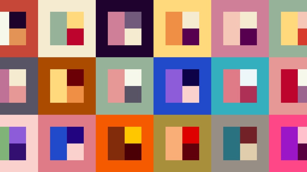
Credit: cladwell.com
Tools And Resources For Making Color Palettes
You don’t need expensive software to build a palette. Here are some beginner-friendly tools:
- Adobe Color – Lets you create, save, and share palettes.
- Coolors.co – Click to generate random palettes or lock colors you like.
- Canva Color Palette Generator – Upload a photo and get a palette from it.
- Colormind – Uses AI to generate palettes for web, art, and UI design.
Each tool has its pros and cons. For example, Adobe Color is great for advanced users, while Coolors is simple and fast.
| Tool | Best For | Special Feature |
|---|---|---|
| Coolors | Beginners | One-click random palettes |
| Adobe Color | Advanced users | Color harmony rules |
| Canva Generator | Designers | Photo-based palettes |
| Colormind | Web/UI design | AI suggestions |
Common Beginner Mistakes (and How To Avoid Them)
Many new creators face the same problems. Here’s how to avoid them:
- Too Many Colors: Using 8 or more colors can make your design confusing. Stick to 3–5 main colors.
- Ignoring Contrast: If all colors are similar in brightness, text and details may be hard to see. Always test your palette for readability, especially for websites or apps.
- Forgetting Neutrals: A palette with only bright colors can feel overwhelming. Add some grays, whites, or blacks for balance.
- Copying Without Adjusting: It’s fine to use another palette as inspiration, but tweak it to fit your style and needs.
- Not Testing on Real Projects: A color might look good on a screen but not in print or in a real room. Test before finalizing.
Two Insights Beginners Often Miss
First, context matters. The same color palette can look very different depending on where you use it—on a dark background versus a light one, or in natural versus artificial lighting. Always preview your palette in the environment where it will appear.
Second, cultural meanings of colors can be important, especially for branding or public projects. For example, white means purity in the West but mourning in some Asian cultures. Always research if your palette will be seen by a global audience.
Practical Examples: How To Build A Palette
Let’s walk through two simple examples.
Example 1: A Calm Website Palette
- Purpose: Yoga studio website
- Base color: Soft blue (#7EC8E3)
- Supporting colors: Light gray (#F4F7FA), gentle green (#AEE9D1)
- Accent color: Warm coral (#FF6F61)
- Neutrals: White (#FFFFFF), charcoal (#333333)
This palette feels relaxing and clean. Blue and green are associated with peace and health, while coral adds friendly warmth.
Example 2: Bold Brand Palette
- Purpose: Modern tech logo
- Base color: Bright purple (#7C3AED)
- Supporting colors: Aqua (#38BDF8), lime green (#A3E635)
- Accent color: Hot pink (#F472B6)
- Neutrals: Black (#18181B), light gray (#F3F4F6)
This palette uses high contrast for energy and memorability. The neutral colors keep it from feeling too wild.
How To Use Your Palette Effectively
Once your palette is ready, use it with intention:
- Stick to your chosen colors; don’t add random shades.
- Assign roles: One color for headings, another for backgrounds, etc.
- Keep accent colors for the most important elements (like buttons or calls to action).
- Review your design from a distance to check balance.
A palette is not a strict rule—it’s a guide. You can adjust as your project grows.
Where To Learn More
If you want to go deeper, check out resources like Color Matters for more on color theory, psychology, and design tips.

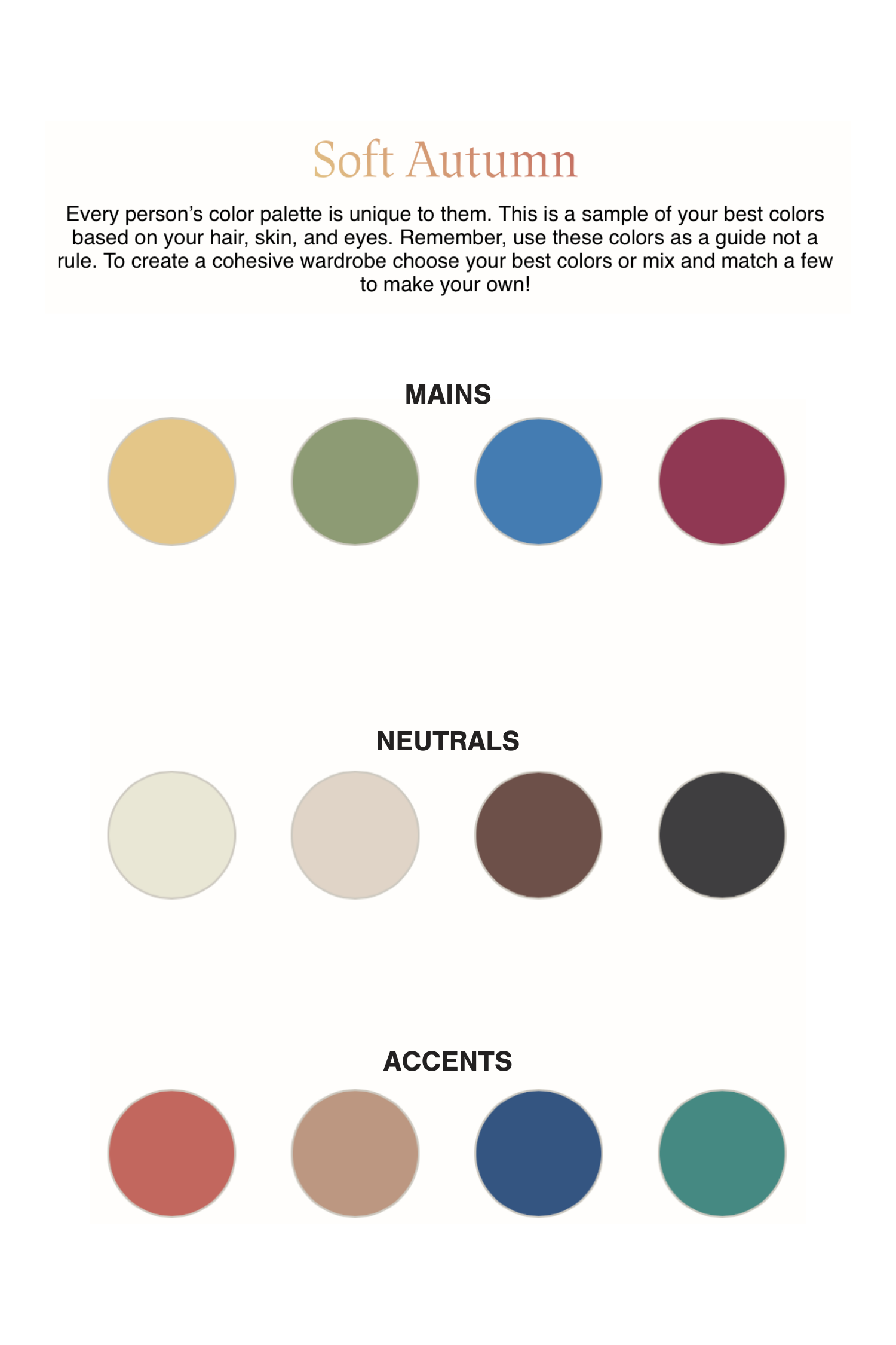
Credit: pearce.caah.clemson.edu
Frequently Asked Questions
What Is The Best Number Of Colors For A Beginner Palette?
For beginners, start with 3 to 5 colors. This includes your base, 2 supporting colors, an accent, and a neutral. Too many colors can make the design messy.
Can I Use A Photo To Make A Color Palette?
Yes! Many online tools let you upload a photo and extract colors from it. This is a great way to get palettes that feel natural and coordinated.
How Do I Know If My Colors Match?
Use the color wheel to check relationships (like complementary or analogous schemes). Also, test colors together in your actual project to see if they feel balanced and easy to read.
What Are Hex And Rgb Codes?
HEX codes are six-digit color codes used in web design (like #FF5733). RGB codes show how much red, green, and blue are in a color (like rgb(255,87,51)). Both help you use the exact same color every time.
Do I Need Expensive Software To Make A Palette?
No. There are many free tools online like Coolors, Canva, and Adobe Color. These are easy for beginners and powerful enough for professionals.
Creating a color palette is a skill that gets easier with practice. Start simple, experiment, and trust your eyes. Over time, you’ll discover what works best for your style and projects. With the right palette, even a beginner’s work can stand out and leave a lasting impression.