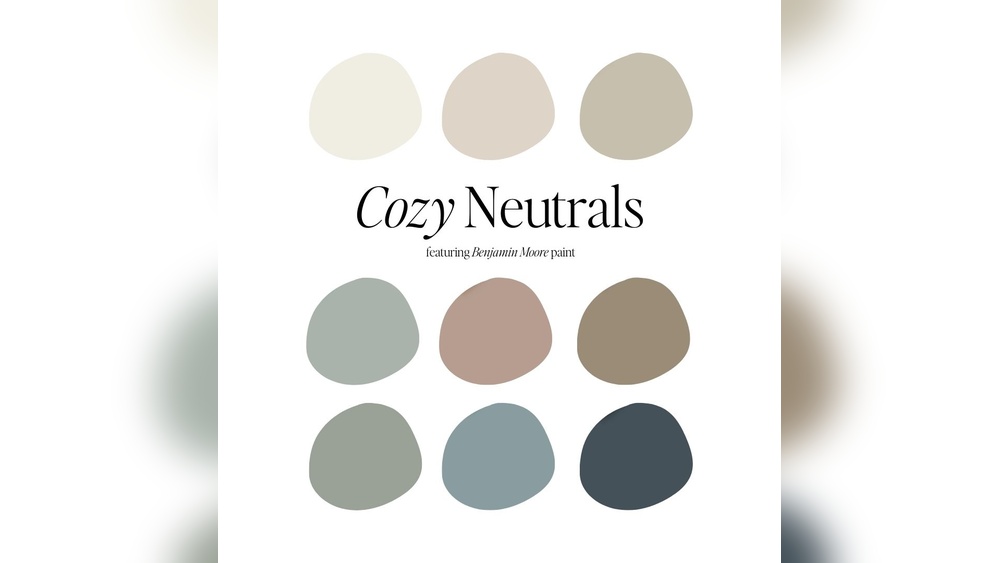
Neutrals are the quiet colors that make everything else in a painting work. Soft grays, earthy browns, muted greens and warm off-whites give the eye a place to rest and make saturated accents glow. Yet tube grays often look flat and lifeless next to the rest of a painting. The solution is to mix neutrals yourself, from the same pigments already on your palette. Here is how to mix neutrals on a painting palette so they stay rich, varied and harmonious.
Quick answer: To mix neutrals, combine complementary colors (opposites on the color wheel) such as blue and orange, red and green, or yellow and violet. Equal-strength amounts give a near-neutral gray or brown; tipping the ratio toward one side makes a warm or cool neutral. Add white to create lighter tints. A reliable starting pair is ultramarine blue and burnt sienna, which produces everything from warm browns to cool blue-grays and deep darks.
What Counts as a Neutral?
In painting, a neutral is any color with low saturation. That includes true grays, but also browns, taupes, olive greens, slate blues, mauves and earthy reds. Very few neutrals are perfectly balanced; most lean slightly warm or cool, which is exactly what makes them useful.
| Type | Description | Example uses |
|---|---|---|
| Warm neutral | Leans toward red, orange or yellow | Sunlit stone, skin shadows, wood |
| Cool neutral | Leans toward blue, green or violet | Shadows, overcast skies, distant hills |
| Chromatic gray | A gray with a visible color bias | Backgrounds, atmosphere, clouds |
| Earth neutral | Browns and ochres | Soil, bark, interiors |
| Off-white | White slightly warmed or cooled | Highlights, clouds, white objects |
Why Mix Neutrals Instead of Using Black and White?
Black-and-white grays are perfectly neutral and contain no color, so they often look dead beside the colors around them. Mixed neutrals contain the same pigments as the rest of the painting, so they harmonize naturally. They also have subtle variations in temperature that make shadows and backgrounds feel alive.
That said, black is not forbidden. Some painters, including those using limited palettes like the Zorn palette, rely on black as a cool color. The key is using it deliberately rather than as the default way to gray or darken everything.
A neutral, well-lit mixing surface helps you judge these subtle colors accurately. Our guide to the best small palettes for detail painting compares palette surfaces and colors that make judging neutrals easier.
The Complementary Method
Complementary colors cancel each other out. Mixing them in the right balance produces a neutral; changing the balance shifts it warm or cool.
Core complementary pairs
| Pair | Neutral produced | Lean toward first color | Lean toward second color |
|---|---|---|---|
| Blue + orange | Gray to brown | Slate, blue-gray | Warm brown, tan |
| Red + green | Gray-brown to near black | Maroon, rose-brown | Olive, gray-green |
| Yellow + violet | Gray to khaki | Khaki, ochre-gray | Mauve, lavender-gray |
Step-by-step: mixing a neutral from complements
- Choose a pair, such as ultramarine blue and a cadmium orange (or burnt sienna, which is a dull orange).
- Start with the weaker color. Pull a small amount of orange into the mixing area.
- Add the stronger color gradually. Blue is usually stronger, so add it in tiny amounts.
- Mix until neutral. Keep adjusting until the mix looks neither clearly blue nor clearly orange.
- Adjust temperature. Add a touch more blue for a cooler neutral, or more orange for a warmer one.
- Lighten with white. Separate the neutral into several piles and add increasing amounts of white to create a value range.
- Test against neighbors. A neutral that looks gray on the palette may look blue next to a warm area, or warm next to a cool one.
Reliable Neutral Pairs for Your Palette
Ultramarine blue + burnt sienna
Probably the most widely used neutral pair. Roughly equal amounts give a deep, nearly black dark. More sienna gives warm browns; more ultramarine gives cool slate grays. Add white for a full range of chromatic grays, ideal for clouds, stone and shadows.
Ultramarine blue + burnt umber
Slightly cooler and less red than the sienna mix. Good for dark, cool shadows and night scenes.
Alizarin crimson + phthalo green
Both are transparent and strong; together they make a deep, rich near-black useful for very dark accents. Add white for unusual violet or green grays.
Cadmium red + viridian or phthalo green
Produces warm or cool grays and earthy browns, useful in landscapes.
Yellow ochre + violet
Creates soft, warm khaki and taupe neutrals, beautiful for sunlit stone, dry grass and interiors.
Burnt sienna + phthalo blue
A cooler, more intense alternative to the ultramarine mix, producing teal-grays and strong darks.
The Palette Gray Method
At the end of a painting session, many painters scrape all the leftover mixes on the palette together into a single pile. Because these mixes contain every color used, they typically combine into a neutral “palette gray” that perfectly harmonizes with the painting.
- Use palette gray to tone the next canvas.
- Add it to colors that look too saturated.
- Use it for underpaintings and background washes.
Store oil palette gray in a sealed container or tube. For acrylic, it must be used quickly or kept in an airtight container.
Mixing Neutrals From Three Primaries
If you do not have complements set out, you can make neutrals from red, yellow and blue. Mixing all three in balanced amounts produces a gray or brown. Adjusting the proportions shifts the neutral warm or cool. This is essentially mixing a secondary (such as orange) with its complement (blue), just done in one step.
Controlling Temperature in Neutrals
Temperature is what makes neutrals useful. Warm and cool neutrals side by side create the sense of light and shadow even without strong color.
- In warm light, shadows often read as cooler, so lean shadow neutrals toward blue or violet.
- In cool or overcast light, shadows can read warmer, so lean them toward brown or red.
- Distance: Far objects often look cooler and grayer; mix their neutrals with more blue and white.
- Focal areas: Neutrals next to a saturated accent make that accent pop.
Neutralizing Specific Colors
Sometimes you do not want a full neutral, just a less intense version of a color. Add a small amount of its complement:
| Color too bright | Add a touch of | Result |
|---|---|---|
| Green | Red or burnt sienna | Natural foliage green |
| Blue | Orange or burnt sienna | Slate or denim blue |
| Red | Green | Brick, rust or maroon |
| Yellow | Violet | Ochre or mustard |
| Orange | Blue | Terracotta or tan |
| Violet | Yellow | Mauve or plum-gray |
This approach keeps color “in the family” and avoids the muddy look of adding black or gray.
Neutrals in Different Media
Acrylic
Mix neutrals in generous batches and keep them moist on a wet palette or in a sealed container, since acrylic dries quickly. Remember acrylic often dries a little darker.
Oil
Oil allows long working time for subtle adjustments. Palette gray is especially useful in oil since it stays workable.
Watercolor
Mix neutrals with water rather than white. Granulating pigments such as ultramarine produce beautiful textured grays when mixed with earth colors. Many watercolorists mix neutrals directly on the paper by dropping complements into wet washes.
Gouache
Gouache neutrals mixed with white become opaque and soft, useful for illustration backgrounds.
Example Neutral Recipes for Common Subjects
These starting points are approximate; adjust them by eye against your reference.
- Overcast sky: White with a small amount of ultramarine and a smaller amount of burnt sienna, plus a hint of yellow ochre near the horizon.
- Gray stone wall: Ultramarine and burnt sienna with white, varied from patch to patch with touches of ochre and violet.
- Shadow on white fabric: White with a little ultramarine and a touch of alizarin crimson for a soft lavender gray.
- Weathered wood: Burnt umber, white and a little ultramarine for silvery gray, with burnt sienna in the cracks.
- Dry winter grass: Yellow ochre with a touch of violet and white for a muted straw color.
- Distant hills: Your sky color plus a little of the foreground green and a touch of its complement.
Practice Exercises
- Complement strip: For each complementary pair, paint a strip of seven swatches from pure color to pure complement, with the neutral in the middle.
- Tint chart: Take the center neutral of each strip and add white in four steps.
- Gray still life: Paint a simple still life using only mixed neutrals plus one saturated accent.
- Temperature sphere: Paint a gray sphere with warm-light neutrals and cool-shadow neutrals.
- Match a neutral: Find a gray or brown object at home and match it exactly.
Common Mistakes
Making every neutral the same
A single gray used everywhere flattens the painting. Vary temperature and value.
Overmixing with too many pigments
Mixing four or five colors to make a neutral often produces mud rather than a clean gray. Use two complements plus white.
Relying only on black and white
These grays can look cold and disconnected. Mixed neutrals harmonize better.
Neglecting the effect of surroundings
Neutrals are strongly influenced by neighboring colors. Always judge them in context.
Mixing on a colored surface
A colored palette surface distorts how neutrals look. Use a white or mid-gray surface.
Keeping Your Palette Clean for Neutral Mixing
Neutrals are easily contaminated, since a trace of a strong pigment like phthalo blue can tint an entire batch. Wipe your palette knife between mixes and clean the mixing area regularly. Our guide on how to clean a painting palette covers routines for different surfaces and paints.
Using Neutrals to Strengthen Composition
Neutrals are not just background filler; they are compositional tools. A painting with large areas of muted color and a single saturated accent automatically directs attention to that accent. Many landscape painters keep most of the scene in subtle greens, grays and browns so that a red barn, a figure in a bright coat or a patch of sunlit flowers becomes the focal point. Portrait painters often surround a face with neutral backgrounds so skin tones read warmly.
Try this: before painting, decide where the most saturated color will go, then plan for everything else to be a step or two more neutral. Even small reductions in intensity across the rest of the painting make the focal area noticeably stronger.
Neutrals and Lighting Conditions
The light you paint under affects how neutrals look. Warm incandescent bulbs make cool grays look bluer and warm grays look muddy, while daylight-balanced bulbs show neutrals more accurately. If your neutrals look different when you move the painting to another room, check the lighting where you mix. A daylight-balanced lamp with a high color rendering index is one of the most effective upgrades for anyone serious about subtle color.
FAQs
How do you mix neutral colors in painting?
Mix complementary colors, such as blue and orange, red and green, or yellow and violet. Adjust the ratio to make the neutral warmer or cooler and add white for lighter tints.
What two colors make a good gray?
Ultramarine blue and burnt sienna are a classic choice. With white, they produce a wide range of warm and cool grays.
Is it better to mix gray or use tube gray?
Mixed grays usually harmonize better because they contain the painting’s own pigments. Tube grays are convenient but can look flat.
How do you make a warm neutral?
Tip a complementary mix toward the warm color, such as more burnt sienna than ultramarine, or add a touch of yellow ochre.
How do you tone down a color that is too bright?
Add a small amount of its complement. For example, add a touch of red to a green that is too vivid.
What is palette gray?
Palette gray is the neutral formed by scraping together all leftover mixes at the end of a session. It harmonizes with the painting and is useful for toning canvases.
Final Thoughts
Mixing your own neutrals is one of the fastest ways to make paintings look more sophisticated. Start with ultramarine and burnt sienna, explore other complementary pairs, and use temperature to give grays life. A clean, neutral mixing surface makes the subtle differences easier to see, so if you are upgrading, compare our picks for compact palettes suited to precise color mixing.