Mixing neutrals on a painting palette is an essential skill for any artist. Neutral colors create depth, harmony, and sophistication in your artwork. They help balance intense colors, make shadows believable, and give skin tones a natural look. Mastering neutrals can be tricky at first, but with practice, you can transform your paintings from basic to professional.
This guide will take you step by step through understanding neutrals, how to mix them, and how to use them effectively.
What Are Neutral Colors?
Neutral colors are hues that do not belong to the color wheel’s primary, secondary, or tertiary groups. The most common neutrals are gray, brown, black, and white. Sometimes, subtle colors like beige, taupe, and off-white are also called neutrals. These colors do not compete for attention and often act as a background or transition in a painting.
Neutrals can be warm (with a hint of red, orange, or yellow) or cool (with a hint of blue, green, or violet). Understanding this temperature helps you mix colors that feel natural and work well together.
Why Neutrals Matter In Painting
Many beginners overlook neutrals, thinking vibrant colors are more important. But if you look at famous artworks, you’ll see that neutrals are everywhere. They make bright colors pop, create mood, and add realism. For example, in portraits, neutrals are essential for lifelike skin tones. In landscapes, they make skies and earth feel believable.
A surprising fact: Most natural scenes are about 70% neutral or muted color, and only 30% bright color. If your painting is all saturated colors, it can look flat or childish.
Basic Color Theory For Mixing Neutrals
Mixing neutrals starts with understanding complementary colors. These are colors opposite each other on the color wheel: red and green, blue and orange, yellow and purple. When mixed, they cancel each other out, creating neutral tones.
For example:
- Mixing red with green gives a warm brown.
- Mixing blue with orange results in gray or muted blue.
- Mixing yellow with purple can create muted olive or taupe.
You’ll also use white and black to lighten or darken your neutrals.
Essential Colors For Mixing Neutrals
Before you start, make sure your palette has these colors:
- Titanium White
- Ivory Black or Mars Black
- Ultramarine Blue
- Burnt Sienna or Burnt Umber
- Yellow Ochre
- Cadmium Red or Alizarin Crimson
- Viridian or Phthalo Green
These colors give you flexibility to mix a wide range of neutrals.
Step-by-step Guide: Mixing Neutrals
Let’s break down the process of mixing neutrals on your painting palette.
1. Mixing Grays
Grays are one of the most useful neutrals. There are two main ways to mix gray:
a) Black and White Method
Simply combine ivory black and titanium white. This gives you a basic, “cool” gray. Adjust the ratio for lighter or darker tones.
b) Complementary Color Method
Mix any pair of complementary colors, such as ultramarine blue and burnt sienna. Adjust the mix until you get the gray tone you want. This method produces more “natural” grays, useful for shadows and skies.
Example:
Mix equal parts ultramarine blue and burnt sienna. If the gray is too warm, add more blue. If it’s too cool, add more sienna.
2. Mixing Browns
Browns are another important neutral, especially for earth tones, trees, and skin.
a) Warm Brown
Combine cadmium red and yellow ochre to create an orange, then add a small amount of ultramarine blue to neutralize it. Adjust until you reach the desired brown.
b) Cool Brown
Mix alizarin crimson with viridian. This creates a deep, cool brown. Add a touch of titanium white if you need a lighter tone.
Example:
Mix equal parts alizarin crimson and viridian. Add a little white for a muted taupe.
3. Lightening And Darkening Neutrals
Use titanium white to lighten any neutral, making it softer or pastel. Use ivory black or more of the darker complementary color to deepen the shade.
Practical Tip:
Always add dark color to light, not the other way around. It’s easier to darken a color than to lighten it.
4. Adjusting Temperature
To make a neutral warmer, add a bit of red, orange, or yellow. For a cooler neutral, add blue or green. This is vital for matching the atmosphere or mood you want to create.
Example:
If your gray is too blue and feels “cold,” add a touch of burnt sienna or yellow ochre.
Common Mistakes When Mixing Neutrals
Many artists make these mistakes:
1. Overusing Black And White
Mixing only black and white makes flat, lifeless grays. Always try mixing complements for richer neutrals.
2. Ignoring Temperature
Not adjusting for warm or cool can make skin tones look unnatural or shadows feel wrong.
3. Using Too Much Paint
Start with small amounts. Neutrals are easy to darken, but hard to lighten if you mix too much.
4. Not Testing On Scrap Paper
Always test your mixed neutral on a scrap before applying it to your painting.
5. Forgetting Color Bias
Each brand of paint has its own bias. For example, some reds are warmer, some cooler. This affects how your neutrals turn out.
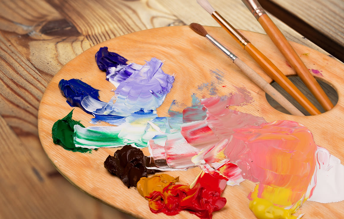
Credit: www.dickblick.com
Table: Mixing Common Neutrals From Primary Colors
Here’s a quick reference for how to mix some basic neutrals with your primary colors.
| Neutral Type | Colors Used | Resulting Shade |
|---|---|---|
| Warm Gray | Ultramarine Blue + Burnt Sienna | Natural, warm gray |
| Cool Gray | Phthalo Blue + Burnt Umber | Cool, blue-gray |
| Rich Brown | Cadmium Red + Ultramarine Blue + Yellow Ochre | Deep, earthy brown |
| Muted Olive | Yellow Ochre + Dioxazine Purple | Olive green-gray |
How To Use Neutrals Effectively In A Painting
Mixing neutrals is only part of the process. Here’s how to use them for maximum effect:
Creating Depth
Use cool neutrals in the background and warm neutrals in the foreground. This mimics how the eye sees distance and creates a sense of space.
Making Colors Pop
Surround a bright color with neutrals to make it stand out. For example, a red apple looks brighter against a gray or brown background.
Harmonizing The Palette
Mix a little of your neutral color into your other colors. This unifies the painting and avoids jarring contrasts.
Realistic Skin Tones
Rarely is skin just pink or peach. Realistic skin always contains neutrals. Try mixing small amounts of green or blue to tone down bright reds and yellows.
Subtle Shadows
Shadows are rarely pure black. Use a dark neutral mixed from complementary colors for a richer, more natural shadow.
Advanced Tips For Mixing Complex Neutrals
Once you’re comfortable with basic neutrals, try these advanced techniques:
1. Split-complementary Mixing
Instead of only using direct complements, use two colors next to the complement. For example, instead of red + green, try red + blue-green or yellow-green. This creates more nuanced neutrals with subtle undertones.
2. Using Transparent Vs. Opaque Paints
Transparent colors (like alizarin crimson or phthalo blue) make clearer, more luminous neutrals. Opaque colors (like cadmium red or yellow ochre) create more muted, solid neutrals. Experiment to see which works for your subject.
3. Glazing With Neutrals
Thin layers of neutral color (glazes) can adjust or soften intense areas in your painting without repainting the whole section. This technique is common in oil and acrylic painting.
4. Mixing Neutrals For Different Lighting
Natural light, artificial light, and sunset all affect how neutrals look. For example, under warm light, add more yellow or orange. For night scenes, use more blue or green in your neutrals.
Table: Temperature Adjustment Of Neutrals
To help you visualize how to adjust temperature, here’s a quick guide:
| Base Neutral | Add To Warm | Add To Cool |
|---|---|---|
| Gray | Yellow Ochre, Burnt Sienna | Ultramarine Blue, Viridian |
| Brown | Cadmium Red, Orange | Phthalo Blue, Dioxazine Purple |
| Beige | Yellow, Red | Blue |
Practical Examples For Artists
Let’s look at two real-world painting scenarios:
Example 1: Landscape
You want to paint distant mountains. If you use pure blue, they will look unnatural. Instead, mix ultramarine blue, a touch of burnt sienna, and titanium white to create a cool, soft gray. This neutral makes the mountains feel far away and atmospheric.
Example 2: Portrait
For a natural skin tone, mix yellow ochre, cadmium red, and a touch of ultramarine blue. If it’s too bright, add more blue or green to neutralize. For shadows, deepen the mix with a little burnt umber and alizarin crimson.
Non-obvious insight: Most professional artists premix their main neutrals before starting the painting. This saves time and keeps color harmony.
How Mixing Neutrals Can Improve Your Art
- Creates Atmosphere: Neutrals set the mood—misty, sunny, or dramatic.
- Adds Realism: The real world is full of subtle colors. Neutrals help you capture that.
- Prevents Over-saturation: Using only bright colors can make art look amateurish.
- Gives More Control: When you master neutrals, you can lead the viewer’s eye where you want.
Advanced tip: If you’re unsure about a neutral, squint your eyes at your palette. The right neutral will blend in, not stand out.

Credit: www.youtube.com
Table: When To Use Neutrals Vs. Pure Colors
| Situation | Use Neutral | Use Pure Color |
|---|---|---|
| Backgrounds | Yes | No |
| Focal Point | No | Yes |
| Skin Tones | Yes | Rarely |
| Highlights | Sometimes | Yes |
Final Thoughts
Mixing neutrals is more than just blending black and white. It’s about understanding color relationships, temperature, and the effect of light. The more you practice, the better you’ll get at seeing and mixing subtle, beautiful neutrals. Don’t be afraid to experiment with different combinations and test them on scrap paper.
Over time, your paintings will become richer, more cohesive, and more professional.
If you want to deepen your knowledge about color theory, you can visit the Encyclopedia Britannica’s color theory page.

Credit: www.amazon.com
Frequently Asked Questions
How Do I Avoid Muddy Colors When Mixing Neutrals?
Muddy colors often happen when you mix too many paints or use low-quality pigments. Stick to two or three colors at a time. Always start with clean brushes and palette. Test mixes before applying them to your work.
What’s The Best Way To Mix A Neutral For Skin Tones?
Start with yellow ochre and cadmium red for a base, then slowly add ultramarine blue or viridian until you get a muted, natural color. Adjust warmth or coolness based on the lighting in your reference.
Can I Mix Neutrals With Only Primary Colors?
Yes, you can mix a wide range of neutrals by combining primary colors (red, yellow, blue) in different proportions. For example, red + yellow + blue in equal parts gives a brown. Adjust each color to get the shade you want.
Why Do My Neutrals Look Different When Dry?
Some paints, especially oils and acrylics, change slightly as they dry (a process called “color shift”). Always let a small sample dry before using it widely. Use the same brand and type of paint for consistency.
How Do I Choose Which Neutral To Use In A Painting?
Think about the light, mood, and subject. Cooler neutrals work for shadows or distant objects; warmer neutrals are good for sunlight or skin. Always compare your neutral mix to your reference or real life.
Mixing neutrals is an art in itself, but with practice, your paintings will improve dramatically. Keep exploring and see how the right neutrals transform your art.