Quick answer: The most useful acrylic painting composition tips for beginners are to choose one focal point, place it off-center (roughly on a rule-of-thirds intersection), plan your darks and lights with a small value sketch before you paint, and use lines and edges to lead the eye toward that focal point. Simplify the scene into three to five big shapes, and keep the sharpest edge, strongest contrast and brightest color at the focal point.
A painting can have accurate drawing and clean color and still feel off. Nine times out of ten, the problem is composition: where things sit, how big they are and where the viewer’s eye goes first.
Composition is also the part most beginner tutorials skip. They show you how to paint a tree, not where to put it. These acrylic painting composition tips for beginners fill that gap with decisions you can make before the first brushstroke, plus fixes for paintings that already feel wrong.
Why Composition Matters More in Acrylic
Acrylic dries quickly and covers well, so you can paint over almost anything. That sounds like a safety net, but it encourages painting first and planning later. The result is often a canvas with five repaints in one corner and a lumpy surface where you kept moving a barn.
Five minutes of planning saves hours of correction. A thumbnail sketch, a value plan and a decision about the focal point take less time than a single repaint, and they make the actual painting faster because you are not deciding as you go.
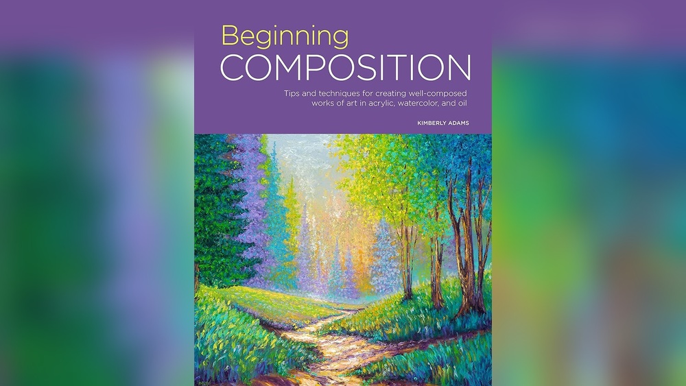
If you learn best from structured lessons, several well-regarded instruction books cover composition alongside technique. Our list of the best acrylic painting books for beginners highlights titles that teach planning, not just copying.
Step 1: Decide What the Painting Is About
Before choosing a layout, finish this sentence: “This painting is about ___.” The answer should be one thing. The light on a barn roof. The red of a single poppy. The calm of an empty beach at dusk.
Everything else in the scene either supports that idea or competes with it. Beginners often try to include every element in a reference photo. Cropping, simplifying or removing objects is not cheating; it is the core of composition.
Step 2: Make Thumbnail Sketches
Thumbnails are tiny sketches, about 2×3 inches, drawn in the same proportions as your canvas. Their purpose is to test layouts quickly.
- Draw a small rectangle matching your canvas ratio (an 8×10 canvas is 4:5, an 11×14 is about 11:14, a 12×12 is square).
- Sketch only the big shapes: horizon, main subject, large masses of dark and light. No details.
- Make three to four versions. Move the horizon up and down, shift the subject left and right, try a vertical and a horizontal crop.
- Pick the one that reads most clearly when you look at it from arm’s length.
Use a marker or soft pencil so you cannot get fussy. If a thumbnail needs detail to make sense, the composition is not strong enough yet.
Step 3: Place the Focal Point Off-Center
The Rule of Thirds
Divide the canvas into a 3×3 grid with two horizontal and two vertical lines. The four places where lines cross are strong locations for a focal point. Placing the main subject near one of these points usually feels more dynamic than dead center.
Horizons follow the same logic. Put the horizon on the upper third line to emphasize land or water, or on the lower third line to emphasize sky. A horizon cutting the canvas exactly in half tends to feel static, because neither area dominates.
When Center Placement Works
Centered compositions are not wrong. They suit symmetrical subjects (a single flower head-on, a reflection, a doorway) and calm, formal moods. The key is to make the choice deliberately rather than by default.
Avoid the Edges and Corners
Objects that just touch the canvas edge create tension the eye fixates on. Either let a shape run clearly off the edge, or leave a clear gap. The same goes for corners: lines that run straight into a corner pull the eye out of the painting.
Step 4: Plan Your Values Before Your Colors
Value means how light or dark something is, regardless of hue. It is the backbone of composition, because the eye goes to the area of highest value contrast first.
Make a three-value sketch using only white paper, a mid-gray marker and a black marker. Assign every area of the scene to light, mid or dark. Then check:
- Is the strongest light-dark contrast at the focal point?
- Does one value dominate, roughly half the area or more? A dominant value gives the painting a mood (mostly dark feels moody; mostly light feels airy).
- Are the darks and lights grouped into connected shapes rather than scattered spots?
A useful proportion to try is roughly 60 percent of one value, 30 percent of another and 10 percent of the third. It is a guideline, not a law, but it prevents the even, checkerboard look that makes paintings feel busy.
Step 5: Lead the Eye with Lines and Shapes
Viewers follow paths. Roads, rivers, fences, shorelines, branches and even the direction of brushstrokes all guide the eye. Use them to point toward your focal point, not away from it.
| Composition device | What it does | Example in acrylic |
|---|---|---|
| Leading lines | Guide the eye toward the subject | A path curving toward a cottage |
| S-curve | Creates a gentle, wandering route through the scene | A winding river in a valley |
| Framing | Encloses the subject with darker shapes | Overhanging branches around a lake |
| Diagonal | Adds energy and movement | A wave breaking across the canvas |
| Triangle grouping | Creates stable, balanced arrangements | Three pears in a still life |
| Negative space | Isolates the subject and adds calm | A lone bird in a large pale sky |
Step 6: Control Contrast, Edges and Color
Composition is not only placement. Within the painting, you decide where the eye rests by controlling three things.
Edges
Sharp, hard edges attract attention; soft, blurred edges recede. Keep your crispest edges at the focal point and soften edges in the background and near the canvas borders. In acrylic, soften an edge while wet by dragging a damp, clean brush along it, or after drying by glazing a thin mix of the surrounding color across it.
Color Saturation
The most saturated, intense color in the painting will draw the eye. If a bright red mailbox sits in the background corner, it may steal attention from your intended subject. Mute secondary areas by adding a touch of the complementary color (a little green into red, a little orange into blue).
Detail
Detail is another form of contrast. Paint the focal area with the most detail and let the rest stay simpler. Viewers’ brains fill in the gaps, and the painting feels more intentional.
Acrylic Underpainting Tips for Composition
An underpainting is a thin first layer that establishes the composition and values before color goes on. Acrylic is well suited to it, since thin layers dry in minutes and will not lift when you paint over them.
- Tone the canvas with a thin wash of burnt sienna or a neutral gray. A toned ground makes it easier to judge values than stark white.
- Sketch the main shapes with a small brush and thinned burnt umber.
- Block in the darks with the same color, slightly thicker. Leave the lights as the toned ground.
- Step back. If the composition reads clearly in this monochrome stage, it will read clearly in color. If not, fix it now while changes are cheap.
Glazing Tips for Beginners Who Want to Adjust Composition
A glaze is a transparent layer of paint, usually mixed with a glazing or gloss medium. Glazing lets you shift attention after the painting is mostly done.
- Glaze a thin layer of blue or violet over a busy background to push it back and calm it down.
- Glaze a warm yellow or orange over the focal area to make it glow.
- Darken corners with a soft glaze of a dark neutral to create a subtle vignette that keeps the eye inside the canvas.
Keep glazes thin, and let each one dry before the next. A common starting ratio is about one part paint to five or more parts glazing medium, adjusted until the color is transparent.
Composition Mistakes Beginners Make (and Fixes)
- Too many focal points. Fix: pick one, then reduce contrast and detail in the others.
- Horizon in the middle. Fix: move it to the upper or lower third.
- Subject too small. Fix: crop in closer. Beginners often leave too much empty foreground.
- Everything the same size. Fix: vary sizes. Three trees of identical height look artificial; make one dominant.
- Evenly spaced objects. Fix: group objects in odd numbers with uneven gaps.
- Tangents. Fix: avoid places where two edges just touch, such as a mountain peak touching a tree tip.
- Lines leading out. Fix: curve a road or river back toward the subject, or block it with a shape.
How to Check a Finished Painting’s Composition
Use these quick tests before you call a painting done:
- Squint test: squint until details disappear. Do the big shapes still read? Does one area stand out?
- Grayscale photo: take a black-and-white phone photo. This reveals value problems color hides.
- Mirror test: view the painting in a mirror or flip a photo horizontally. Fresh eyes catch imbalance.
- Distance test: step back six to ten feet. Composition problems show up from across a room.
Acrylic Painting Tips for Beginners Beyond Composition
Composition works best when your materials cooperate. A few practical habits help:
- Work from large brushes to small. Use your biggest brush for as long as possible, which keeps early stages loose and focused on shapes.
- Keep paint moist with a stay-wet palette so you are not rushing decisions.
- Paint background to foreground, and dark to light in most cases, since acrylic covers well and highlights look cleaner on top.
- Make several small studies before a large piece. A 6×6 study can solve composition problems in 30 minutes.
If you need subjects to apply these principles to, our guide on finding easy acrylic painting ideas for beginners walks through choosing references that are simple enough to compose well.
A 30-Minute Composition Exercise
Find a landscape photo you like. Set a timer and follow this sequence:
- (5 minutes) Make three thumbnails with different crops and horizon heights.
- (5 minutes) Choose one and make a three-value sketch.
- (15 minutes) Paint a small 5×7 study using only burnt umber and white, matching your value sketch.
- (5 minutes) Run the squint and grayscale tests and write one note on what you would change.
Repeat this with a new photo a few times a week. It builds compositional instinct quickly because it separates design decisions from color mixing.
FAQs
What is the rule of thirds in acrylic painting?
It is a guideline that divides the canvas into a three-by-three grid. Placing the focal point near one of the four intersections, or a horizon along one of the lines, usually creates a more balanced and interesting layout than placing it in the exact center.
How do I make my acrylic paintings look less flat?
Increase value range by including true darks and clean lights, keep the strongest contrast at the focal point, soften background edges, and use cooler, less saturated color in the distance. Glazing thin layers also adds depth.
Should beginners do an underpainting with acrylics?
Yes, it is one of the most useful acrylic underpainting tips for any level. A thin monochrome underpainting sets the composition and values first, and it dries fast enough to paint over within minutes.
How many objects should be in a still life composition?
Odd numbers, such as three or five, tend to look more natural than even numbers. Vary their sizes, overlap some of them and leave uneven gaps between them.
How do I know if my composition is working?
Squint at it, view it in grayscale, flip it horizontally and look from a distance. If your eye goes straight to the intended focal point and the big shapes read clearly, the composition is working.
What are the best acrylic painting tips for beginners blending in the background?
Work in small sections, mist the area lightly, and blend while the paint is wet using a soft, clean brush. A retarder medium extends working time. Soft, blended backgrounds help the focal point stand out.
Final Thoughts
Composition is a set of decisions, and every decision gets easier with practice. Make thumbnails, plan values, pick one focal point and guide the eye to it. Those four habits will improve your paintings faster than any new brush.
For deeper, structured lessons with worked examples, browse our picks of beginner-friendly acrylic painting books that teach composition and design, and choose one that matches the subjects you enjoy painting.