Are you ready to make your digital artwork pop with stunning colors? Learning how to do color grading in Procreate can transform your creations from ordinary to extraordinary.
Whether you want to enhance mood, highlight details, or create a unique style, mastering color grading gives you the power to control the vibe of your art. In this guide, you’ll discover simple, step-by-step techniques to adjust colors like a pro—even if you’re just starting out.
Keep reading, and unlock the secrets that will bring your artwork to life in ways you never thought possible.
Prepare Your Canvas
Getting your canvas ready is the first step in color grading with Procreate. A well-prepared canvas helps you work faster and keep your artwork safe. It also allows you to experiment with colors without losing the original look. Follow these simple steps to prepare your canvas effectively.
Duplicate Original Artwork
Always start by duplicating your original artwork. This keeps your first version safe and untouched. To duplicate, tap the artwork thumbnail, then select “Duplicate.” Work on the copy to try different color grades. This method gives you freedom to experiment without worries.
Set Up Color Profile
Choose the right color profile for your project. Procreate offers profiles like sRGB, P3, and CMYK. For digital work, sRGB is a good choice. For print, select CMYK to match printer colors. Setting the color profile early helps keep colors accurate throughout your work.
Basic Color Adjustments
Basic color adjustments form the foundation of color grading in Procreate. They help you enhance and correct the colors in your artwork quickly. These adjustments improve the overall look by changing color tones, brightness, and saturation levels. Understanding these basic tools lets you create a balanced and vibrant image with ease.
Use Hue, Saturation, Brightness Sliders
Start by tapping Adjustments and selecting Hue, Saturation, Brightness. Three sliders appear for you to control your image’s colors. The Hue slider shifts all colors around the color wheel. Move it left or right to find the perfect tone. The Saturation slider adjusts the intensity of colors. Slide it up to make colors richer or down to mute them. The Brightness slider changes how light or dark your image looks. Increase brightness for a lighter feel or lower it for a moodier effect. Use small changes for subtle improvement.
Apply Color Balance Changes
Color Balance allows you to tweak shadows, midtones, and highlights separately. This tool adds more control over your artwork’s mood. Tap Adjustments and choose Color Balance. Three sliders adjust the balance between red, green, and blue tones. Change shadows to add warmth or coolness. Modify midtones to affect the main color range. Adjust highlights to brighten or tint the lightest parts. These changes refine your image’s colors and create harmony. Experiment with small shifts to avoid overdoing it.
Advanced Grading Tools
Advanced grading tools in Procreate give you more control over color and tone. These tools help refine your artwork with precision. They allow subtle changes that improve the mood and feel of your piece. Using these features, you can enhance colors and create a professional look.
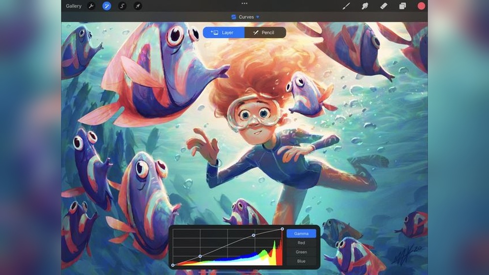
Utilize Curves For Precision
Curves let you adjust brightness and contrast in specific areas. You can control shadows, midtones, and highlights separately. This tool helps fix color balance and improve depth. Drag points on the curve to brighten or darken parts of the image. Small changes create big effects on your final look.
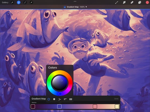
Apply Gradient Maps
Gradient maps replace original colors with a new gradient palette. This changes the overall tone and style of the artwork. You can create dramatic color shifts or smooth blends. Choose gradients that match the mood you want to express. Adjust the opacity to blend the effect naturally.
Experiment With Color Balance Layers
Color balance layers adjust colors in shadows, midtones, and highlights separately. This tool helps correct color casts and create harmony. Move sliders to add or reduce red, green, or blue tones. Use this to warm up or cool down your image easily. Layer masks can limit the effect to specific areas.

Credit: www.amazon.com
Masking For Targeted Edits
Masking lets you focus color grading on certain parts of your artwork. It helps apply changes only where needed. This control saves time and keeps your edits clean. Use masking to make your colors pop without affecting the whole image.
Create And Use Layer Masks
Start by selecting the layer you want to edit. Tap the layer to open options. Choose “Mask” to add a new layer mask. This mask hides parts of the layer while showing others. Paint on the mask with black to hide areas. Use white to reveal them again. Gray shades give partial transparency. This technique lets you protect parts from color changes. It keeps your edits precise and easy to fix.
Adjust Specific Colors With Qualifier
Qualifier helps you pick and change specific colors. Use it to isolate a color range in your image. Tap Adjustments and select “Hue, Saturation, Brightness.” Then tap the color to target it. Adjust sliders to fine-tune your selection. This way, you change only the chosen colors. Combine Qualifier with masks for sharper control. It makes your color grading more detailed and effective.
Enhancing Light And Shadows
Enhancing light and shadows is key in color grading within Procreate. It brings depth and life to your artwork. Proper use of light and shadow guides the viewer’s eye and adds mood. This section shows simple steps to improve your piece by adjusting highlights and shadows effectively.
Add Fill Light Effects
Fill light brightens dark areas without harming your image’s contrast. Start by creating a new layer above your artwork. Set the layer mode to “Soft Light” or “Overlay” for a natural glow. Use a soft brush with low opacity and pick a light color that fits your scene.
Gently paint over shadowed areas to reveal hidden details. Avoid overdoing it; subtlety keeps the effect believable. This technique helps balance light and makes your artwork appear more polished.
Deepen Shadows For Contrast
Shadows add drama and shape to your artwork. Create a new layer and set its mode to “Multiply.” Choose a dark color, often a deep blue, purple, or black with low opacity. Use a soft brush to paint areas that need stronger shadows.
Focus on edges and places where light naturally fades. This deepens contrast and makes colors pop. Adjust the layer opacity if shadows look too harsh. Deepening shadows guides the viewer and gives your image more depth.
Credit: help.procreate.com
Color Sampling Techniques
Color sampling is a key step in color grading within Procreate. It helps you pick exact colors to create a consistent look. Using color sampling techniques makes your artwork look professional and vibrant. These techniques save time and improve accuracy.
Use Eyedropper Tool
The Eyedropper Tool in Procreate allows you to pick colors directly from your canvas. Tap and hold anywhere on your artwork to activate it. This tool samples the color under your finger or stylus. It works instantly, so you can match colors quickly.
Use this tool to maintain color harmony across your layers. It is perfect for selecting shades and tones from your painting. The Eyedropper Tool makes blending and shading easier and more precise.
Sample Colors From Reference Images
Import a reference image to Procreate to sample colors from it. Place the image on a separate layer above your artwork. Use the Eyedropper Tool to pick colors directly from the reference.
This method helps you achieve realistic color grading. It is useful for matching skin tones, landscapes, or lighting effects. Sampling from references improves color accuracy and inspires your creative choices.
Maintaining Line Art Integrity
Maintaining the integrity of your line art is crucial during color grading in Procreate. Clean lines keep your artwork sharp and professional. Without careful techniques, colors can bleed outside the lines, ruining the design. This section explains simple methods to keep colors neatly inside your line art.
Color Within Lines
Start by creating a base color layer under your line art. Use the selection tool to outline the area you want to color. This prevents paint from spilling outside the lines. Zoom in for better control and apply colors carefully. Using a brush with a hard edge helps stay inside boundaries. This method keeps your line art clear and precise.
Use Alpha Lock And Clipping Masks
Alpha Lock locks transparency on a layer, so you can only paint on existing pixels. Enable Alpha Lock on your color layer to avoid coloring outside your shapes. Clipping Masks allow you to add shading and highlights only on the base color layer. Add a new layer and set it as a Clipping Mask. This keeps effects contained within your color shapes. Both tools help maintain clean edges while adding depth to your art.
Finalizing Your Grade
Finalizing your color grade in Procreate is a crucial step. It brings all your adjustments together. This phase ensures your artwork looks polished and balanced. Small changes can make a big difference in the final look. Taking time here will improve the overall impact of your piece.
Compare With Original
Start by comparing your graded image with the original. Toggle the adjustments on and off to see the difference clearly. Notice how colors, tones, and contrast have changed. This helps you check if the mood and style match your vision. Make sure the changes enhance rather than overpower the artwork.
Make Last Tweaks For Cohesion
Look closely for any color clashes or areas that feel off. Use tools like Curves or Hue, Saturation, Brightness to refine these spots. Adjust the overall brightness or contrast if needed for better unity. Aim for smooth transitions and consistent color flow. These small tweaks help your grade feel natural and complete.
Tips For Consistent Grading
Consistent color grading in Procreate helps maintain a unified look across your artwork. It avoids color mismatches and saves time. Following a few simple tips ensures your colors stay balanced and pleasing.
Use Master Frames As Reference
Create a master frame with your ideal color settings. Use this frame as a color reference for all your other pieces. Check your current work against the master to keep colors steady. This step helps avoid unwanted shifts in tone or brightness.
Keep the master frame visible or saved in your gallery. Compare often to make sure your grading matches. This technique is especially useful for series or animations where color consistency is key.
Save Custom Color Palettes
Build custom color palettes in Procreate for your grading projects. Saving palettes lets you reuse exact colors without guessing. It reduces errors and speeds up your workflow.
Organize palettes by project or mood for easy access. Use the palette tool to add, remove, and adjust colors quickly. This method keeps your color choices consistent and professional.

Credit: www.amazon.com
Frequently Asked Questions
How To Color Grade In Procreate?
Open your artwork in Procreate. Tap Adjustments > Hue, Saturation, Brightness. Adjust sliders to change colors. Use Curves for precise grading. Apply Gradient Maps for creative effects. Preview often to maintain balance. Save your graded artwork.
How To Do Color Grading For Beginners?
Start by choosing a reference frame to guide your color choices. Adjust hue, saturation, and brightness using simple tools. Use masks to isolate areas for correction. Fix specific colors with curves and qualifiers. Regularly compare with the original to maintain consistency.
Practice to improve your skills.
How To Create A Color Gradient In Procreate?
Open Procreate, create a new layer, and select the Gradient Map under Adjustments. Choose colors and adjust sliders to blend smoothly. Use the Brush tool with low opacity to refine the gradient manually if needed.
How To Color In Procreate Without Going Over Lines?
Use the selection tool to isolate areas, then fill with color. Enable clipping masks to keep colors within lines. Adjust brush size for precision.
Conclusion
Color grading in Procreate is simple with practice and patience. Use the Hue, Saturation, and Brightness tools to adjust colors. Try masking to fix specific areas easily. Compare your work with the original often to see progress. Small changes can make your artwork look more vibrant.
Keep experimenting with different settings to find your style. This process helps your drawings stand out beautifully. Enjoy creating with color and have fun learning each step.