
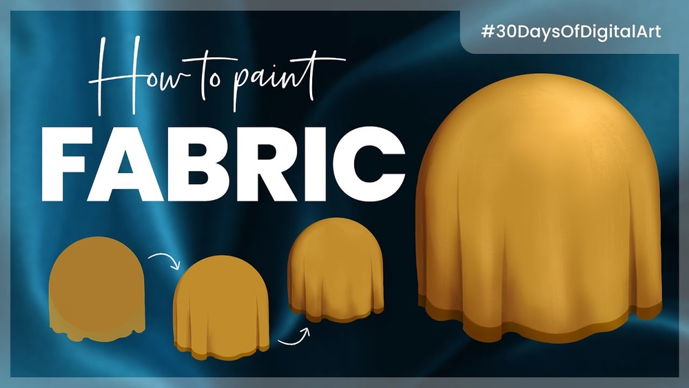
Quick answer: To paint digital fabric texture, first paint the folds and overall form with clear light and shadow, then describe the material through contrast and edges: soft gradients and low contrast for cotton and wool, sharp bright highlights for silk and satin, bright edges with dark centers for velvet, and stiff creases with seam detail for denim and leather. Add the surface texture last, using a pattern or texture brush on a clipped Overlay or Multiply layer warped to follow the folds, and keep it subtle in shadows.
Fabric is one of the most common things in illustration and one of the most commonly painted badly. The usual approach is to slap a texture over a flat shape and hope it reads as cloth. It rarely does, because fabric’s identity comes mostly from how it folds and reflects light, not from its weave.
This guide explains how to paint digital fabric so it reads as a specific material. You will learn the main fold types, how different fabrics react to light, a step-by-step process, how to add patterns and textures that follow form, and common mistakes. There is also a section for anyone who wants to bring designs onto real clothes; if that is your goal, our guide to the best fabric paint for DIY shirt art covers the physical side.
Why Fabric Is Mostly About Folds
Before thinking about texture, think about structure. Fabric hangs, stretches, compresses and twists depending on gravity and the body or object underneath. Getting those folds right does most of the work of making cloth look real.
The seven classic fold types
Figure drawing instruction often groups folds into seven types. Learning to recognize them makes painting clothing much easier.
| Fold type | Where it appears | What it looks like |
|---|---|---|
| Pipe fold | Curtains, long skirts, fabric hanging from one point | Tubular, parallel folds running downward |
| Diaper fold | Fabric supported at two points, such as a scarf or draped cloth | U-shaped or V-shaped sagging curves |
| Spiral fold | Sleeves and pant legs around cylinders | Folds wrapping diagonally around the form |
| Zigzag fold | Inside elbows, back of knees, bunched pants at ankles | Alternating diagonal folds where fabric compresses |
| Half-lock fold | Where a tube of fabric bends sharply, like a bent knee | Fabric folds over itself, creating a distinct break |
| Drop fold | Fabric falling freely off an edge, like a tablecloth corner | Cascading, cone-like folds |
| Inert fold | Fabric lying on the floor or a surface | Collapsed, irregular folds with no tension |
Tension points
Folds radiate from tension points, where fabric is pulled or supported: shoulders, elbows, knees, the waist and buttons. Before painting, mark tension points on a separate layer and let folds flow from them.
How Different Fabrics React to Light
Once folds are right, material qualities come from light behavior. The key variables are contrast, highlight sharpness and edge quality.
| Fabric | Folds | Highlights | Contrast | Key painting tip |
|---|---|---|---|---|
| Cotton | Medium, soft | Broad, dull | Low to medium | Smooth gradients, few sharp edges |
| Silk and satin | Many, flowing | Sharp, bright, long streaks along folds | High | Strong light-to-dark transitions, reflections of surrounding color |
| Velvet | Soft, rounded | Bright at edges and fold crests, darker where fabric faces you | Medium to high | Reverse the usual logic: rim light on edges, deep color in centers |
| Denim | Stiff, chunky, holds creases | Dull, fades at worn areas | Medium | Visible seams, diagonal twill texture, lighter wear on knees and edges |
| Leather | Few, thick, creased | Sharp but small, glossy or semi-matte | Medium to high | Crisp creases, small specular highlights, stitching details |
| Wool and knits | Thick, soft, bulky | Very soft or absent | Low | Fuzzy edges, ribbed or knit pattern following form |
| Sheer fabrics (chiffon, organza) | Light, floaty | Soft | Low | Lower opacity, show the body or background through overlapping layers |
| Linen | Many small wrinkles | Dull | Low to medium | Crumpled creases, slightly rough texture |
How to Paint Digital Fabric Texture: Step by Step
This process works for a shirt, a cape, drapery or any fabric object.
Step 1: Sketch the form underneath
Draw the body or object the fabric sits on, even if it will be covered. A sleeve wraps around an arm; a tablecloth drapes over a table. Fabric without a form underneath looks like it is floating.
Step 2: Mark tension points and fold lines
On a new layer, mark where the fabric is supported or pulled. Sketch the main folds radiating from those points, choosing fold types from the table above. Simplify: three to five major folds are usually enough.
Step 3: Block in the base color
Fill the fabric shape with a flat mid-value base color. Decide on the material now, because it affects every step after this.
Step 4: Paint shadow shapes
Choose a light source. On a clipped layer, paint the shadow side of each fold and cast shadows where one fold overlaps another. Think of each fold as a cylinder or a half-cone with a light side, a core shadow and a shadow side.
Step 5: Define the material through edges and contrast
Now adjust based on fabric type. For cotton, soften transitions. For silk, sharpen the edge between light and shadow and push the contrast. For velvet, brighten the fold crests and edges while keeping the planes facing the viewer deep and rich. For leather, keep creases crisp and add small, bright highlights.
Step 6: Add highlights
Place highlights on the tops of folds that face the light. Their size and sharpness are the material signature: broad and soft on matte fabrics, thin and bright on shiny ones. Shiny fabrics also reflect nearby colors, so a satin dress near a red wall might pick up a reddish tint in some highlights.
Step 7: Add surface texture
Only now add weave, knit or grain. Paint or import a texture on a new layer clipped to the fabric. Use Transform with Warp or Liquify so the texture bends along the folds. Set it to Overlay, Soft Light or Multiply and lower the opacity until it reads without overpowering the form.
Step 8: Add patterns
Patterns such as stripes, plaid or florals must follow the folds. Warp the pattern to match the fabric’s flow, then darken it in shadow areas. Patterns should be interrupted where folds overlap; a stripe disappears behind a fold and reappears on the other side, often slightly offset.
Step 9: Add details
Seams, stitching, hems, buttons and wear marks sell the realism. Seams follow the construction of the garment, often running along the sides of the body and around the shoulders. Wear marks appear at friction points: knees, elbows, cuffs and pocket edges.
Step 10: Unify
Check the fabric with a grayscale layer. Make sure folds read as form, highlights are consistent with the light source and texture does not flatten the value structure.
Texture Brushes and Techniques
- Canvas or linen texture brushes: Good for subtle weave on cotton or linen.
- Knit or rib pattern brushes: Paint along the form for sweaters and scarves.
- Noise or grain brushes: A light grain adds tactile quality to matte fabrics.
- Diagonal hatching: Fine diagonal lines at low opacity suggest denim twill.
- Soft round brush: Essential for velvet and satin gradients.
- Smudge tool: Useful for soft folds, but avoid over-blending, which makes everything look like plastic.
Keep texture contrast lower in shadows and stronger in midtones. In bright highlights, texture is often washed out by reflected light, especially on shiny materials.
How to Paint Specific Fabrics
Silk and satin
Use a dark base and paint long, flowing highlight streaks along fold ridges. Transitions are sharp. Add reflected color in shadows. Keep the number of folds high but smooth.
Velvet
Start with a deep, saturated base. Brighten the edges, fold crests and areas turning away from the viewer. Planes facing the viewer stay dark and rich. Highlights are soft and fuzzy rather than sharp.
Denim
Paint chunky, stiff folds that hold their shape. Add diagonal twill texture on an Overlay layer. Lighten worn areas such as knees, thighs and pocket edges. Add contrast stitching in orange or gold along seams.
Leather
Use fewer, thicker creases. Highlights are small and sharp for glossy leather, broader and softer for suede or matte. Add stitching and edge wear for realism.
Knit sweaters
Folds are bulky and soft. Paint the overall form first, then add a ribbed or cable pattern following the body’s curves. Fuzzy edges along the silhouette help sell the softness.
How to Texture Fabric Paint for Clothes
Some artists want to take digital designs onto real garments. While digital texture is about simulating light, physical fabric paint texture is created with materials and tools:
- Puff or dimensional paints rise when heat is applied or dry raised, creating tactile texture.
- Sponging gives a mottled surface with fabric paint.
- Dry brushing with stiff brushes creates a worn, distressed effect.
- Stencils and stamps transfer digital pattern designs onto fabric.
- Layering opaque and transparent fabric paints creates depth, much like digital layers.
Planning a shirt design digitally first lets you test colors and placement before committing to fabric. Follow the paint manufacturer’s instructions for heat setting and washing, since methods vary.
Fabric on Different Forms
The same fabric behaves differently depending on what it covers. A cotton shirt on a standing figure forms gentle pipe folds from the shoulders, while the same shirt on a figure reaching upward stretches across the chest and bunches at the waist. Draped over a chair, it collapses into inert folds.
When painting clothing on characters, pose the body first, then think about where the fabric is pulled tight and where it relaxes. Tight areas show the form underneath with few folds; relaxed areas hang and gather. Getting this balance right makes clothing look worn rather than painted on.
Common Mistakes When Painting Fabric
Texture over flat form
A weave pattern on a flat shape still looks flat. Paint folds and light first.
Folds that ignore tension points
Random folds scattered across a garment look like crumpled paper. Folds should radiate from supports and stress points.
Same highlight treatment for all fabrics
If cotton and silk have identical highlights, neither reads as a specific material.
Patterns that do not bend
Stripes or prints laid flat over folds destroy the illusion. Warp them to follow the form.
Too many folds
Painting every tiny wrinkle makes clothing look noisy. Simplify to major folds and a few secondary ones.
Practice Exercises
- Fold studies: Hang a towel or shirt and paint it from life in 20 minutes, focusing only on folds.
- Same drape, four materials: Paint one simple drapery shape as cotton, silk, velvet and leather.
- Pattern warping: Apply stripes to a draped cloth and practice bending them along folds.
- Garment study: Paint a pair of jeans and a sweater from photos, noting seams and wear.
FAQs
How do you make digital fabric look realistic?
Get the folds and lighting right first, then define the material through highlight sharpness and contrast. Add surface texture last, warped to follow the folds and kept subtle.
What is the hardest fabric to paint digitally?
Many artists find silk, satin and velvet hardest because of their strong contrast and unusual highlight behavior. Practicing simple drapery studies in each material helps.
Should I use texture brushes or photo textures for fabric?
Both can work. Texture brushes give more control, while photo textures can add realism if they are your own or properly licensed and are warped to follow the folds.
How do I paint velvet digitally?
Use a deep base color, brighten the edges and fold crests, and keep planes facing the viewer dark. Highlights should be soft rather than sharp.
How do I add patterns to digital clothing?
Place the pattern on a clipped layer, warp it with Transform or Liquify to follow the folds, and darken it in shadow areas.
How do I texture fabric paint for clothes?
Use puff paints, sponging, dry brushing, stencils or layered paint. Testing your design digitally first helps plan colors and placement before painting the garment.
Final Thoughts
Convincing digital fabric starts with folds and light, not with texture overlays. Learn the seven fold types, study how each material handles highlights and contrast, and add texture and pattern only after the form reads. With a few drapery studies, clothing in your illustrations will start to feel tactile and real.
If you want to move from screen to shirt, explore our picks for fabric paints that work well for custom clothing and try turning one of your digital designs into wearable art.



One Comment