Graffiti looks spontaneous, but the pieces that stop people in their tracks are built in a predictable order: a sketch, a fill, an outline, then highlights and a background. If you want to learn how to paint graffiti art, the fastest route is to practice that order on paper and canvas first, then move to a legal wall once your can control and letter structure feel solid.
Quick answer: To paint graffiti art, sketch your letters in pencil until the structure works, then block in the fill color, add a crisp outline, and finish with a 3D shadow, highlights and a background. Practice with acrylic paint markers or brush-on acrylics on paper or canvas, and only paint walls where you have written permission or a designated legal wall.
This guide walks through the whole process: the vocabulary, the tools, how to design letters that read well, the painting sequence, and the mistakes that make beginner pieces look flat. It also covers how to get a graffiti look with acrylics indoors, which is how many artists build skills before they ever pick up a spray can.
What Graffiti Art Actually Is (and the Styles You Will Hear About)
Graffiti writing grew out of name-based work: artists developed a “tag” (a stylized signature) and pushed it into larger, more designed letters. Over time, that turned into a set of recognizable styles. Knowing them helps you choose a starting point instead of trying to do everything at once.
| Style | What it looks like | Difficulty | Good for practicing |
|---|---|---|---|
| Tag | A fast, one-color signature | Low to start, high to master | Line confidence and flow |
| Throw-up (throwie) | Bubble letters with a fill and an outline, usually two colors | Low to medium | Fill coverage, clean outlines |
| Block letters | Straight-edged, heavy, highly readable letters | Medium | Proportion and spacing |
| Piece (masterpiece) | Multi-color letters with fades, 3D, highlights and background | Medium to high | The full painting sequence |
| Wildstyle | Interlocking, arrow-heavy letters that are hard to read | High | Advanced letter construction |
| Characters | Cartoon figures that sit beside letters | Medium to high | Shading and figure drawing |
Most people should start with bubble letters and simple block letters. They teach the same fundamentals a wildstyle piece needs, but the problems are easier to see and fix.
Legal First: Where You Can Paint
Painting on property without permission is illegal in the US and can bring fines or criminal charges. That is not a footnote; it shapes how you practice. The good news is that you have plenty of legal options:
- Paper and sketchbooks for letter design and marker practice.
- Canvas, wood panels and cardboard for full-color pieces with acrylics or paint markers.
- Your own property, such as a garage wall or a fence you own (check HOA and local rules).
- Legal walls and free walls that some cities and community spaces designate for public painting.
- Commissioned murals with written permission from the owner.
Keep any permission in writing. If someone asks, a signed note from the owner settles the conversation quickly.
Tools and Materials You Need
You can learn a lot with a pencil, a black marker and a few colors. As you progress, the tools split by surface. If you want help choosing specific marker and paint sets, the graffiti-friendly acrylic paint sets and markers roundup compares the main formats.
For paper and sketchbook practice
- Pencil (an HB for light sketching) and a kneaded eraser
- A fine black liner for outlines
- Alcohol markers or acrylic paint markers for fills
- A white paint marker or gel pen for highlights
- Smooth, heavy paper so markers do not bleed through
For canvas, panels and indoor pieces
- Acrylic paint markers in several tip sizes (fine, medium, broad)
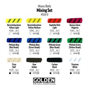
- Heavy-body or soft-body acrylic paint plus flat and round brushes
- Gesso or a primer coat for raw wood or cardboard
- Painter’s tape for straight edges on block letters
- A palette, water jar and paper towels
For walls (legal spots only)
- Spray paint made for art use, which tends to come in low- and high-pressure versions
- Interchangeable caps: skinny caps for lines, fat caps for fills
- A respirator rated for paint fumes and organic vapors, plus nitrile gloves
- Exterior primer or a base coat (a roller works well for big areas)
- A printed or sketched reference of your design
Acrylic Paint vs Regular Paint for Graffiti
“Regular paint” usually means house paint: latex or oil-based coatings designed to cover walls evenly. House paint is useful for rolling a base coat, but it is not made for fine lines, saturated color or layering detail. Artist acrylics and acrylic paint markers carry more pigment in a form you can control, and they dry fast enough to layer outlines and highlights in one session.
| Option | Strengths | Weak spots | Best use |
|---|---|---|---|
| Acrylic paint markers | Precise lines, no mixing, low mess | Slow on big fills, tips wear | Paper, canvas, small panels, outlines |
| Brush-on artist acrylics | Mixable, cheap per area, good blends | Brush marks, slower to work | Canvas pieces with fades and backgrounds |
| Art spray paint | Fast coverage, soft fades, true wall look | Fumes, overspray, needs outdoor space | Walls and large boards |
| House latex paint | Inexpensive, covers large areas | Dull for detail, poor for lines | Background or wall base coat only |
Step 1: Design Your Letters
Every strong piece starts with letters that are built well. Pick a short word, ideally three to five letters. Your name or a nickname is traditional because you will repeat it often and learn its quirks.
- Write the word as a skeleton. Draw each letter as a single line, like a simple print letter. This is your structure.
- Give the skeleton thickness. Draw an outline around each line, keeping the stroke width consistent. For bubble letters, round every corner; for block letters, keep edges straight and parallel.
- Fix the spacing. Letters should touch or overlap slightly so the word reads as one shape. Big gaps make a piece look like separate stickers.
- Adjust the baseline. Tilt some letters, bounce others up or down, but keep the overall word readable.
- Add simple extensions. One or two arrows, a curl off a letter end or a bar connecting two letters adds movement. Start with fewer than you think you need.
Sketch the same word ten or twenty times. It is normal for the first few to look stiff. Each pass, change one thing: letter width, lean, overlap or extension shape.
Step 2: Plan the Color Scheme
Graffiti relies on contrast. A piece with five equally bright colors fighting each other reads worse than one with a clear fill, a dark outline and one accent.
- Fill: one main color or a two-color fade (for example, yellow into orange).
- Outline: a dark color that contrasts with the fill, often black, navy or deep purple.
- 3D or shadow: a mid-to-dark tone that sits behind the letters.
- Highlights: white or a very light tint.
- Background: a color that makes the fill pop, often a cooler or darker hue than the letters.
A simple test is to squint at your color sketch. If the letters still separate clearly from the background when blurred, your value contrast works.
Step 3: Prepare the Surface
On paper, no prep is needed. On canvas, a pre-primed canvas is ready, but raw wood or cardboard should get a coat of gesso so paint does not soak in unevenly. On a wall, clean off dust and loose material, then roll a base coat. A base coat gives spray paint and markers an even surface and helps colors stay bright.
Step 4: Sketch the Outline on the Surface
Transfer your design lightly. On canvas, a light pencil or a pale paint marker works. On a wall, artists often sketch with a light color in thin lines, because the fill will cover it. Keep the sketch loose; you will tighten it with the final outline.
If your design is detailed, draw a simple grid on your sketch and a matching grid on the surface. Copying square by square keeps proportions accurate when you scale up.
Step 5: Lay Down the Fill
Fill the letters first, slightly past your sketch lines. Going a little over is intentional: the outline will cut a clean edge later, and it is easier to cover overspill than to patch gaps.
- Markers: use a broad tip and work in overlapping strokes in one direction. Let the first layer dry before a second pass for solid color.
- Brush acrylics: use a flat brush and two thinner coats rather than one thick coat.
- Spray: hold the can roughly 6 to 12 inches away and keep it moving. Several light passes beat one heavy pass that drips.
For a fade, lay the lighter color first, then bring the darker color in from one side. With acrylics, blend wet-into-wet quickly or use a dry brush to soften the transition. With spray, a soft fade comes from pulling the can back as you mist the edge.
Step 6: Add the Outline
The outline turns a colorful blob into letters. It is also where most beginners struggle, because a shaky outline is very visible.
- Start at a natural corner and move with your whole arm, not just your wrist.
- Keep the line weight consistent around each letter.
- Go slightly faster than feels comfortable. Slow lines wobble; confident lines stay straight.
- Clean up rough edges with a second pass or with background color later.
On canvas, a medium paint marker gives the most control. On walls, a skinny cap and a steady distance from the surface keep lines thin and crisp.
Step 7: Create 3D, Highlights and Background
3D blocks and drop shadows
Choose a light direction, such as top left. Then extend each letter’s edges toward the opposite side (bottom right) with short parallel lines, and connect them. Fill that shape with your shadow color. Keep every extension the same length and angle; inconsistent 3D is one of the quickest ways a piece looks off.
Highlights
Add small white marks on the side facing the light: short lines along edges, a dot or a shine shape on curves. Less is more. A handful of sharp highlights reads as glossy; dozens reads as noise.
Background
The background frames the letters. Bubbles, stars, bricks, a cityscape or a simple gradient all work. Paint it after the letters on canvas, cutting carefully around the outline, or before the outline on a wall so the outline sits cleanly on top. A thin second outline in a contrasting color around the whole piece (sometimes called a cut line) separates letters from a busy background.
Acrylic Paint Tips and Tricks for a Graffiti Look Indoors
If you are working on canvas or panels, these acrylic techniques mimic spray effects without the fumes:
- Sponge or stipple fades: dab two colors with a makeup sponge where they meet for a soft, misty transition.
- Airbrush-style glow: thin white acrylic with water or a glazing medium and dry-brush it lightly around letters.
- Drips: add a drop of water to fluid acrylic, load a round brush, touch the bottom edge of a letter and tilt the canvas so it runs.
- Sharp edges: use painter’s tape for block letters and press the edge down firmly before painting.
- Marker over paint: once brush-on acrylic is fully dry, paint markers glide over it for outlines and highlights.
Painting Tips for Acrylic on Canvas Graffiti Pieces
- Work in thin layers. Thick layers of acrylic can crack or stay tacky.
- Keep a damp paper towel nearby to wipe marker tips clean when switching from dark to light.
- Prime marker tips on scrap paper before touching the canvas, so the first stroke is not a blob.
- Seal finished pieces with a clear acrylic varnish once the paint has cured, which also protects marker work from scuffs.
Common Mistakes Beginners Make
- Skipping the sketch. Improvising letters on the surface almost always leads to cramped spacing on the last letter.
- Too many arrows. Extensions should add energy, not hide the word.
- Low contrast. Similar values in fill and background make the piece disappear from a distance.
- Uneven 3D. Changing the shadow angle partway through breaks the illusion.
- Heavy coats. Thick spray or paint leads to drips and long drying times.
- Ignoring safety. Spray paint should be used outdoors with a proper respirator, not a dust mask.
A Simple Practice Plan
| Week | Focus | Exercise |
|---|---|---|
| 1 | Letter structure | Draw the alphabet in bubble letters, then in block letters |
| 2 | One word | Sketch your word 20 times, changing one feature each time |
| 3 | Color | Color three versions with different palettes and compare contrast |
| 4 | Full piece on canvas | Paint fill, outline, 3D, highlights and background in order |
| 5 and on | Scale and surface | Move to larger panels or a legal wall |
Safety and Cleanup
Spray paint releases fumes and fine mist, so wear a respirator with organic-vapor cartridges, gloves and old clothes, and paint outdoors or in a very well ventilated space. Acrylic paint and acrylic markers are water-based and easier to manage indoors, but still keep them away from food areas. Wash brushes in water before acrylic dries. Store spray cans away from heat, and never puncture or burn them.
FAQs
How do you paint graffiti art for beginners?
Start with bubble letters on paper. Sketch the skeleton, add thickness, fill with color, outline in a dark contrasting color, then add a simple shadow and a few highlights. Repeat on canvas with paint markers before trying walls.
Can acrylic be painted over spray paint?
Generally yes, once the spray paint is fully dry. Lightly scuffing a glossy spray surface helps acrylic grip. Test a small area first, because some formulations behave differently.
Can you do graffiti with acrylic paint?
Yes. Brush-on acrylics and acrylic paint markers are popular for canvas and indoor graffiti. You will not get the exact misty spray texture, but sponging and dry brushing come close.
What is the easiest graffiti style to learn?
Throw-ups and bubble letters are the easiest. They use only a few colors and teach clean fills and outlines.
Do I need special spray paint for graffiti?
Art spray paints tend to offer better color ranges, pressure options and cap compatibility than hardware-store cans, which helps control. Hardware cans can still work for base coats.
How long does it take to get good at graffiti?
It varies. Consistent sketching for a few months usually brings noticeable improvement in letter structure, and can control develops with time on legal walls.
Next Step
Once your letters work on paper, the right tools make the jump to canvas and walls much easier. Browse our comparison of the best acrylic paint sets, markers and spray paints for graffiti to pick a starter kit that matches the surface you plan to paint.