Quick answer: To set up a color palette for painting, pick a small set of colors (a warm and cool version of each primary, one or two earths and white), then place them around the edge of your palette in a fixed order, usually white in one corner followed by yellows, reds, blues and earth tones. Leave the center open for mixing, and use the same layout every session so your hand finds each color without looking.
A well-arranged palette is quiet infrastructure. It doesn’t make the painting for you, but it removes dozens of small decisions so you can keep your attention on the subject. Learning how to set up a color palette for painting comes down to three choices: which colors you put out, where each one goes, and how much of each you squeeze.
This guide covers all three for acrylic, oil and watercolor, with sample layouts, pigment suggestions and a routine for building and testing your own color palette. The physical palette matters too; a cramped one forces muddy mixes, so if you are still choosing a surface, see our comparison of the best small palettes for detail painting.
What a Color Palette for Painting Actually Means
The word “palette” does double duty. It is the physical surface you mix on and the group of colors you choose for a painting. Setting up a good color palette means getting both right at once: a surface big enough to mix on, holding colors that can reach every hue the painting needs.
Painters who reach for 20 tubes often end up with less harmony, not more, because every color brings its own temperature and strength. Most experienced painters work from 6–12 colors, and many work from far fewer.
Step 1: Choose Your Colors
The most flexible starting point is a split-primary palette: a warm and a cool version of each primary. Warm and cool here describe the bias of each color. A cool red leans toward blue; a warm red leans toward yellow. Mixing two colors that lean toward each other gives clean secondaries; mixing two that lean away gives duller, more neutral ones. Having both lets you choose.
| Role | Common choice | Typical pigment code | What it mixes well |
|---|---|---|---|
| Cool yellow | Lemon yellow / hansa yellow light | PY3, PY175 | Clean greens |
| Warm yellow | Cadmium yellow medium / hansa yellow deep | PY35, PY65 | Oranges, warm skin and light |
| Warm red | Cadmium red light / pyrrole red | PR108, PR254 | Bright oranges, warm darks |
| Cool red | Quinacridone rose / alizarin crimson | PV19, PR83 | Purples, pinks |
| Warm blue | Ultramarine blue | PB29 | Violets, grays, shadows |
| Cool blue | Phthalo blue (green shade) | PB15:3 | Greens, turquoise |
| Earths | Yellow ochre, burnt sienna | PY43, PBr7 | Natural tones, quick neutrals |
| White | Titanium white | PW6 | Tints, opacity (not used in watercolor) |
Pigment codes are printed on most artist-grade tubes and are more reliable than color names, which vary between brands. Two tubes both called “permanent rose” can contain different pigments.
Optional additions
- Burnt umber for fast, warm darks without black.
- Payne’s gray or a mixed neutral for watercolor skies and shadows.
- A convenience green such as sap or phthalo green, if you paint a lot of landscapes.
Step 2: Decide on a Layout
There is no single correct order, but there are good principles. Choose one and stick with it; consistency is the whole point.
The spectrum layout
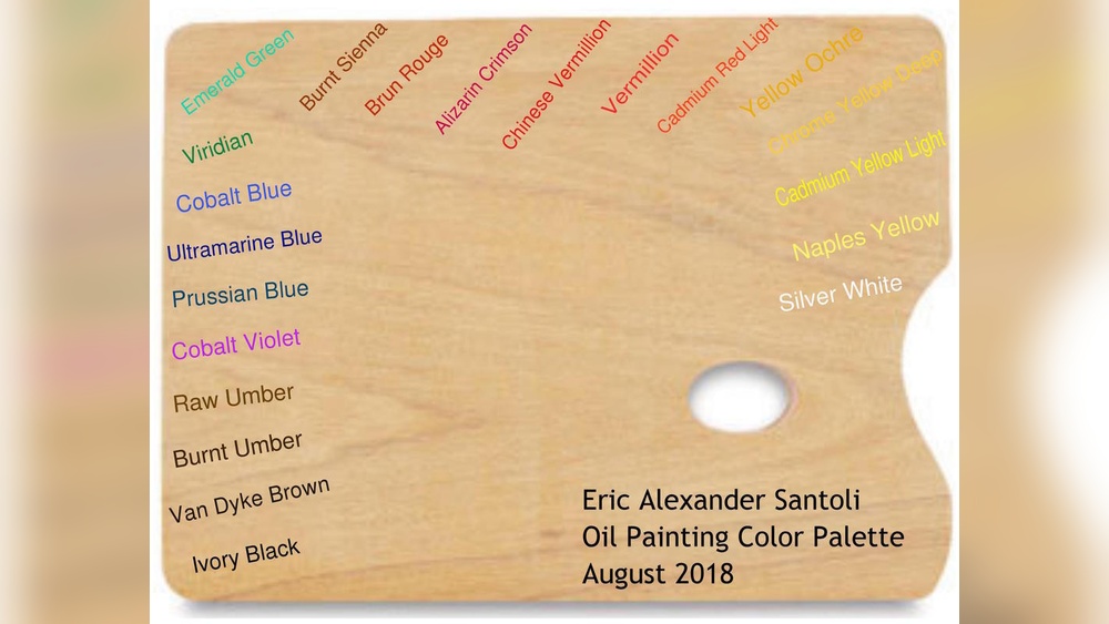
Place colors around the edge in rainbow order: white, lemon yellow, warm yellow, warm red, cool red, ultramarine, phthalo blue, then the earth tones. Neighbors are related colors, so accidental contamination between them is less destructive.
The value layout
Arrange colors from lightest to darkest: white, yellows, oranges and ochres, reds, then blues and darks. Painters who think in value first find this intuitive because the palette reads like a value scale.
The warm/cool split
Put warm colors along one edge and cool colors along the other, with white at the corner where they meet. This is popular with landscape painters who constantly shift temperature between light and shadow.
Whichever you choose, follow these rules:
- Keep paint on the outer edge, at least 1–2 inches apart, so piles don’t merge.
- Put white where you can reach it from the mixing area without dragging your brush through another color.
- Leave the center (at least half the surface) clear for mixing.
- If you are right-handed, many painters put white and the most-used colors on the right side, closest to the brush hand. Left-handers flip it.
Step 3: How Much Paint to Squeeze Out
Too little and you interrupt yourself to refill; too much and it dries or gets wasted. Rough guides by medium:
| Medium | Colors | White | Notes |
|---|---|---|---|
| Acrylic | Pea to marble size | 2–3 times the color amount | Dries fast; refill as needed |
| Oil | Marble to grape size | A large walnut-size pile | Stays workable for hours |
| Watercolor (tubes) | Fill a well halfway to full | Not used | Can dry in the well and be rewet |
| Gouache | Pea size | Generous, used for tints | Rewets but loses creaminess |
White disappears fastest because nearly every opaque mix uses it. Running out of white mid-passage is one of the most common causes of inconsistent color.
How to Set Up a Watercolor Palette
Watercolor setup is different because paint is often prepared in advance. Most watercolorists fill their palette wells once and let the paint dry, then rewet it each session.
- Squeeze each tube into its own well, filling it about two-thirds full.
- Tap the palette gently on the table to level the paint and release air bubbles.
- Let it dry flat for 24–48 hours, uncovered, before closing the lid. Some honey-rich paints stay slightly soft and may need longer.
- Label each well with the color name and pigment code on a strip of tape or on a swatch card kept with the palette.
- Before painting, mist the wells with a spray bottle and wait a minute or two so the surface softens.
How to set up a watercolor palette for beginners
A beginner watercolor setup can be as simple as six wells: lemon yellow, warm yellow, a warm red, a cool red, ultramarine and phthalo blue, plus burnt sienna if there’s room. Arrange them in spectrum order with the largest open mixing wells or flat areas next to the blues, because blue mixes (skies, shadows, greens) tend to need the most water and space.
Leave one or two empty wells for a mixed gray or a convenience color you discover you use often. Avoid filling every slot of a 24-well palette on day one; most of those colors will go unused while you learn mixing.
Acrylic and Oil Palette Setup Differences
The color order can be identical across media, but the logistics aren’t.
- Acrylic dries in minutes, so squeeze less and keep a spray bottle nearby to mist the piles. A stay-wet palette extends working time to days; our explainer on what a wet palette is shows how the sponge and membrane system works.
- Oil stays open for hours or days, so you can lay out more and keep the layout between sessions. Toning a glass palette mid-gray (with gray paper underneath) helps judge values, because colors look different against bright white.
- Gouache behaves like a cross between the two: it rewets like watercolor, but rewet gouache gets chalky, so many painters put out fresh paint each session.
How to Build a Color Palette for a Specific Painting
Your standard layout covers most work, but a deliberate, painting-specific palette creates stronger color harmony. A simple process:
- Identify the dominant temperature. Is the subject mainly warm (sunset, interior lamplight) or cool (snow, overcast seascape)?
- Pick one dominant hue family and one accent. A seascape might be mostly blue-greens with a small orange accent.
- Remove colors you won’t need. Taking the cool red off the palette for a misty landscape prevents stray purples.
- Premix key colors. Mix the three or four main colors in quantity before you start (sky, main shadow, main light, dominant local color) so you can return to them.
- Test on scrap. Paint small swatches side by side on the same surface you’ll use; colors shift when dry, especially acrylics, which often dry slightly darker.
How to make a color palette from a reference photo
Squint at the reference or blur it on a screen. Identify the five or six biggest color shapes and mix a swatch for each. Those swatches become your palette for that painting. If you can’t mix a swatch with your current colors, that tells you what’s missing before you begin.
How to Use a Color Palette Once It’s Set Up
Setting up is half the habit; using the palette cleanly is the other half.
- Pull, don’t dip. Take paint from the edge of each pile into the mixing area with a brush or knife, so the pile itself stays pure.
- Mix in separate zones. Keep lights in one area and darks in another. Dragging a dark mix through a light one is the fastest route to mud.
- Wipe or rinse between mixes. A rag for oil and acrylic, clean water for watercolor.
- Use a palette knife for large mixes. It blends evenly without wearing brushes.
- Scrape the mixing area mid-session when it gets crowded, rather than squeezing mixes into the last clean corner.
How to Set Up an Easel and Palette Together
Where the palette sits relative to the easel affects how often you look away from the painting. Place the palette on a table or tray at roughly waist height, on the same side as your brush hand, and close enough that you can reach it without stepping. Light the palette and the canvas with the same light source; if the palette is under a warm lamp and the canvas under a cool window, your mixes won’t match on the canvas.
Sample Palette Setups by Subject
Your base layout can stay the same while the colors on it shift with the subject. Three examples show how small changes add up:
- Landscape: lemon yellow, yellow ochre, cadmium red light, ultramarine, phthalo blue, burnt sienna and white. Dropping the cool red cuts down on accidental purples in foliage, and the two blues cover both warm distant hills and cool greens.
- Portrait: yellow ochre, cadmium red light, alizarin or quinacridone rose, ultramarine, burnt umber and white. Skin mixes come mostly from the earths and warm red; the blue cools half-tones and backgrounds.
- Floral still life: the full split-primary set plus a quinacridone magenta, since saturated pinks and violets are hard to mix from earth colors.
Keep each color in the same position even when you leave some out. An empty slot is better than shuffling the order.
Common Color Palette Setup Mistakes
- Too many colors. More tubes mean more contamination, more cost and less harmony.
- Changing the layout every session. You lose the muscle memory that makes a layout useful.
- Crowding the edge. Piles that touch merge within minutes.
- A palette that’s too small. If the mixing area is the size of your hand, mixes overlap and turn gray.
- Skipping a mixing chart. Without one you won’t know what your colors can and can’t do.
When you finish, clean up while paint is still soft. Our step-by-step palette cleaning guide covers each medium.
FAQs
How do you set up a watercolor palette?
Squeeze each tube into its own well about two-thirds full, tap to level it, and let it dry for 24–48 hours before closing the lid. Arrange colors in spectrum or warm-to-cool order and label each well. Mist the paint before each session to reactivate it.
What is the best color palette for beginners?
A split-primary set is a strong start: a warm and cool yellow, red and blue, plus yellow ochre, burnt sienna and titanium white for opaque media. It mixes nearly every hue and teaches color temperature without overwhelming you.
What order should colors go on a palette?
There is no single rule, but most painters use spectrum order (yellows, reds, blues, earths) or light-to-dark order, with white placed where it’s easy to reach. The best order is the one you repeat every time.
How many colors should be on a painting palette?
Six to twelve covers most needs. Many painters do excellent work with three primaries and white, and adding more colors rarely solves mixing problems on its own.
Should I put black on my palette?
It’s optional. Mixed darks from ultramarine and burnt umber or burnt sienna are often livelier than tube black. Black is useful for certain limited palettes and for very deep darks, but use it sparingly to avoid flat, dead shadows.
How do you use a color palette to keep colors clean?
Pull paint from the edge of each pile into a separate mixing area, wipe or rinse the brush between mixes, and keep light and dark mixes in different zones. Clean the mixing area when it gets crowded instead of mixing on top of old paint.
Next Step
Pick a split-primary set, choose one layout and use it for your next five sessions without changing it. After that, adjust only what you actually missed. The right physical surface makes this easier; compare sizes and materials in our guide to the top compact palettes for precise color mixing.