Choosing the best palette for advertising illustration can boost your design’s impact. Colors shape how people see and feel about your message.
What Makes the Best Palette for Advertising Illustration
A palette is more than a handful of pretty colors. In advertising it is a working tool: it must attract attention, communicate a mood in a glance, stay legible next to text, and hold up when the artwork is printed on posters, packaging, screens or products such as cushions and mugs. The best palette for advertising illustration is therefore built around a goal, an audience and a medium, not a personal favorite.
The building blocks of a campaign palette
- A dominant color that carries the brand or theme and covers most of the space.
- A supporting color that sits next to the dominant one and adds variety without fighting it.
- An accent color used sparingly for the focal point, such as a price badge, a headline word or a key object.
- Neutrals like off-white, charcoal or warm gray that give the eye a place to rest and keep text readable.
A common rule of thumb is to give roughly sixty percent of the area to the dominant color, thirty percent to the supporting color and ten percent to the accent. It is a starting point, not a law, but it helps beginners avoid palettes where every color shouts at once.
Color relationships that work in ads
| Scheme | How it works | Typical advertising effect |
|---|---|---|
| Complementary | Opposites on the color wheel, such as blue and orange | High contrast and energy |
| Analogous | Neighbors on the wheel, such as yellow, orange, red | Harmonious and warm or cool as a whole |
| Triadic | Three evenly spaced hues | Playful, balanced, good for festive themes |
| Split complementary | One hue plus the two neighbors of its opposite | Contrast with less tension |
| Monochromatic | One hue in multiple tints and shades | Elegant, clean and calm |
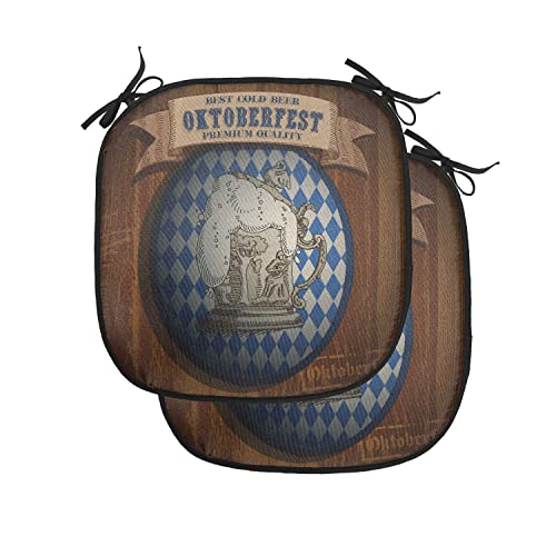
A good palette uses colors that fit the product and catch attention. For example, warm tones like brown and blue work well in Oktoberfest chair cushions, creating a cozy and inviting look. Red, black, and white colors suit casino-themed designs, giving a bold and energetic feel.
Using the right colors helps highlight key features and makes the product memorable. Simple, clear palettes improve communication and make ads easier to understand. This guide explores how to pick the best colors for different advertising illustrations. It shows how color choices affect mood and style in marketing materials.
Lunarable Oktoberfest Chair Cushion Pads Set Of 2

The Lunarable Oktoberfest Chair Cushion Pads Set of 2 is ideal for individuals who love to add both comfort and a touch of festive style to their seating areas. Perfect for those who enjoy hosting gatherings or simply want to enhance their kitchen or patio chairs, these cushions cater to anyone seeking durable and visually appealing seat padding with a classic Oktoberfest theme. If you appreciate quality craftsmanship and want to celebrate the spirit of Oktoberfest while enjoying your favorite cold beer, this set is a great choice.
Pros:
- Featuring a premium quality classic advertising illustration that adds charm and character
- Anti-slip backing ensures the cushions stay securely in place during use
- Comfortable 16″x16″ size with 1.38 inches thickness for enhanced seating comfort
- Durable construction ideal for both kitchen and patio chairs
- Lightweight design at only 13.4 ounces for easy handling and portability
- Attractive brown and blue color scheme that complements various décor styles
Cons:
- May not fit larger or unusually shaped chairs perfectly
- Limited to the Oktoberfest-themed design, which might not suit all tastes
The Lunarable Oktoberfest Chair Cushion Pads offer a blend of style and functionality with their thoughtfully designed dimensions and attractive artwork. Each cushion measures 16″x16″ with a thickness of 1.38 inches, providing ample padding that transforms hard chairs into comfortable seating options. The anti-slip feature is especially beneficial for outdoor use on patio furniture, helping to maintain stability and prevent slipping during social gatherings or everyday use.
Crafted by Lunarable, these cushions are lightweight yet durable, making them easy to move and store when not in use. The appealing brown and blue color combination, paired with a classic Oktoberfest advertising illustration, adds a festive ambiance to any setting. Whether you are looking to brighten up your kitchen chairs or enhance your patio seating, these cushion pads provide a practical and decorative solution that celebrates tradition while offering superior comfort.
To buy this product, click here.
Lunarable Casino Chair Cushion Pad

The Lunarable Casino Chair Cushion Pad is ideal for individuals who enjoy adding a touch of personality and comfort to their seating areas, particularly those who appreciate gaming-themed decor. Whether you’re a casino enthusiast, a frequent host of game nights, or simply looking to enhance your kitchen or patio chairs with stylish and functional padding, this cushion pad is designed to meet your needs.
Pros:
- Features a vibrant Red Black White card suits design that adds a unique entertainment vibe to any space.
- Measures a comfortable 16″x16″ with a thickness of 1.38 inches for enhanced seat comfort.
- Equipped with an anti-slip backing to keep the cushion securely in place on various chair surfaces.
- Lightweight at only 6.7 ounces, making it easy to move or carry around.
- Durable seat padding suitable for both indoor and outdoor use, such as in kitchens and patios.
Cons:
- May not provide adequate cushioning for those requiring extra thick padding for extended sitting periods.
- The gaming illustration might not suit more formal or minimalist decor styles.
Crafted by Lunarable, this Casino Chair Cushion Pad offers a blend of style and comfort with its bold card suits advertising design. The striking color palette of red, black, and white makes it a focal point in any room, especially for spaces dedicated to leisure and gaming. Its 16″x16″ dimensions fit most standard chairs, providing a cozy surface that enhances sitting experience without overwhelming the seat.
The anti-slip backing ensures that the cushion remains firmly in place, preventing any sliding or shifting that could cause discomfort or accidents. Additionally, its lightweight construction allows for easy portability, enabling users to switch it between kitchen chairs, patio seats, or even outdoor benches. This cushion pad not only boosts comfort but also serves as a decorative accessory that highlights the owner’s passion for entertainment and gaming culture.
To buy this product, click here.
Asian Times

The Asian Times is ideal for readers who are passionate about staying informed on current events, cultural insights, and in-depth analysis related to Asia. Whether you are a student, professional, or enthusiast seeking reliable and comprehensive news coverage, this publication caters to those who value quality journalism focused on the Asian continent.
Pros:
- Provides extensive coverage of Asian news and events.
- Offers insightful analysis and expert opinions.
- Suitable for a diverse audience interested in Asian culture and politics.
Cons:
- Lacks detailed specifications or specialized focus areas.
- May not cover global news extensively outside Asia.
The Asian Times excels in delivering a wide range of news stories that highlight the dynamic political, economic, and cultural landscapes across Asia. Its content is designed to keep readers well-informed about regional developments, helping them understand the complexities and nuances that shape the continent. This benefit is particularly valuable for anyone needing trusted information for academic research, business decisions, or personal interest.
Additionally, the publication’s emphasis on expert analysis provides readers with deeper insights beyond basic news reporting. This feature enhances the reader’s comprehension and engagement, making it easier to grasp the significance of ongoing events. Overall, the Asian Times serves as a reliable resource for those dedicated to following Asian affairs with clarity and depth.
To buy this product, click here.
How to Build a Palette for Advertising Illustration Step by Step
- Write the message in one sentence. Is it cozy, luxurious, thrilling, fresh? The adjective guides the color family.
- Study the audience and the setting. A seasonal festival design, a gaming-night design and a wellness design call for different emotional temperatures.
- Pick the dominant color first. Choose it from the mood, then test two or three supporting colors beside it.
- Add one accent. Place it where you want the viewer to look first. If everything is an accent, nothing is.
- Check value, not just hue. Convert a draft to grayscale. If key shapes disappear, the lights and darks need more separation.
- Test the text. Put the headline over the artwork and check legibility at small sizes and at a distance.
- Review across media. A color on a bright screen may look different when printed, so check proofs or swatches when the piece will be physical.
- Save the palette. Record the exact color values so later pieces in the campaign stay consistent.
Palette Ideas for Seasonal and Themed Advertising
Festival and harvest themes
Warm ambers, deep browns, cream and a cool blue accent create a cozy, celebratory feeling. The blue prevents the scheme from becoming muddy, while cream keeps the illustration bright enough for text. This kind of balance is the logic behind many Oktoberfest-style designs.
Game night and casino themes
Red, black and white is a classic high-contrast scheme. Red adds urgency, black adds drama and white gives structure. Keep the red for focal elements and let black and white organize the layout.
Travel and cultural themes
Rich saturated hues combined with muted backgrounds help detailed motifs read clearly. Limit the number of saturated colors so busy patterns do not become noisy.
Fresh and wellness themes
Soft greens, sky blues and warm whites feel airy. A small coral or yellow accent keeps the design from fading into the background.
Why Color Psychology Is a Guide, Not a Guarantee
People often say red excites, blue calms and green signals nature. These associations have some cultural weight, but they shift between regions, age groups and contexts. Research findings on color and emotion are mixed, so treat them as hypotheses to test. If you are producing work for an international audience, ask whether the colors carry any unintended meaning in the target market. Context, contrast and clarity often matter more than a single hue.
Frequently Asked Questions
What Makes Lunarable Oktoberfest Chair Cushions Ideal For Advertising?
Lunarable Oktoberfest cushions feature vibrant classic advertising illustrations. They combine comfort with themed design, perfect for kitchen and patio use. The anti-slip backing ensures stability. Their premium quality materials enhance durability. These cushions boost ambiance while promoting Oktoberfest themes effectively.
How Does The Anti-slip Feature Improve Seat Cushion Usability?
The anti-slip backing prevents cushions from sliding on smooth surfaces. This ensures safety and comfort during use. It keeps cushions securely in place on chairs, both indoors and outdoors. The feature is essential for active settings like patios and kitchens.
It enhances user experience and convenience.
Why Choose Lunarable Casino Chair Cushions For Gaming Spaces?
Lunarable Casino cushions showcase card suits and gaming-themed illustrations. They add a playful, leisure vibe to any seating area. The anti-slip backing provides secure seating during gameplay. Their durable fabric suits both indoor and outdoor environments. These cushions enhance the gaming atmosphere stylishly.
What Size Are The Lunarable Chair Cushions?
Both Oktoberfest and Casino cushions measure 16″x16″. This size fits most standard kitchen and patio chairs comfortably. The dimensions provide ample padding without overwhelming the chair design. This makes them versatile for various seating arrangements. The size supports ergonomic seating and decor.
Can These Cushions Withstand Outdoor Use?
Yes, both cushion sets are designed for indoor and outdoor use. Their materials resist wear from sun exposure and moisture. The anti-slip backing also helps maintain position on outdoor furniture. They are easy to clean, supporting outdoor durability. These cushions combine style with practical outdoor performance.
Using a Palette on Products and Printed Goods
When an illustration is printed on household goods like seat cushions, the same palette rules apply, with a few practical additions. Large flat areas of color look cleaner than tiny, low-contrast details, because fabric texture and print resolution soften fine lines. Dark backgrounds can hide small elements, while very light ones can make a design look washed out. Think about the surroundings as well: a product with a brown and blue scheme sits comfortably in neutral kitchens, while a bold red and black scheme makes more of a statement and may need calmer furniture around it.
If you are choosing a ready-made illustrated product instead of designing one, use the same checklist: dominant color, accent, contrast and fit with your space. Compare the product description on Amazon for sizes and materials, and choose the design whose color mood matches the way you plan to use it.
Palette Mistakes to Avoid
- Using too many saturated hues in one illustration.
- Placing similar-value colors next to each other so shapes blur together.
- Putting thin light text on a busy mid-tone background.
- Ignoring color-blind viewers: avoid relying only on red versus green to convey differences, and add shape or label cues.
- Changing the palette from piece to piece in a campaign, which weakens recognition.
Conclusion
Choosing the right colors can make your advertising illustration stand out. The palettes used in the Lunarable Oktoberfest and Casino Chair Cushion Pads show how simple colors create strong messages. Brown, blue, red, black, and white work well together to catch attention and fit the theme.
These colors also help viewers connect with the product quickly. Using easy, clear colors makes your design more memorable. The anti-slip seat padding examples prove that practical items can look great with the right palette. Whether for kitchen or patio, the colors match the mood and purpose perfectly.
Keep your palette simple but meaningful. This helps your audience understand and enjoy your message without confusion. Good color choices support your advertising goals and make your illustration effective. Always think about the feeling and message your palette sends. That is the key to good advertising illustration.