Mixing paint looks simple on a color wheel and gets confusing the moment real tubes hit the palette. Red and blue make a dull brown instead of purple, a green turns muddy, and a skin tone that looked right wet dries a shade too dark. This guide to how to mix acrylic paint colors explains why that happens and gives you exact starting mixes, ratios and a chart routine you can use on every painting.
Quick answer: To mix acrylic paint colors cleanly, use a split-primary palette (a warm and a cool version of red, yellow and blue) plus white, and combine colors that lean toward each other: cool red with cool blue for bright purple, cool yellow with cool blue for bright green, warm yellow with warm red for bright orange. Always add the darker or stronger color to the lighter one in tiny amounts, mix thoroughly with a palette knife, and test a dried swatch because acrylic dries slightly darker.
Why Mixes Go Muddy: Color Bias Explained
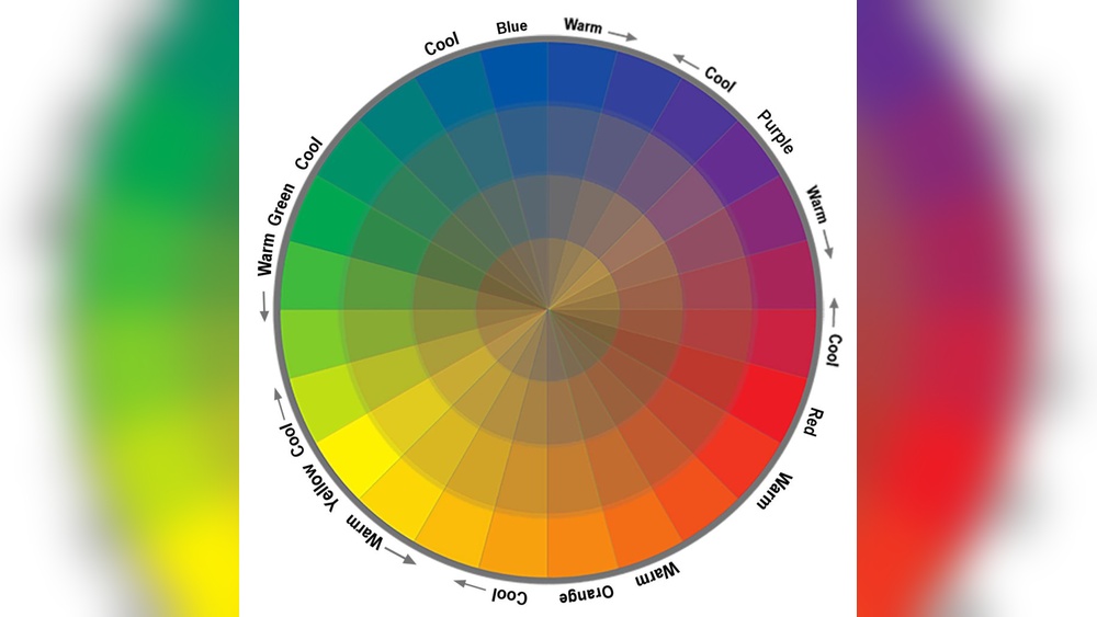
Basic color wheels assume perfect primaries. Real pigments don’t work that way. Every red, yellow and blue leans toward one of its neighbors on the wheel, and that lean is called bias.
- Cadmium red or pyrrole red leans toward orange (warm red).
- Quinacridone magenta or alizarin-type crimson leans toward purple (cool red).
- Ultramarine blue leans toward purple (warm blue).
- Phthalo blue leans toward green (cool blue).
- Cadmium yellow medium leans toward orange (warm yellow).
- Lemon yellow or hansa yellow light leans toward green (cool yellow).
When you mix two colors, any hint of the third primary in either one dulls the result. Cadmium red contains a touch of yellow, so mixing it with ultramarine gives you red + blue + a little yellow, which is a muted, brownish purple. Swap in quinacridone magenta, which has no yellow lean, and the same blue gives a clean violet.
Understanding this one idea solves most “how do colors mix” frustration.
What Colors to Buy: A Split-Primary Starter Palette
You can mix almost anything from a small set. A practical starter palette for acrylic color mixing looks like this:
| Role | Warm version | Cool version |
|---|---|---|
| Red | Cadmium red medium (or pyrrole red) | Quinacridone magenta or crimson |
| Yellow | Cadmium yellow medium | Lemon yellow / hansa yellow light |
| Blue | Ultramarine blue | Phthalo blue (green shade) |
| Extras | Titanium white, burnt umber, and optionally burnt sienna and yellow ochre | |
Pigment names matter more than marketing color names. “Primary blue” from one maker may be phthalo while another uses a blend. Check the pigment code on the label (for example PB15 for phthalo blue, PB29 for ultramarine). If you’re building a set, our guide to the best acrylic paint brands for color mixing compares pigment quality and single-pigment options.
How to Mix Acrylic Paint Colors Chart: Core Recipes
Use these as starting points. Ratios are approximate, by volume, and vary with each brand’s tinting strength.
| Target color | Mix | Starting ratio | Tip |
|---|---|---|---|
| Bright orange | Cadmium yellow medium + cadmium red | 3 : 1 | Add red gradually; it dominates |
| Bright green | Lemon yellow + phthalo blue | 5 : 1 or more | Phthalo is very strong; use a tiny touch |
| Olive / natural green | Cadmium yellow + ultramarine | 3 : 1 | Add a speck of red to deepen further |
| Clean violet | Quinacridone magenta + ultramarine | 1 : 1 | Add white for lavender |
| Muted plum | Cadmium red + ultramarine | 1 : 1 | Expect a dull, brownish purple |
| Brown | Orange + blue, or all three primaries | 2 : 1 (orange : blue) | Shift warmer with red, cooler with blue |
| Chromatic black | Phthalo blue + burnt umber (or alizarin + phthalo green) | 1 : 1 | Richer than tube black; reads as dark color |
| Neutral gray | Ultramarine + burnt umber + white | 1 : 1 : white to taste | Tip warmer or cooler as needed |
| Sky blue | White + phthalo or ultramarine | 10 : 1 | Add blue to white, never the reverse |
| Light skin base | White + yellow ochre + cadmium red | 6 : 1 : small touch | Adjust with burnt sienna and a hint of blue for shadows |
| Deep skin base | Burnt umber + burnt sienna + white | 2 : 1 : small touch | Add ultramarine for cool shadows, cadmium red for warmth |
| Teal / turquoise | Phthalo blue + small amount phthalo green or lemon yellow + white | 2 : 1 : white to taste | Great for tropical water |
How to Mix Acrylic Paint Colors for Beginners: Step by Step
- Squeeze out small amounts of each color around the edge of your palette, leaving the center for mixing. Keep colors in the same order every time so you reach for them without thinking.
- Start with the lighter color. Put the lighter or weaker color down first, then add the darker or stronger one in tiny amounts. It takes a lot of yellow to lighten a blue, but only a speck of blue to darken a yellow.
- Use a palette knife. Fold and press the paint together until there are no streaks. Brushes trap unmixed paint in the bristles and wear out faster.
- Mix more than you need. Matching a mixed color later is hard, so make about 30 percent extra for anything you’ll use across a large area.
- Test a swatch. Brush a small patch on a scrap of the same surface and let it dry. Acrylic usually dries a little darker because the milky binder turns clear.
- Adjust in small steps. Too bright? Add a touch of its complement. Too dark? Add more of the lighter base color rather than white if you want to keep saturation.
- Keep mixes workable. Mist the palette with water or use a stay-wet palette so paint doesn’t skin over while you work.
Tints, Shades and Tones
Three simple adjustments create almost endless variety from one mix:
- Tint: add white. It lightens but also cools and slightly chalks the color. Phthalo blue plus white stays vivid; cadmium red plus white becomes a cooler pink.
- Shade: add a dark. Tube black can make colors look dead, especially yellows, which turn olive. Instead, darken with the color’s complement or a deeper version of the same hue, such as burnt umber for warm colors or ultramarine for cool ones.
- Tone: add gray, or a mix of the complement and white. It softens saturation without changing value much, which is useful for backgrounds and distance.
Warm and Cool Neutrals
Grays and browns don’t have to look dead. A gray mixed from ultramarine, burnt umber and white can lean warm or cool depending on which color dominates, and that small shift changes how it sits in a painting. Warm grays come forward and feel sunlit; cool grays recede and feel shadowed or distant. Mix two versions of each neutral you plan to use, one tipped toward blue and one toward brown, and use them side by side in stone, clouds, wood or shadows for subtle variety without adding new colors.
Neutralizing With Complements
Complementary pairs sit opposite each other on the wheel: red and green, blue and orange, yellow and purple. Adding a little of one to the other lowers saturation and creates natural, believable colors. A touch of red in a too-bright green produces a convincing foliage green. A bit of orange in sky blue near the horizon creates atmospheric haze.
Mix them in equal intensity and you get a neutral brown or gray. That’s why many painters skip tube grays entirely and mix their own from complements, so the neutrals harmonize with the rest of the painting.
Make Your Own Color Mixing Chart
A personal mixing chart teaches you more than any printed one, because it uses your exact paints.
- On a sheet of primed paper or canvas pad, draw a grid with one row and one column for each color you own.
- Paint each pure color down the left column and across the top row.
- In each square, mix the row color with the column color, roughly 1 : 1.
- Add a second chart for each color mixed with white in three steps: 3 : 1, 1 : 1 and 1 : 3.
- Label everything with pigment names and keep it near your painting area.
A six-color palette gives you 15 two-color mixes plus tints, which covers the needs of most landscapes and still lifes.
Tinting Strength: Why Some Colors Take Over
Pigments differ hugely in strength. Phthalo blue and phthalo green can overpower a mix at a ratio of 1 part to 20 parts or more, while yellow ochre and many yellows are weak. Always add strong colors in tiny amounts with the tip of a palette knife. If a mix goes too far, take a small portion of it into a new pile and adjust that, rather than adding paint endlessly to the original.
Strength varies by brand and grade, too. Student paints often contain more filler, so you may need more paint for the same intensity. Comparing pigment loads is one reason a detailed review of a specific acrylic range can be useful before buying.
Good Color Mix for Painting Common Subjects
| Subject | Mix suggestion |
|---|---|
| Summer foliage | Cadmium yellow + ultramarine, darkened with burnt umber |
| Distant hills | Ultramarine + a touch of cadmium red + plenty of white |
| Sunset sky | Cadmium yellow, cadmium red and quinacridone magenta in bands, each lightened with white |
| Shadows on snow | White + ultramarine + a whisper of magenta |
| Weathered wood | Burnt umber + ultramarine + white for gray, with burnt sienna accents |
| Ocean water | Phthalo blue + burnt umber for depths, phthalo + lemon yellow + white for shallows |
Can You Mix Acrylic With Gouache or Watercolor?
Can you mix acrylic and gouache?
You can use them together, but physically mixing them in one puddle is unpredictable. Traditional gouache stays water-soluble after drying, while acrylic doesn’t, so a mixed layer can partially rewet and smear. Many artists layer them instead: gouache washes first, then acrylic on top, or acrylic underpainting with gouache details. Acrylic gouache, a separate product, behaves like acrylic and mixes freely with regular acrylic.
Can you mix watercolor and acrylic?
Mixing them in one puddle weakens the acrylic film and creates uneven results. Layering works better: watercolor first on paper, then acrylic over the top once it’s dry. Acrylic beneath watercolor tends to resist the watercolor because the dried acrylic film isn’t absorbent.
Common Color Mixing Mistakes
- Using black to darken everything. It flattens colors. Use complements or deeper hues.
- Using white to lighten everything. It chalks and cools. For bright light colors, lighten with yellow or a lighter version of the hue first.
- Over-mixing on the canvas. Acrylic sets fast and turns muddy if you scrub colors together as it dries.
- Too many colors in one mix. Three pigments are usually the limit before things turn gray-brown.
- Ignoring bias. Choosing the wrong red or blue causes most dull purples and greens.
- Judging color while wet. Wait for a dried swatch before matching critical areas.
FAQs
What colors do you mix to get brown with acrylic paint?
Mix orange with blue, or combine all three primaries. Equal-ish amounts of cadmium red, cadmium yellow and ultramarine give a warm brown; add more blue for a cooler brown or white for tan.
What are the basic colors needed for acrylic color mixing?
A warm and cool red, yellow and blue plus titanium white covers almost everything. Burnt umber is a helpful seventh color for browns and neutral darks.
Why does my acrylic paint look different when dry?
The binder in wet acrylic is milky and turns transparent as it dries, so colors appear slightly darker and more saturated. Test swatches help you compensate.
How do you keep mixed acrylic paint from drying out?
Use a stay-wet palette, mist the paint with water every few minutes, or store mixes in small airtight containers. A slow-drying medium can also extend working time.
How do I mix a color to match something exactly?
Identify the hue first, then the value (light or dark), then the saturation. Mix the hue, adjust lightness with white or the base color, and dull it with its complement. Compare dried swatches against the target in the same light.
Can you mix different brands of acrylic paint?
Yes. Most artist acrylics are compatible across brands. Consistency and tinting strength may differ, so adjust ratios by eye.
Final Thoughts
Clean color mixing comes down to choosing pigments with the right bias, adding strong colors to weak ones in small steps, and testing dried swatches. Build a personal chart once and you’ll mix faster and waste far less paint.
The quality of the pigments in your tubes sets the ceiling for how clean your mixes can get. Single-pigment, well-loaded paints make every recipe above more predictable, and you can compare them in our roundup of the best acrylic paint for artists at every level.