Have you ever stared at your digital artwork and felt like the background just doesn’t quite fit or bring your piece to life? You’re not alone.
Crafting digital backgrounds that truly enhance your art can be tricky, but with the right tips, you can create stunning scenes that make your subject pop and tell a story all on their own. In this guide, you’ll discover simple yet powerful techniques to paint digital backgrounds that grab attention and add depth—without overwhelming your main focus.
Ready to transform your art and captivate anyone who sees it? Let’s dive in and unlock the secrets to painting digital backgrounds like a pro.
Choosing Colors
Choosing the right colors is crucial for painting digital backgrounds. Colors set the mood and guide the viewer’s eye. The right palette can make your background lively or calm. It helps your subject stand out clearly. Understanding how colors work together improves your art’s overall look.
Color Palette Tips
Select a limited color palette to keep harmony. Too many colors can make the background busy. Use shades from the same color family for smooth transitions. Add one or two accent colors to create interest. Test your palette on a small area before applying it fully. Remember, colors affect emotions—warm colors feel energetic, cool colors feel peaceful.
Using Contrast To Separate Subject
Contrast helps separate the background from the subject. Use lighter or darker colors behind your main focus. High contrast draws attention to important parts. Lower saturation in the background avoids distraction. Try complementary colors to create clear boundaries. This technique makes your subject pop and improves depth.
Sketching The Layout
Sketching the layout is the first step in painting digital backgrounds. It helps plan the scene and organize elements. A clear sketch guides the entire painting process. It sets the foundation for composition, perspective, and details.
Start with a loose sketch to capture the main shapes and structure. This stage focuses on getting the idea down quickly. Avoid worrying about details or perfect lines. The goal is to visualize the scene and its flow.
Rough Sketch Techniques
Use light, simple lines to block out major areas. Sketch basic shapes for buildings, trees, or objects. Keep strokes loose and fluid to allow easy changes. Experiment with different layouts without fear of mistakes.
Work with layers to separate parts of the sketch. This method helps adjust each section independently. Use a low opacity brush to avoid clutter. The rough sketch should remain clear and easy to read.
Composition And Perspective
Focus on arranging elements to create balance and interest. Use the rule of thirds to place important parts off-center. This technique makes the scene more dynamic and natural.
Apply perspective lines to add depth and realism. Choose one or two vanishing points depending on the scene. Ensure all objects follow these lines for consistency. Correct perspective helps viewers feel immersed in the background.
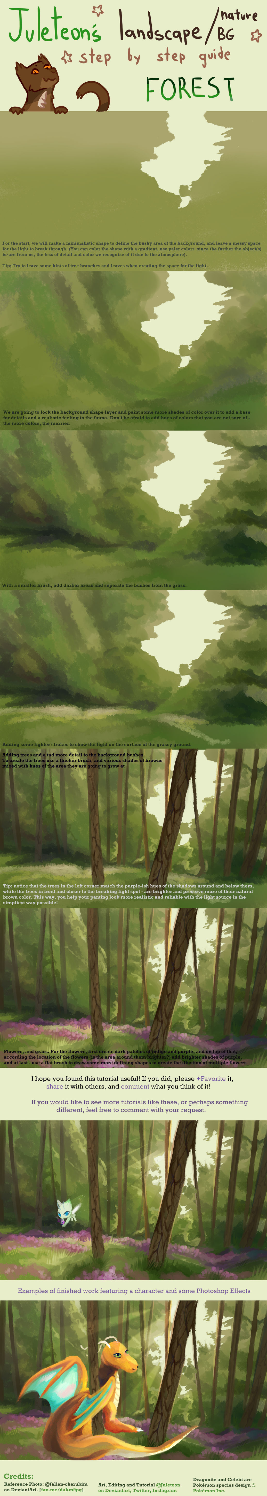
Blocking Shapes
Blocking shapes is the first step in painting digital backgrounds. It helps to set the foundation for your artwork. By focusing on large shapes and forms, you avoid getting lost in tiny details too early. This method saves time and keeps your composition clear.
Start by identifying the main shapes in your background. These shapes define the overall structure and balance of your painting. They guide your color choices and help organize your elements. Blocking shapes simplifies the painting process and improves the final result.
Color Blocking Stage
During the color blocking stage, fill large shapes with simple colors. Use flat, solid tones to separate different parts of the background. This step helps you see how colors interact and supports the composition.
Choose colors that match the mood of your scene. Keep colors basic without shading or texture. This makes changes easy and fast. Adjust the color blocks until you feel the balance is right.
Simplifying Complex Backgrounds
Complex backgrounds can be overwhelming. Simplify them by breaking the scene into basic shapes. Ignore small details and focus on major forms. This approach helps you manage the painting in steps.
Work on one section at a time. Use simple shapes to represent trees, buildings, or mountains. This way, the background stays clear and readable. Simplifying also helps keep the viewer’s focus on the main subject.
Credit: medibangpaint.com
Adding Details
Adding details to digital backgrounds brings your artwork to life. Details create depth and interest. They help the viewer feel more connected to the scene. Focusing on textures and light makes your background more realistic and vivid. Small touches can change a flat image into something captivating. Use these tips to add meaningful details in your digital paintings.
Painting Textures
Textures give surfaces a natural look. Try different brushes to mimic materials like wood, stone, or fabric. Use rough strokes for rough surfaces and smooth strokes for soft ones. Layer textures to build complexity. Avoid overdoing it; keep textures subtle to maintain balance. Zoom in to add fine details like cracks or grain. Textures help viewers imagine how objects feel.
Incorporating Light And Shadow
Light and shadow create depth and mood. Decide where your light source is in the scene. Shade areas that are away from the light to add contrast. Use soft shadows for diffuse light and sharp shadows for direct light. Highlights show where light hits the surface directly. Play with different light colors to add atmosphere. Shadows and light make your background dynamic and believable.
Creating Depth
Creating depth in digital backgrounds makes your artwork feel alive and real. Depth helps viewers see space and distance clearly. It guides the eye through the scene naturally.
Using simple techniques can add layers and dimension. These tips focus on how to separate space into parts. Each part plays a role in building depth.
Using Atmospheric Perspective
Atmospheric perspective shows how air affects objects far away. Objects become lighter and less clear as they move back. Colors turn cooler and less saturated with distance. This effect makes distant objects look far away. Use softer edges and pale colors for far elements. This trick adds realism to your digital backgrounds.
Foreground
The foreground is the closest part of your scene. Use bright colors and sharp details here. Add strong contrast to make objects stand out. This draws attention and creates a clear starting point. Place important elements in the foreground to anchor the view.
Middleground
The middleground sits between foreground and background. Use medium values and moderate detail here. Blend colors softly but keep some shapes clear. This area connects front and back parts smoothly. Avoid heavy contrast to keep balance in the scene.
Background
The background is the farthest space in your painting. Use muted colors and low contrast for this part. Blur edges slightly to show distance. Keep details minimal to avoid distraction. This helps push the background back visually.

Credit: www.reddit.com
Enhancing With Effects
Enhancing digital backgrounds with effects brings depth and life to your artwork. Effects help create mood and focus. They guide the viewer’s eye and add realism. Simple touches can turn a flat background into a dynamic scene. The right effects make your painting feel complete and polished.
Cloud Shadows And Lighting Effects
Use cloud shadows to add realism and interest. Paint soft, diffused shadows on the ground or objects. This shows the presence of clouds above. Adjust opacity and blur for natural softness. Change shadow color slightly to match sky tones. Lighting effects boost atmosphere and time of day. Add warm light for sunrise or sunset. Use cool light for cloudy or moonlit scenes. Highlight edges with light to create contrast. Shadows and light give your background volume and space.
Post-processing Tips
Post-processing enhances colors and sharpness after painting. Use adjustment layers for brightness and contrast. Slight color grading can unify the scene. Blur some areas to simulate depth of field. Sharpen details in focal points to draw attention. Add subtle noise or texture for realism. Avoid overdoing effects to keep natural look. Final tweaks ensure your background looks polished and vibrant.
Background Styles
Background styles set the mood and atmosphere in digital art. Choosing the right style helps tell your story. Each style has its own rules and techniques. Explore different styles to find what fits your vision.
Fantasy And Sci-fi Settings
Fantasy and sci-fi backgrounds create otherworldly scenes. Use bold colors and unusual shapes. Add glowing effects or strange landscapes. Think about futuristic cities or magical forests. These settings allow for creative freedom and imagination. Layers and textures add depth and interest. Play with light sources to enhance the mood.
Realistic And Abstract Backgrounds
Realistic backgrounds mimic real life scenes. Pay attention to light, shadow, and perspective. Use natural colors and detailed textures. This style grounds your artwork in reality. Abstract backgrounds focus on shapes and colors. They do not represent real objects. Use gradients, patterns, or brush strokes. Abstract styles add emotion and energy to your art. Both styles can support your subject in different ways.
Tools And Software
Choosing the right tools and software is essential for painting digital backgrounds. The software provides the canvas and brushes, while the tools help create textures and effects. Understanding these basics can improve your workflow and final result.
Many artists prefer software like Adobe Photoshop, Procreate, or Clip Studio Paint. Each offers unique features that support digital painting. Selecting one that suits your style and needs is important.
Best Brushes For Backgrounds
Brush choice affects the texture and feel of your background. Soft round brushes work well for smooth gradients and skies. Textured brushes add depth and interest to natural scenes like forests or rocks.
Experiment with scatter and grainy brushes for organic effects. Custom brushes can mimic natural media like watercolor or charcoal. Using a mix of brush types creates a richer background.
Using Layers Effectively
Layers separate different parts of your painting for easier editing. Use multiple layers to build depth in your background. For example, one layer for the sky, another for distant hills, and one for foreground details.
Set layer blending modes to blend colors smoothly. Lock layers to avoid accidental changes. Naming your layers keeps your workflow organized and fast.
Avoiding Common Mistakes
Painting digital backgrounds can be challenging. Many beginners make simple errors that affect the final look. Avoiding common mistakes helps create clean and attractive backgrounds. Focus on clarity and balance to improve your artwork.
Overcrowding Details
Too many details can confuse the viewer. Crowded backgrounds steal attention from the main subject. Keep details minimal and purposeful. Use simpler shapes and fewer elements. This creates space and makes the scene easier to understand. Let your background support the main focus, not compete with it.
Ignoring Color Harmony
Colors that clash ruin the mood and flow. Choose colors that work well together. Use color palettes with related hues for smooth transitions. Avoid random bright colors that distract the eye. Balanced colors create a natural and pleasant look. Plan your color scheme before adding details. This keeps your background visually pleasing and consistent.
Credit: www.deviantart.com
Frequently Asked Questions
What Tools Are Best For Painting Digital Backgrounds?
Use software like Photoshop, Procreate, or Clip Studio Paint. These tools offer versatile brushes and layers perfect for digital backgrounds. A graphics tablet enhances control and precision, making your painting process smoother and more professional.
How To Choose Colors For Digital Backgrounds?
Select colors that complement your main subject. Use color theory to create harmony or contrast. Start with a limited palette and gradually add shades. Consider mood and lighting to enhance the overall atmosphere of your artwork.
What Techniques Improve Digital Background Realism?
Incorporate layering, texture brushes, and lighting effects. Use gradients and soft shadows for depth. Adding subtle details like clouds or foliage boosts realism. Practice blending colors smoothly to avoid harsh edges in your background.
How Important Is Composition In Digital Backgrounds?
Composition guides the viewer’s eye and balances the artwork. Use the rule of thirds or leading lines to arrange elements effectively. A well-composed background supports the subject without overwhelming it, enhancing the overall visual impact.
Conclusion
Painting digital backgrounds takes patience and practice. Start with simple shapes and colors. Use contrast to separate the subject from the background. Experiment with light and shadow to add depth. Keep your layers organized for easy editing. Try different brushes and textures for variety.
Don’t rush; allow your work to evolve naturally. Each step improves your skills and creativity. Enjoy the process and keep creating beautiful digital backgrounds.