PaintingProGuide is reader-supported. When you buy through links on this page we may earn an affiliate commission at no extra cost to you.
Every acrylic painter eventually discovers that tube colors are only a starting point. The greens you need for a real landscape, the warm gray of a shadow, the exact peach of a cheek: all of them are mixed. Mixing colors with acrylic paint is a learnable skill built on a handful of principles, and acrylic adds two quirks of its own: it dries fast and it usually dries slightly darker than it looks when wet.
This complete guide covers the palette to start with, the principles that make mixing predictable, step-by-step recipes for the colors people struggle with most, and acrylic-specific tips. At the end, we review seven books and tools from our October 2026 research that make practice faster.
Quick answer: Start with a split-primary palette (a warm and a cool version of red, yellow and blue) plus titanium white. Mix with a palette knife, add dark colors to light a little at a time, and adjust saturation with the complementary color rather than black. Because acrylic often dries slightly darker, test a swatch and let it dry before committing. Color by Betty Edwards explains the theory; William F. Powell’s 1,500 Color Mixing Recipes gives exact formulas to practice.
Our Top Picks at a Glance
- Color by Betty Edwards — Best book for understanding color mixing
- 1,500 Color Mixing Recipes for Oil, Acrylic and Watercolor (William F. Powell) — Best recipe reference
- Color Mixing Recipes for Oil and Acrylic (Powell) — Best compact recipe book
- Oil and Acrylic Color Mixing Recipes Card Deck (Powell) — Best portable recipe cards
- Mcbazel 3-Piece Color Mixing Guide Wheels — Best quick-reference tool
- Compendium of Acrylic Painting Techniques (Gill Barron) — Best for applying color in technique
- The Complete Acrylic Painting Guide for Beginners (Leonard Koe) — Best all-round beginner guide
| Resource | Best For | Key Spec | Key Strength | Price Tier |
|---|---|---|---|---|
| Color by Betty Edwards | Understanding theory | Course-style book | Builds real understanding | $ |
| 1,500 Color Mixing Recipes | Exact formulas | Spiral-bound, oil/acrylic/watercolor | Huge recipe range | $$ |
| Color Mixing Recipes (450+) | Compact reference | Hardcover | Low price tier | $ |
| Recipe Card Deck | Studio and travel | Cards plus mixing grid, 400+ colors | Portable | $$ |
| Mcbazel Color Wheels | Quick reference | 3 wheels, large and pocket | Laminated, spinning | $ |
| Compendium of Acrylic Techniques | Technique practice | Paperback | Broad technique coverage | $ |
| Complete Acrylic Painting Guide | Beginners | Step-by-step guide | Supplies, techniques, mistakes | $$$ |
How We Chose
The mixing guidance below reflects well-established color theory and acrylic painting practice. Book and tool picks are based on Amazon listing details checked in October 2026, how directly each one helps with mixing acrylic color, and how widely each product is reviewed by Amazon buyers. We have not worked through every page of every book.
Start With the Right Palette
A split-primary palette gives you clean mixes across the whole color wheel with just six colors plus white:
- Warm yellow: a cadmium yellow medium or hansa yellow medium
- Cool yellow: a lemon yellow
- Warm red: a cadmium red light or pyrrole red
- Cool red: a quinacridone magenta, crimson or alizarin hue
- Warm blue: ultramarine blue
- Cool blue: phthalo blue or cerulean
- Titanium white: opaque and strong
Optional additions are burnt sienna and burnt umber, which speed up mixing earth tones and neutrals. Many painters skip black entirely and mix darks instead.
The Principles That Make Mixing Predictable
Hue, value and saturation
Every color has three properties. Hue is its position on the wheel (red, orange, blue). Value is how light or dark it is. Saturation, or chroma, is how intense or grayed it is. When a mix looks wrong, ask which of the three is off and fix that one.
Warm and cool biases
Each primary leans toward one neighbor. Ultramarine leans toward red; phthalo blue leans toward green. For clean secondaries, combine the two primaries that lean toward each other: phthalo blue and lemon yellow make a bright green, while ultramarine and cadmium yellow make a duller olive. Neither is wrong; they are different greens.
Complementary colors
Colors opposite on the wheel, such as red and green, orange and blue, yellow and violet, neutralize each other when mixed. Adding a little complement lowers saturation without simply darkening, which is more natural than adding black or gray.
Tints, shades and tones
- Tint: color plus white. Lighter and often cooler and chalkier.
- Shade: color plus a dark, such as black or a dark complement mix.
- Tone: color plus gray or its complement. Less saturated.
Strong colors first, in small amounts
Dark and high-tinting colors such as phthalo blue overpower lighter ones. Always add the dark or strong color to the light one, a tiny amount at a time.
Step-by-Step Mixing Recipes
Clean secondaries
- Bright orange: warm yellow plus warm red.
- Bright green: cool yellow plus cool blue (phthalo).
- Clean violet: cool red (magenta) plus warm blue (ultramarine).
Natural greens for landscapes
- Start with ultramarine and cadmium yellow for a mid green.
- Add a touch of burnt sienna or red to gray it toward olive.
- Add white and a hint of blue for distant, cooler greens.
- Add yellow for sunlit leaves; add ultramarine and a red for deep shadow greens.
Browns and earth tones
Mix all three primaries, or mix complements such as orange and blue. Adjust toward red for warm browns, toward blue for cool, and add white for tans and beiges. Burnt sienna plus ultramarine is a classic rich dark brown that can stand in for black.
Grays and neutrals
Mix complements, then add white. Orange plus blue gives a versatile gray; tilt it warm or cool by adjusting the ratio. These “colored grays” look more alive than black plus white.
Skin tones
- Start with a base of white plus a little warm red and warm yellow for a light peach.
- Add burnt sienna for medium tones and burnt umber for deeper ones.
- Cool shadows slightly with a touch of blue or green; warm highlights with a touch of yellow.
- Check against your reference in good light and adjust value first.
Rich darks without black
Ultramarine plus burnt umber, or phthalo blue plus a deep red, gives dark tones that can be tilted warm or cool. Black can still be useful, but mixed darks harmonize better with the rest of the painting.
Pastels and soft colors
Start with white and add color to it, not the other way round. Pastels mixed from titanium white can look chalky; a tiny touch of the complement or a warm yellow takes off the chalky edge and makes them feel more natural.
Sky blues
Mix ultramarine with white for overhead sky, then shift toward a greener blue (phthalo or cerulean plus white) and a touch of warm yellow or pink near the horizon. Skies are almost never one flat blue.
Matching a color you see
- Decide the hue family first: is it more red, yellow or blue?
- Match the value: squint to compare light and dark, and add white or a dark to correct.
- Adjust saturation last with its complement.
- Test on scrap, let it dry, compare and tweak.
Acrylic-Specific Mixing Tips
Acrylic often dries darker
Many acrylic paints shift slightly darker as they dry, because the binder looks milky when wet and turns clear when dry. Paint a test swatch on scrap paper, dry it with a hair dryer and compare before mixing a large batch.
Mix enough paint
Acrylic dries quickly, and remixing an exact color is hard. Mix more than you think you need for large areas.
Keep paint workable
A stay-wet palette, a light mist of water or a slow-drying medium (retarder) extends working time. Do not overdo water, which can weaken the paint film.
Use a palette knife
Knife mixing blends thoroughly without loading brush bristles with paint and keeps colors clean. Wipe the knife between mixes so traces of one color do not contaminate the next, and scrape mixed piles into neat mounds so they dry more slowly.
Transparency and opacity
Some pigments are transparent (phthalos, quinacridones) and others opaque (cadmiums, titanium white). Opaque mixes cover; transparent mixes glaze. Know which you are making.
Books and Tools That Help You Mix Better
1. Color by Betty Edwards — Best for Understanding Color

Betty Edwards’ book is subtitled “A Course in Mastering the Art of Mixing Colors,” and it is structured as a course. It is the best choice if you want to understand why mixes behave as they do, not just follow formulas.
Best suited for: painters who want true understanding of color.
Pros
- Course structure with exercises
- Transferable to any medium
Cons
- Not acrylic-specific
Buying consideration: Do the exercises with your acrylics; reading alone will not build the skill.
2. 1,500 Color Mixing Recipes for Oil, Acrylic and Watercolor (William F. Powell) — Best Recipe Reference

This spiral-bound book provides recipes for achieving precise colors when painting landscapes, portraits, still lifes and more, across oil, acrylic and watercolor. Spiral binding lets it lie flat beside your palette.
Best suited for: painters who want specific formulas to match colors.
Pros
- Large recipe range
- Lies flat while painting
Cons
- Recipes assume specific paint colors; your brand may vary
Buying consideration: Use recipes as starting points and adjust by eye.
3. Color Mixing Recipes for Oil and Acrylic (Powell) — Best Compact Recipe Book

A smaller Powell title with mixing recipes for more than 450 color combinations for oil and acrylic, in hardcover.
Best suited for: painters who want recipes at a lower price tier.
Pros
- Focused on oil and acrylic
- Low price tier
Cons
- Fewer recipes than the 1,500 edition
Buying consideration: Choose this or the 1,500 edition; most painters do not need both.
4. Oil and Acrylic Color Mixing Recipes Card Deck (Powell) — Best Portable Reference

This card deck with a color mixing grid covers 400+ colors. Cards are easy to pull out and prop next to your palette or take to a class.
Best suited for: classes, plein air and quick reference.
Pros
- Portable
- Mixing grid included
Cons
- Less explanation than a book
Buying consideration: Keep the cards you use most clipped near your palette.
5. Mcbazel 3-Piece Color Mixing Guide Wheels — Best Quick-Reference Tool

This set includes three dual-sided color wheels in large and pocket sizes. The front spins to show mixing results in a window, and the back explains relationships such as complementary and triad schemes. They are made from high-gloss coated paper with a laminated surface that resists water and paint stains.
Best suited for: beginners and classrooms learning color relationships.
Pros
- Visual and fast
- Three sizes for studio and travel
Cons
- Printed colors approximate real paint mixes
Buying consideration: Use the wheel to plan, then confirm with real paint swatches.
6. Compendium of Acrylic Painting Techniques (Gill Barron) — Best for Applying Color

Gill Barron’s compendium covers a wide range of acrylic techniques. It helps you put mixed color to work through glazing, layering, dry brush and more.
Best suited for: painters ready to move beyond flat mixing exercises.
Pros
- Broad technique coverage
Cons
- Not solely about color mixing
Buying consideration: Pair it with a theory book for a complete foundation.
7. The Complete Acrylic Painting Guide for Beginners (Leonard Koe) — Best All-Round Beginner Guide

Leonard Koe’s guide is a step-by-step introduction to essential techniques, choosing supplies, avoiding common mistakes and creating first paintings. It suits beginners who want color mixing in the context of the whole painting process.
Best suited for: complete beginners.
Pros
- Covers supplies through finished paintings
Cons
- Highest price tier here
Buying consideration: Choose this if you want one book covering everything rather than a color specialist title.
Practice Exercises
- Value scale: mix a single color from white to its darkest shade in nine steps.
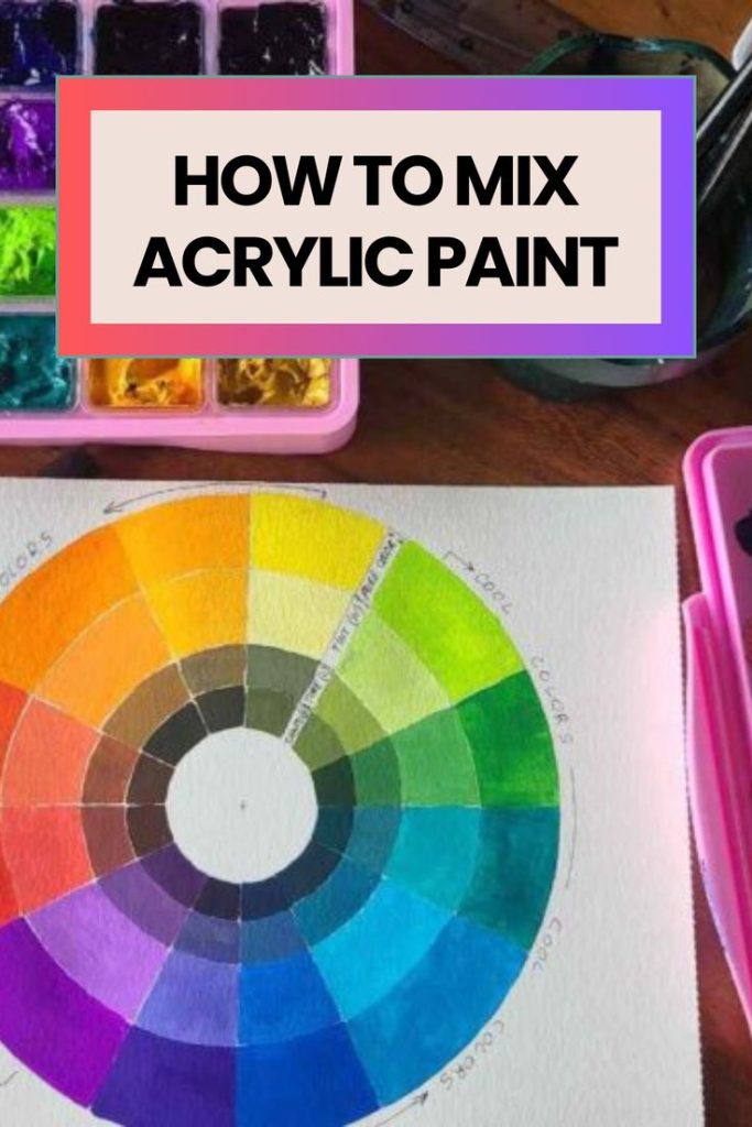
- Color wheel: paint a 12-step wheel using only your six primaries.
- Complement chart: mix each color with increasing amounts of its complement.
- Green chart: mix every yellow with every blue, then add white to each.
- Match a photo color: pick five colors from a photograph and mix them exactly.
Our step-by-step guide on how to mix acrylic paint colors includes more charts, and once your mixes are reliable, learn how to blend colors smoothly in acrylic paintings.
Buying Guide: Choosing Color Mixing Resources
Theory or recipes
Theory books build lasting skill; recipe books give quick answers. Beginners benefit from one of each.
Format
Spiral-bound books and card decks stay open beside a palette. Hardcovers are better for study at a desk.
Medium coverage
Some resources cover several media. Principles transfer, but acrylic-specific notes on drying shift are valuable.
Your paints
Recipes depend on specific colors. Check that your palette has the colors a book uses, or substitute close equivalents.
Common Mistakes to Avoid
- Adding light to dark. Add dark to light, a little at a time.
- Using black to darken everything. It deadens color; try complements or mixed darks.
- Overmixing into mud. Mixing too many colors grays everything.
- Ignoring the dry shift. Test swatches dry before committing.
- Mixing too little. Remixing an exact acrylic color is hard.
- Using too much water. It weakens the paint film; use an acrylic medium to thin instead.
- Judging color under poor light. Mix under daylight-balanced light so colors look the same elsewhere.
FAQs
What primary colors should I use for mixing acrylics?
A split-primary palette: a warm and cool red, yellow and blue, plus titanium white, mixes a full range cleanly.
Why does acrylic paint dry darker?
The acrylic binder looks milky when wet and turns clear as it dries, so many colors appear slightly darker once dry. Test swatches help.
How do I keep mixed acrylic colors from drying out?
Use a stay-wet palette, mist lightly with water or add a retarder medium. Cover the palette between sessions.
How do I mix a natural green with acrylic paint?
Mix blue and yellow, then gray it slightly with a touch of red or burnt sienna. Adjust with white for distance and darker blue for shadows.
How do I avoid muddy colors?
Limit mixes to two or three colors, use clean brushes and knives and choose primaries that lean toward the color you want.
Is a color wheel useful for acrylic painting?
Yes, for planning relationships like complements and harmonies. Always confirm with real paint, since printed colors only approximate mixes.
Final Recommendation
Set up a split-primary palette, mix with a knife and always test dry swatches. To understand color deeply, work through Color by Betty Edwards. For specific formulas, keep William F. Powell’s 1,500 Color Mixing Recipes or the compact 450+ recipe book by your easel, or carry the card deck to class. Beginners who want everything in one place should consider The Complete Acrylic Painting Guide for Beginners. For simple projects to practice on, try our acrylic painting ideas for complete beginners.