Acrylic painting is loved for its bright colors, fast drying time, and flexibility. But many artists—especially beginners—struggle with how to set up their palette. The way you arrange your colors can make painting easier, faster, and more enjoyable. A good palette layout helps you mix colors quickly, avoid muddy results, and keep your work area clean. In this article, you’ll discover how to choose the best palette layout for acrylic painting, why it matters, and how to adapt it to your own style.
Why Palette Layout Matters
Some painters ignore palette layout, thinking it’s just a personal choice. But your palette is like the control center of your painting. If your colors are messy or in the wrong order, you’ll waste time searching for the right paint, mix too much, and sometimes make mistakes that could have been avoided.
A smart palette layout helps you:
- Work faster and focus on painting, not searching for colors
- Mix colors more easily and consistently
- Keep your paints clean, avoiding contamination and waste
- Train your eye to understand color relationships
Many professional artists stick with one layout for years because it saves them time and helps them get the results they want.
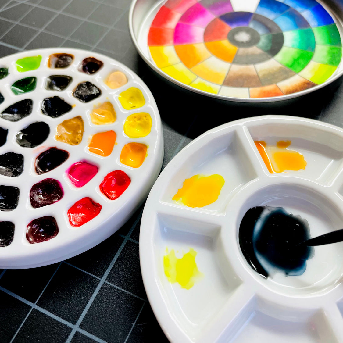
The Classic Color Wheel Layout
The color wheel layout is popular among both beginners and advanced painters. It arranges colors in the same order as the color wheel, making it easy to see relationships between hues.
How it works:
You place your primary colors (red, yellow, blue) far apart on the palette. Secondary colors (orange, green, purple) are placed between them. Tertiary colors fill in the gaps.
Here’s a simple example:
| Position | Color Example |
|---|---|
| Top Left | Cadmium Red |
| Top Center | Cadmium Yellow |
| Top Right | Ultramarine Blue |
| Middle Left | Orange (mixed) |
| Middle Right | Green (mixed) |
| Bottom Center | Purple (mixed) |
Benefits:
- Makes mixing easier and more logical
- Helps you avoid accidental color contamination
- Trains your eye to spot complementary colors quickly
A beginner’s tip:
Keep your whites and blacks separate from other colors. This prevents them from mixing accidentally and keeps your colors bright.
The Warm-cool Split Layout
Another effective layout is the warm-cool split. Here, you arrange colors by temperature, placing warm colors on one side of the palette and cool colors on the other.
Example:
- Left side: Warm colors (reds, oranges, yellows)
- Right side: Cool colors (blues, greens, violets)
- White paint is usually kept at the bottom or in the center
This layout is useful when you want to control the mood or temperature of your painting. It helps you remember which colors will create a warm or cool feeling and makes it easier to avoid mixing colors that could become muddy.
Pro insight:
Many artists forget that even the same hue can have warm and cool versions. For example, Cadmium Red is warmer than Alizarin Crimson.
The Limited Palette Layout
Some artists prefer to work with a limited palette—just a few colors that can mix to create almost any other color. This is a great way to keep your painting simple, harmonious, and easy to manage.
A classic limited palette for acrylics might include:
- Titanium White
- Cadmium Red
- Ultramarine Blue
- Cadmium Yellow
These four can create a surprising range of colors.
How to arrange:
Place each color in a corner of your palette, leaving space in the center for mixing.
| Corner | Paint Color |
|---|---|
| Top Left | Titanium White |
| Top Right | Cadmium Yellow |
| Bottom Right | Ultramarine Blue |
| Bottom Left | Cadmium Red |
Advantages:
- Less confusion and fewer mistakes
- Forces you to learn color mixing skills
- Keeps your painting harmonious
Hidden benefit:
A limited palette actually makes you more creative. You learn to mix what you need, instead of searching for the “perfect” tube color.
The Studio Pro Layout
More advanced artists sometimes create a custom studio pro layout, arranging paints in two lines—one for pure colors, another for earth tones and neutrals.
Example:
- Top row: Pure colors (bright reds, blues, yellows, greens, violets)
- Bottom row: Earth tones and neutrals (burnt sienna, raw umber, ochres, gray, black, white)
This setup is ideal if you paint portraits, landscapes, or realistic scenes and need quick access to both bright and muted colors.
Tip for organization:
Always place your most-used colors in the most accessible spots. If you use a lot of white or burnt umber, put them where your hand naturally rests.
The Ring Or Horseshoe Layout
Some artists like to arrange their colors in a ring or horseshoe shape around the edge of a large palette. The mixing area stays in the center.
Why try this?
- It keeps colors separated, so you don’t accidentally mix them together
- The large center space gives you lots of room for blending
This is especially useful when working on a complex painting with many colors. You can keep each color in its “home” and always have a clean area to mix new shades.
Unexpected bonus:
If you’re right-handed, put the colors you use most often on the left side. This way, your mixing hand doesn’t block your view.
The Value Scale Layout
A less common but very effective layout is the value scale. Here, you arrange colors from light to dark, not by hue or temperature.
How it helps:
If you often struggle with making your paintings too flat or too dark, this layout forces you to think about value (lightness or darkness) before hue.
| Order | Color Example |
|---|---|
| 1 (Lightest) | Titanium White |
| 2 | Yellow Ochre |
| 3 | Cadmium Yellow |
| 4 | Cadmium Red |
| 5 | Ultramarine Blue |
| 6 | Burnt Umber |
| 7 (Darkest) | Ivory Black |
Beginner’s mistake:
Don’t confuse color temperature with value. A bright yellow can be a lighter value than a pale blue.
Choosing The Right Palette Surface
The way you arrange your paints depends a lot on your palette surface. Acrylics dry quickly, so the type of palette you use matters.
Popular palette types:
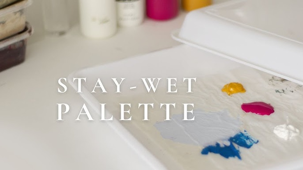
- Stay-wet palettes: Keep paints moist for longer. Great for beginners or slow painters.
- Glass palettes: Easy to clean, reusable, and good for mixing.
- Disposable paper palettes: Cheap and convenient, but paint dries fast.
- Wood palettes: Classic, but absorb moisture and stain over time.
Insider tip:
If you use a stay-wet palette, arrange your colors around the edge, just like a ring layout. This keeps the mixing area clean and paints wet longer.
How To Set Up Your Palette (step-by-step)
Knowing layouts is helpful, but actually setting up your palette can be tricky. Here’s a practical guide:
- Choose your palette type based on your painting style (wet, dry, small, or large).
- Pick your colors before you start. Limit yourself to 5–10 at most for clarity.
- Squeeze out small amounts. Acrylics dry fast, so add more as needed.
- Arrange colors logically—by wheel, temperature, value, or your own method.
- Leave plenty of mixing space in the center or side.
- Keep a clean knife or brush handy for scraping and cleaning.
- Mist with water if your palette dries out too fast.
Common mistake:
Don’t crowd your colors together. It’s better to use a larger palette or less paint.
Advanced Tips For Efficient Palettes
Even experienced artists sometimes waste paint or mix muddy colors. Here are some advanced tips:
- Pre-mix key colors before you start, especially flesh tones or background colors.
- Use a palette knife for mixing large amounts—keeps brushes clean.
- Cover your palette with plastic wrap during breaks to keep paint wet.
- Label your colors with tape if you use many similar shades.
Surprising insight:
If you use the same palette layout every time, your color mixing becomes faster and more instinctive.

Credit: www.youtube.com
Comparing Palette Layouts
Choosing between layouts can be confusing. Here’s a quick side-by-side comparison.
| Layout Type | Best For | Main Advantage | Main Drawback |
|---|---|---|---|
| Color Wheel | Beginners, color mixing practice | Clear color relationships | Can be slow for fast painters |
| Warm-Cool Split | Landscape, mood control | Easy temperature control | Requires color knowledge |
| Limited Palette | Harmony, simplicity | Forces good mixing | Fewer choices |
| Studio Pro | Advanced, realistic art | Access to all tones | Can get crowded |
| Ring/Horseshoe | Large paintings, many colors | Big mixing area | Takes more space |
| Value Scale | Portraits, value studies | Focus on light/dark | Less intuitive for hue |
Mistakes To Avoid With Palette Layout
- Using too many colors: More than 10 colors can make your palette confusing and wasteful.
- Placing paints too close: This leads to accidental mixing and wasted paint.
- Not cleaning as you go: Dry acrylic is hard to remove and can muddy future colors.
- Switching layouts too often: Consistency helps you remember where colors are.
- Ignoring color temperature: Mixing warms and cools can create dull, lifeless colors.
Little-known tip:
Some artists use a mirror behind their palette. This helps spot color errors quickly because the reversed view makes mistakes stand out.

Credit: willkempartschool.com
Adapting Your Layout To Different Paintings
Not every painting needs the same palette. For a small still life, a limited palette works well. For a large landscape, you might need a ring layout with lots of greens and browns.
How to adapt:
- Before starting, ask: “Which colors do I really need for this painting?”
- Test your layout with a quick color sketch on scrap paper.
- Adjust the order if you find yourself reaching across the palette too often.
Unusual but helpful:
Try switching your layout for practice sessions. This builds flexibility and helps you find what really works for you.
Maintaining Your Palette
Keeping your palette clean and organized is just as important as layout.
- Wipe off unused paint after each session.
- Soak your palette (if it’s plastic or glass) in water to loosen dried acrylic.
- Scrape with a palette knife to save time.
- Store your palette in a sealed box or wrap for longer breaks.
For more cleaning tips, you can check WetCanvas, a top resource for acrylic artists.
Credit: etchrlab.com
Frequently Asked Questions
What Is The Best Palette Layout For Beginners?
For most beginners, the color wheel layout is best. It helps you see how colors relate and mix. Place your primaries (red, yellow, blue) in a triangle and fill in secondaries between them. Keep white and black separate to avoid muddy colors.
How Do I Keep Acrylic Paint From Drying On My Palette?
Use a stay-wet palette or mist your palette with water every 15–30 minutes. You can also cover your palette with plastic wrap during breaks. Avoid using too much paint at once—add more as needed.
Should I Always Use The Same Palette Layout?
It’s a good idea to use the same basic layout for most paintings. This builds muscle memory and speeds up your process. But don’t be afraid to adjust for special projects or to experiment with new layouts.
What’s The Difference Between A Warm And Cool Color?
Warm colors (red, orange, yellow) feel energetic and closer to the viewer. Cool colors (blue, green, violet) feel calm and distant. Even within one hue, some versions are warmer or cooler. For example, Phthalo Blue is cooler than Ultramarine Blue.
How Many Colors Should I Put On My Palette?
Start with 5 to 10 colors. Too many can confuse you and waste paint. As you gain experience, add more colors only if you really need them for a specific effect or subject.
Getting your palette layout right can make a huge difference in your painting journey. Take time to set up before you start, and you’ll spend less time fixing mistakes. Over time, you’ll find the layout that fits your own style—and your creativity will thank you.