PaintingProGuide is reader-supported. When you buy through links on this page we may earn an affiliate commission at no extra cost to you.
Quick answer: Opaque acrylics hide what is underneath and are the right choice for solid coverage, corrections and crisp edges; transparent acrylics let light pass through to the layer below and are the right choice for glazing, luminous shadows and color-shifting effects. Most pigments fall somewhere between, which is why the small square on the tube label (filled, half-filled or empty) matters more than the color name. To go deeper, The New Acrylics by Rheni Tauchid is the most thorough book on modern acrylic behavior, and 1,500 Color Mixing Recipes is the practical reference for predicting how opaque and transparent colors mix.
This acrylic paint opacity vs transparency guide explains what the two properties actually are, how to read them on a tube, how to test them in your own studio, and when each one gives a better painting. It closes with a short list of books that cover the subject in more depth than any web page can, because this is one area where a reference on the shelf pays for itself.
Opacity vs Transparency: What the Terms Mean in Acrylic Paint
Opacity is a pigment’s ability to block light. An opaque color laid over a dark ground covers it; a transparent color laid over the same ground barely changes it, and instead tints whatever shows through. In acrylics the binder (acrylic polymer) dries clear, so the pigment particles alone decide how much light gets through.
Three things drive the result. Pigment chemistry is the biggest: titanium white, cadmiums, most earth colors and many “hue” mixtures are opaque, while phthalo blues and greens, quinacridones, dioxazine purple and many modern organic pigments are transparent. Particle size and refractive index add to that: coarse mineral pigments scatter more light, fine synthetic organics scatter less. Finally, pigment concentration in the tube matters, which is why student-grade paint often looks more transparent than the same color in a professional range.
The label symbols
Most professional acrylic brands print an opacity symbol on the tube: a filled square for opaque, a half-filled square for semi-opaque or semi-transparent, and an empty square for transparent. Some brands use words instead. A few also print the pigment index code (for example PB15 for phthalo blue or PW6 for titanium white), which lets you look up the pigment’s typical behavior regardless of the marketing name.
Why “hue” colors behave differently
A color labeled “Cadmium Red Hue” is a mixture that imitates cadmium red, usually with cheaper organic pigments plus white. The added white makes many hue colors more opaque than you would expect, but it also makes them chalkier in glazes. Check the symbol rather than assuming a hue behaves like the original.
Opaque vs Transparent Acrylics Side by Side
| Property | Opaque Acrylics | Transparent Acrylics |
|---|---|---|
| Typical pigments | Titanium white, cadmium yellows and reds, yellow ochre, most oxides, mars black | Phthalo blue and green, quinacridone magenta and red, dioxazine purple, transparent oxides |
| Covering power | High; hides underlayers in one or two coats | Low; underlayers show through and tint the color |
| Best technique | Blocking in, flat color, corrections, highlights | Glazing, shadows, luminous color, layered depth |
| Mixing with white | Stays opaque; tints are clean | Becomes semi-opaque and loses some glow |
| Over a dark ground | Reads at full strength | Almost disappears unless thickly applied |
| Risk when overused | Flat, pasty surfaces | Weak, streaky coverage |
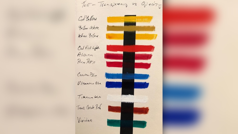
How to Test Opacity Yourself
You do not have to trust the label. A ten-minute test with a black marker and a scrap of primed paper tells you more than any chart.
- Draw a thick black line across a sheet of acrylic paper or primed board with a permanent marker.
- Brush a stroke of each color straight from the tube across the line, undiluted.
- Below it, brush the same color thinned with water or glazing medium to a milk-like consistency.
- Let everything dry completely. Acrylics darken and often look more transparent once the water evaporates.
- Compare: a color that hides the line undiluted is opaque; one that shows the line clearly even thick is transparent; anything between is semi-opaque.
Keep the sheet. Over time it becomes a personal opacity chart for your specific brands, which beats any generic list because concentration varies between manufacturers.
When to Use Opaque Acrylics
Blocking in and covering a ground
Opaque colors establish the big shapes quickly over a toned ground. A single coat of titanium white, yellow ochre or cadmium red hue reads at full strength and gives you a clean surface to work on.
Highlights and crisp edges
The brightest light in a painting almost always needs an opaque color. A transparent yellow over a mid-tone will never pop the way an opaque cadmium yellow does. Likewise, hard edges along a building or a horizon are easier to cut with paint that covers in one pass.
Corrections
Acrylic’s fast drying makes it forgiving, but only if you can hide the mistake. Opaque colors, especially mixtures containing titanium white, let you paint out an area without ghosting.
When to Use Transparent Acrylics
Glazing
A glaze is a thin, transparent layer of color over a dry layer. Because light travels through the glaze, bounces off the lighter layer beneath and comes back, glazed color looks lit from within in a way mixed color never does. Transparent pigments thinned with glazing medium (not just water, which weakens the film) are the tool for this.
Shadows that stay alive
Shadows mixed from opaque colors tend to go dead. A transparent glaze of dioxazine purple or phthalo blue over the local color keeps the shadow related to the object and lets texture show through.
Color temperature shifts
A transparent warm glaze over a cool passage, or the reverse, changes temperature without repainting. This is the fastest way to unify a painting that feels disjointed.
Staining and watercolor-like effects
Transparent acrylics thinned heavily and applied to absorbent grounds behave like watercolor but dry permanent, which suits mixed-media work and under-drawings that must not lift.
Mixing Opaque and Transparent Colors
Mixing is where many painters get surprised. Add even a little titanium white to a transparent color and it becomes semi-opaque and shifts toward pastel; this is useful for tints but kills the glow you wanted from a glaze. Conversely, adding a small amount of a strong transparent color such as phthalo green to an opaque mixture changes hue dramatically because transparent organics are often very high in tinting strength.
A practical rule: build mid-tones and lights from opaque and semi-opaque colors, and reserve transparent colors for darks, glazes and chroma boosts. If a mixture needs to be both light and transparent, use a glazing medium or a transparent white (zinc or “mixing” white) rather than titanium.
Books That Help
The subject rewards a reference you can flip through at the easel. These titles, chosen from the Amazon listings available for this guide, cover acrylic properties and color mixing from beginner to advanced. Product details come from the listings checked in October 2026; we have summarized each book’s scope from its title and series rather than reviewing its contents page by page.
| Product | Best For | Key Spec | Key Strength | Price Tier |
|---|---|---|---|---|
| The New Acrylics (Rheni Tauchid) | Understanding modern acrylic properties | Paperback, complete guide to new-generation acrylics | Depth on paint chemistry and mediums | $$ |
| 1,500 Color Mixing Recipes (William F. Powell) | Predicting mixtures | Spiral-bound, oil, acrylic and watercolor recipes | Lies flat at the easel | $$ |
| Compendium of Acrylic Painting Techniques (Gill Barron) | Technique reference | Paperback compendium of acrylic methods | Broad coverage in one volume | $ |
| Acrylics: Techniques and Tutorials for the Complete Beginner (Adrian Burrows) | Starting from zero | Paperback, Art Techniques series | Step-by-step structure | $ |
| Acrylic Painting Step by Step (Tom Swimm) | Guided projects | Paperback, Artist’s Library series | Short, project-based lessons | $ |
How We Chose
The books were selected from the Amazon listings supplied for this page, based on how directly each title addresses acrylic paint properties and color behavior, the author or publisher’s standing in art instruction, and how widely each book is reviewed by Amazon buyers. We have not quoted or tested the books’ contents; descriptions reflect their stated scope.
1. The New Acrylics: Complete Guide to the New Generation of Acrylic Paints — Best for Understanding Modern Acrylic Properties

Rheni Tauchid’s book is the standard reference for how contemporary acrylics behave: pigment properties, binders, mediums, and the practical consequences of each for the painter. For anyone trying to understand why some colors glaze beautifully and others go chalky, this is the most direct route.
It is a reading book as much as a project book, so expect explanation rather than step-by-step paintings. That depth is exactly what the opacity question needs.
Best suited for: Intermediate and advanced acrylic painters who want to understand their materials, and anyone experimenting with mediums and glazes.
2. 1,500 Color Mixing Recipes for Oil, Acrylic and Watercolor — Best for Predicting Mixtures

William F. Powell’s spiral-bound reference lays out color recipes for landscapes, portraits and still lifes across oil, acrylic and watercolor. Its value for this topic is practical: seeing which mixtures rely on opaque bases and which on transparent glazes makes the theory concrete.
The spiral binding lets it lie flat next to the palette, which is the point of a mixing reference.
Best suited for: Painters who want a fast lookup for specific colors and a way to see how transparent and opaque pigments combine in real mixtures.
3. Compendium of Acrylic Painting Techniques — Best for A Technique Reference

Gill Barron’s compendium collects a wide range of acrylic methods in one paperback, from basic washes to textural techniques. Opacity and transparency are threads that run through most of them, so the book works as a companion to the test sheet described above.
Best suited for: Hobbyists who want a broad, dip-in reference rather than a single structured course.
4. Acrylics: Techniques and Tutorials for the Complete Beginner — Best for Starting From Zero

Part of the Art Techniques series, Adrian Burrows’ book is built for people picking up acrylics for the first time. If the difference between opaque and transparent color is still new to you, a structured beginner course will place it in context alongside brushes, surfaces and basic mixing.
Best suited for: Absolute beginners who want a guided introduction before worrying about pigment properties.
5. Acrylic Painting Step by Step (Artist’s Library) — Best for Guided Projects

Tom Swimm’s title in the Artist’s Library series takes a project approach: basics first, then a range of special techniques built into finished paintings. Watching how opaque blocking-in and transparent glazing are sequenced in a project is often the fastest way to internalize when to use each.
Best suited for: Learners who prefer to paint along with a demonstration rather than read theory.
Buying Guide: How to Choose Acrylics by Opacity
Read the symbol, not the name
The filled, half-filled or empty square on the tube is the single most useful piece of information for this decision. Marketing names tell you nothing about light transmission.
Buy at least one opaque and one transparent version of each primary
A palette with cadmium yellow (opaque) and a transparent yellow such as a hansa or nickel azo, cadmium red (opaque) and quinacridone red (transparent), and an opaque blue such as cerulean plus phthalo blue (transparent) covers almost every situation.
Choose professional grade for glazing
Student paints contain less pigment and more filler, which dulls glazes. If you glaze often, the transparent colors are where professional-grade paint earns its price.
Use glazing medium, not just water
Thinning acrylic with a lot of water weakens the binder. A gloss glazing medium keeps the film strong and maximizes the clarity of transparent pigments.
Consider zinc or mixing white
Titanium white is the most opaque pigment in common use. For lightening a color without killing transparency, a zinc or “mixing” white is far gentler.
Match the ground to the technique
Transparent methods need a light ground to reflect light back. Opaque methods work on any ground, including dark or toned surfaces.
Related Reading on This Site
Once you can predict opacity, mixing gets much easier; our guide to mixing acrylic paint colors builds on the pigment basics covered here. For projects that put both properties to work, try making DIY wall art with acrylic, or start simpler with acrylic painting ideas for beginners.
Common Mistakes to Avoid
- Judging opacity while the paint is wet. Acrylics become more transparent and darker as they dry.
- Glazing with opaque colors. The result is a cloudy veil rather than a glow.
- Adding titanium white to “lighten” a glaze, which destroys its transparency.
- Thinning glazes with water alone, which can leave a weak, underbound film.
- Assuming a hue color matches the original pigment’s opacity.
- Painting transparent colors over a dark ground and expecting them to read.
- Buying a huge color set instead of a small palette with deliberate opaque and transparent pairs.
FAQs
How can I tell if an acrylic paint is opaque or transparent?
Look for the opacity symbol on the tube: a filled square means opaque, half-filled means semi-opaque or semi-transparent, empty means transparent. If there is no symbol, brush the color over a black marker line on primed paper and let it dry; if the line disappears the color is opaque.
Which acrylic colors are usually transparent?
Phthalo blue and green, quinacridone red and magenta, dioxazine purple, many hansa and nickel azo yellows, and transparent iron oxides. Most cadmiums, titanium white, mars black and earth colors like yellow ochre are opaque.
Can I make an opaque acrylic transparent?
Not truly. Thinning with glazing medium spreads the pigment out so more light passes through, which gives a translucent effect, but the pigment particles still scatter light and the glaze will look milky compared with a genuinely transparent color.
Why does my glaze look cloudy?
Usually because the color contains white or another opaque pigment, or because it was thinned with too much water. Use a transparent pigment and a gloss glazing medium instead.
Is transparent acrylic paint lower quality?
No. Transparency is a pigment property, not a quality grade. Some of the most expensive and strongest pigments, such as quinacridones, are transparent. Student-grade paint can look more transparent than it should because it is diluted with filler, which is a different issue.
Do I need both opaque and transparent acrylics?
For most representational painting, yes. Opaque colors handle coverage, lights and corrections; transparent colors handle glazing, shadows and chroma. A small palette with one of each per primary is enough.
Final Recommendation
Treat opacity and transparency as two tools rather than a quality ranking. Block in and highlight with opaque colors, glaze and deepen with transparent ones, and keep a tested chart of your own tubes so you are never guessing. Painters who want the full technical background should read The New Acrylics; painters who mostly want to mix predictable colors will get more daily use from 1,500 Color Mixing Recipes. Beginners should start with Burrows’ tutorial book and return to the theory once the basics feel natural.