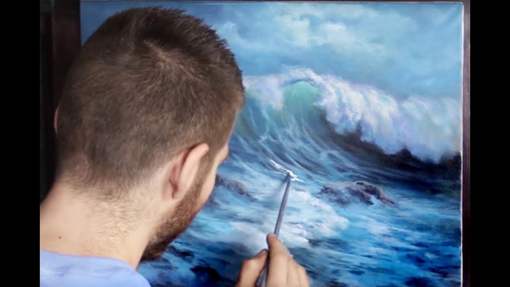
Quick answer: The secret of how to paint crashing waves in acrylic is to paint the wave as a dark, curved form first, then let light pass through it. Block in the sea and wave shape in deep blue-green, add a turquoise glow just below the curling lip where the water is thinnest, paint the foam in off-white with dry-brush and dabbing strokes, and save pure white for a few final spray highlights. Values do the work: dark wave body, glowing middle, bright foam.
A breaking wave is one of the hardest things to paint convincingly because it is never still. It is a moving wall of water, translucent at the top, opaque at the base, exploding into foam at the point of impact. Paint it as a blue shape with white on top and it looks like a cartoon. Paint it as a form lit from behind and it starts to move.
This tutorial explains how to paint crashing waves step by step, from the anatomy of a breaking wave through color mixing, foam textures and spray. It assumes you can already paint a basic sky gradient. If not, practice that first; it shares the same blending skills.
Anatomy of a Crashing Wave
Before you mix a single color, learn the parts of the wave. Each part gets a different treatment.
- Swell: The rising hump of water behind the breaking wave. Darker, smoother, reflecting the sky.
- Face: The steep front of the wave as it rises. This is where light passes through and creates the glowing turquoise or green band.
- Lip: The thin top edge that throws forward and curls over. Often the lightest, most translucent part.
- Curl or barrel: The hollow space under the falling lip, deep in shadow.
- Impact zone: Where the falling lip hits the water and explodes into foam and spray.
- Foam patterns: Lacy white networks spreading across the water in front of and behind the wave.
- Backwash: Thin sheets of water sliding back down the beach, reflecting the sky.
Most dramatic wave paintings place the viewer at a slight angle to the wave, so you can see the face, the curl and the foam at once.
Why Waves Glow: The Light-Through-Water Effect
The single most important effect in a crashing wave is translucency. When sunlight hits the back of a wave, it passes through the thin upper part and comes out the front with a green or turquoise tint. The thicker base of the wave stays dark because light cannot penetrate it.
In paint, that means a value structure that runs dark at the bottom of the face, lighter and more saturated in a band just below the lip, and lightest at the lip itself. If you skip this glowing band, the wave reads as a solid, opaque object rather than water.
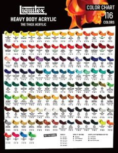
Pigment choice supports this effect. Transparent colors such as phthalo blue and phthalo green let the light ground show through and glow, while opaque colors sit on top and look solid. Labels on artist-grade tubes usually mark transparency, and our guide to acrylic paint brands and paint bodies explains how to read them before you buy.
Colors for Painting Ocean Waves With Acrylics
| Wave area | Suggested mix | Notes |
|---|---|---|
| Deep sea and wave base | Phthalo blue + burnt umber or Payne’s gray | Darkest values in the painting |
| Swell and mid-water | Ultramarine + phthalo green + a little white | Cool, slightly reflective |
| Glowing wave face | Phthalo green + lemon yellow + white | Clean, saturated turquoise |
| Foam shadows | White + a touch of blue and purple | Foam in shade is blue-gray, not white |
| Foam in light | White + a tiny touch of yellow | Warm off-white |
| Spray highlights | Pure titanium white | Use very sparingly |
Phthalo pigments are extremely strong, so add them to other colors in tiny amounts. A pea-sized dot can tint a large pile of white.
Supplies
- Primed canvas or panel, 11×14 inches or larger (waves need room to move).
- Large flat brush for the sky and sea, medium filbert for wave forms, small round and liner for foam lace, an old stiff brush or toothbrush for spray.
- Natural sponge for foam texture.
- Slow-drying medium to extend blending time on the wave face.
- Fluid or soft-body paint for the glowing face and glazes; heavy-body white for thick foam.
Paint body affects how easily you get a smooth glow versus thick, sculptural foam. Fluid acrylics blend into smooth transitions; heavy-body paint holds peaks. Many painters use both in the same seascape: fluid paint for the water, heavy body for the surf.
How to Paint Crashing Waves: Step-by-Step
Step 1: Sketch the wave shape
Lightly draw the horizon line (high, around two-thirds up, keeps the focus on the water). Then draw the wave as a curved form: the rising face, the forward-throwing lip and the area where it will crash. Keep the shape simple at this stage.
Step 2: Paint the sky
Paint a soft sky gradient. A slightly overcast or warm evening sky gives good contrast with bright foam. Let it dry.
Step 3: Block in the distant sea
Paint the sea near the horizon in a darker blue than the sky, with a crisp horizon line. Use horizontal strokes. Distant water is darker and flatter than you might expect.
Step 4: Paint the dark wave body
Fill the base of the wave and the area beneath the curl with your darkest blue-green. Use strokes that follow the curve of the wave, sweeping upward along the face.
Step 5: Add the glowing band
While the dark base is still workable, paint the turquoise mix in a band just below the lip. Blend it downward into the dark base with upward-curving strokes so there is no hard line. This band should be the most saturated color in the painting.
Step 6: Lighten the lip
Add a lighter, paler version of the turquoise right at the top edge of the wave where it curls. This is the thinnest water and lets through the most light.
Step 7: Shade the curl
Under the curling lip, darken the hollow with your deep mix. Strong contrast between the bright lip and the dark curl creates drama.
Step 8: Block in the foam masses
Paint the main foam areas (the impact zone and the foam running along the top of the wave) in your blue-gray foam shadow color first. Foam is a three-dimensional mass with shadow sides; starting with the shadow tone gives it volume.
Step 9: Add lit foam
With a sponge or a dabbing filbert, add the warm off-white on the parts of the foam facing the light. Leave the shaded parts blue-gray. Use broken, irregular dabs, not smooth strokes.
Step 10: Paint foam lace on the water
With a small round or liner brush and thinned off-white, draw the lacy, net-like foam patterns spreading across the water in front of the wave. These patterns follow the contours of the water surface, so they curve over swells and flatten in troughs. Leave plenty of dark water showing through the gaps.
Step 11: Add spray
Protect the sky with a sheet of paper if needed. Load an old toothbrush or stiff brush with thinned white and flick it toward the impact zone by running your thumb across the bristles. Then soften a few areas of spray with a dry brush so they look like mist rather than dots.
Step 12: Final highlights
Add a handful of pure white highlights on the very top of the lip and the brightest foam. These should be the smallest marks on the canvas. Too many and the wave loses its form.
How to Paint Waves With Acrylics for Beginners
A full crashing wave can be overwhelming. Start with a smaller version that still teaches the key effect:
- Paint a simple sky and a dark sea band.
- Paint a single low wave as a gentle curve across the canvas, dark at the base.
- Add a thin turquoise band near the top of the curve.
- Dab a line of foam along the crest with a sponge.
- Add a few foam lines on the water in front.
This version usually takes 45 to 60 minutes and introduces the dark-to-glow-to-foam value structure without the complexity of a full curl and explosion.
Foam Techniques Compared
| Technique | Best for | Tip |
|---|---|---|
| Dry brushing | Soft foam edges, mist | Wipe most paint off the brush before dragging |
| Sponging | Bubbly foam masses | Use a natural sponge; rotate it between dabs |
| Liner brush lace | Foam patterns on flat water | Thin paint to an ink consistency |
| Spattering | Spray and droplets | Test on scrap paper first to control size |
| Palette knife | Thick, textured surf | Use heavy-body white for raised peaks |
Common Wave Painting Mistakes
- Using pure white for all foam. Foam in shadow is blue-gray or lavender. Using pure white everywhere flattens the form.
- Missing the translucent glow. Without the turquoise band, the wave looks like a solid wall.
- Overly regular foam patterns. Real foam lace is random and uneven. Avoid repeating shapes.
- Tilted horizon. A sloping horizon makes the whole sea look like it is draining off the canvas. Use a ruler or tape.
- Too much spray. A little spatter suggests energy. Too much looks like snow.
- Stiff, straight strokes on the wave face. The face is curved; strokes should follow that curve.
Tips for Waves That Feel Like They Are Moving
- Use diagonal composition. A wave crashing diagonally across the canvas feels more energetic than one running parallel to the edges.
- Contrast hard and soft edges. Crisp edges on the lip and soft, lost edges in spray and mist.
- Keep the darkest dark next to the brightest light. Put the deepest shadow of the curl right next to the brightest foam for maximum impact.
- Repeat sky color in the water. A touch of the sky color in the backwash and flat areas ties the painting together.
- Study reference photos. Waves move too fast to paint from life. Freeze-frame photos show foam shapes and translucency clearly.
Fluid acrylics are a common choice for the glowing face and glazes because they spread thinly and blend smoothly. Our review of Daler-Rowney fluid acrylics looks at how a fluid formula behaves when glazing and layering.
Painting Waves in Different Light
The same wave changes character depending on the time of day, and adjusting your palette is an easy way to vary a series of seascapes.
- Midday sun: Strong contrast, bright turquoise glow, crisp white foam and short, dark shadows under the curl. The sea reflects a clear blue sky.
- Golden hour: Warm light turns lit foam peach or pale gold, and the glowing face shifts toward green-yellow. Foam shadows lean purple, which complements the warm highlights.
- Overcast: Low contrast and muted gray-greens. The glow is subtle, and foam reads as soft gray-white with few highlights. This light suits moody, quiet compositions.
- Stormy: Dark slate water, heavy gray sky and dramatic white surf. The bright foam against near-black water carries the whole painting.
Whatever the light, keep the relationship constant: the foam in light is always the brightest value, the curl is always among the darkest, and the translucent face sits between them.
Related Reading
FAQs
How do you paint ocean waves with acrylics?
Paint the dark body of the wave first, add a lighter turquoise band below the lip where light passes through, paint foam in blue-gray shadow tones, then add warm white on the lit parts of the foam. Finish with foam lace on the water and a few spray highlights.
What color is foam on a wave?
Foam is white only where light hits it directly. In shadow, foam looks blue-gray, lavender or even slightly green. Painting both shadow and light tones gives foam volume.
Why do my waves look flat?
Flat waves usually lack value contrast and the translucent glow. Darken the base and the curl, add a saturated turquoise band below the lip, and keep highlights small.
What brush is best for painting waves?
A filbert is versatile for wave forms and foam. Add a liner brush for foam lace, a flat brush for sea and sky, and an old toothbrush for spray.
How do I make waves look like they are crashing?
Show the lip throwing forward over a dark curl, explode foam at the impact zone, add soft spray drifting upward, and use a diagonal composition. Strong contrast between the curl and the foam creates the sense of impact.
Can beginners paint crashing waves?
Yes, with a simplified approach. Start with a low wave and a single line of foam, then add the curl, impact foam and spray as your confidence grows.
Final Thoughts
Crashing waves come together when you respect three value zones: a dark, solid base, a glowing translucent face, and bright, textured foam. Get those right and even a loose, quick painting reads as moving water. Add the details last and keep them sparing.
Clean, saturated turquoises and opaque whites depend on good pigment. If your foam looks chalky or your greens turn dull, explore our list of recommended acrylic paints for seascapes and bold color to choose colors that keep their brightness.