Painting a wave in oil is an exciting challenge for any artist. Waves are full of motion, energy, and subtle color changes. Capturing their beauty requires careful observation, good technique, and a sense of adventure. Even if you are new to oil painting, you can learn how to paint a wave that looks vibrant and realistic.
This guide will walk you through every step, from gathering your materials to adding those final highlights that make your wave sparkle. Along the way, you’ll discover useful tips, common mistakes to avoid, and techniques that even experienced artists sometimes overlook.
Gathering Materials For Oil Painting
Before starting your wave, it’s important to have the right supplies. Quality materials make a big difference in the painting process and final result.
Essential items:
- Oil paints – Choose artist-grade for richer color. Key colors include titanium white, ultramarine blue, phthalo blue, cerulean blue, viridian green, burnt umber, yellow ochre, and alizarin crimson.
- Brushes – Use a mix of flat, filbert, and round brushes. Flats and filberts (sizes 4–12) are great for broad strokes and blending, while small rounds (sizes 0–2) help with details.
- Canvas or panel – Stretched canvas or primed panel, 11×14 inches or larger gives enough space for detail.
- Palette – Glass or wood palettes are ideal for mixing.
- Palette knife – Useful for mixing and some texture effects.
- Mediums – Linseed oil and odorless mineral spirits for thinning and cleaning.
- Rags or paper towels – For wiping brushes and correcting mistakes.
- Easel – Keeps your work upright and comfortable to view.
Non-obvious insight: Many beginners use too small a canvas, which makes painting water details harder. Choose a size that gives you room to work.
Pro tip: Cheap brushes leave bristles in your paint and wear out fast. Invest in mid-range synthetic or natural brushes for smoother results.
Planning Your Wave Composition
A great painting starts with a strong composition. Think about the mood you want. Is the wave gentle and rolling, or powerful and crashing? Decide on the viewpoint—are you looking at the wave from the beach, the water, or above?
Key decisions:
- Focal point: Where do you want the viewer’s eye to go? The crest of the wave or the light shining through the water are common choices.
- Horizon line: A higher horizon gives a “wave-level” feel, while a lower one emphasizes sky and openness.
- Wave shape: Use reference photos or your own sketches. Observe how real waves curve, break, and reflect light.
| Composition Element | Effect on Painting | Common Pitfall |
|---|---|---|
| High Horizon | Focuses on water and wave | Can feel crowded if wave is too large |
| Low Horizon | Adds space and atmosphere | Wave may feel less dramatic |
| Diagonal Wave | Adds movement and energy | Harder to balance composition |
Non-obvious insight: Overcrowding the canvas with too many wave forms can confuse viewers. Focus on one main wave and keep the rest simpler.
Sketching The Wave Structure
Once your composition is set, lightly sketch the main shapes with a pencil or thin brush and diluted paint. Mark the horizon, the crest, and the curve of the wave.
- Use simple shapes like ovals and arcs for the wave’s body.
- Indicate the shadowed side and the translucent area where light shines through.
- Sketch foam patterns but keep them loose—they’re best painted with energy later.
Tip: Don’t overdraw. Keep the sketch minimal, just enough to guide your brush.
Common mistake: Beginners often make the wave too symmetrical. In nature, waves are rarely perfect—add some irregularities for realism.
Blocking In Base Colors
Start painting by blocking in large areas of color. This step sets the foundation for your lights and darks.
- Sky: Mix titanium white, ultramarine blue, and a touch of alizarin crimson for a soft blue. Apply with a large flat brush.
- Distant ocean: Use ultramarine blue and white, adding a little viridian for a cool, greenish tone.
- Main wave: The top of the wave (where foam forms) is darker, using ultramarine, phthalo blue, and a hint of burnt umber. The middle, where light passes through, has more cerulean blue, viridian, and yellow ochre for a glowing effect.
- Foreground water: Darker and warmer, with more burnt umber and green.
Apply paint thinly at this stage. You can always add more layers later.
| Wave Area | Suggested Colors | Key Effect |
|---|---|---|
| Crest (top) | Ultramarine, Phthalo Blue, White | Cool, foamy highlights |
| Translucent middle | Cerulean, Viridian, Yellow Ochre | Glowing, sunlit water |
| Shadow side | Phthalo Blue, Burnt Umber | Depth and volume |
Non-obvious insight: Adding a touch of alizarin crimson or burnt sienna in shadow areas can make the blues feel richer and more natural.
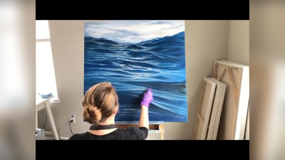
Building Up Layers And Depth
Oil paint is perfect for layering. Once the base is dry or tacky, start developing depth.
- Work from dark to light. Begin with deeper tones under the wave, then build up lighter colors.
- Blend edges where the water curves, using a soft brush.
- Add subtle greens in the wave’s body by mixing ultramarine, viridian, and a touch of yellow ochre.
- Soften the transition from wave to sky for distant spray or mist by gently feathering the paint.
Pro tip: Don’t rush drying time. Oil paint stays wet for hours or days. If your layers get muddy, let the surface dry before continuing.
Common mistake: Beginners often paint the wave “flat,” forgetting to model the form with light and shadow. Study reference photos for where the light hits and where shadows fall.
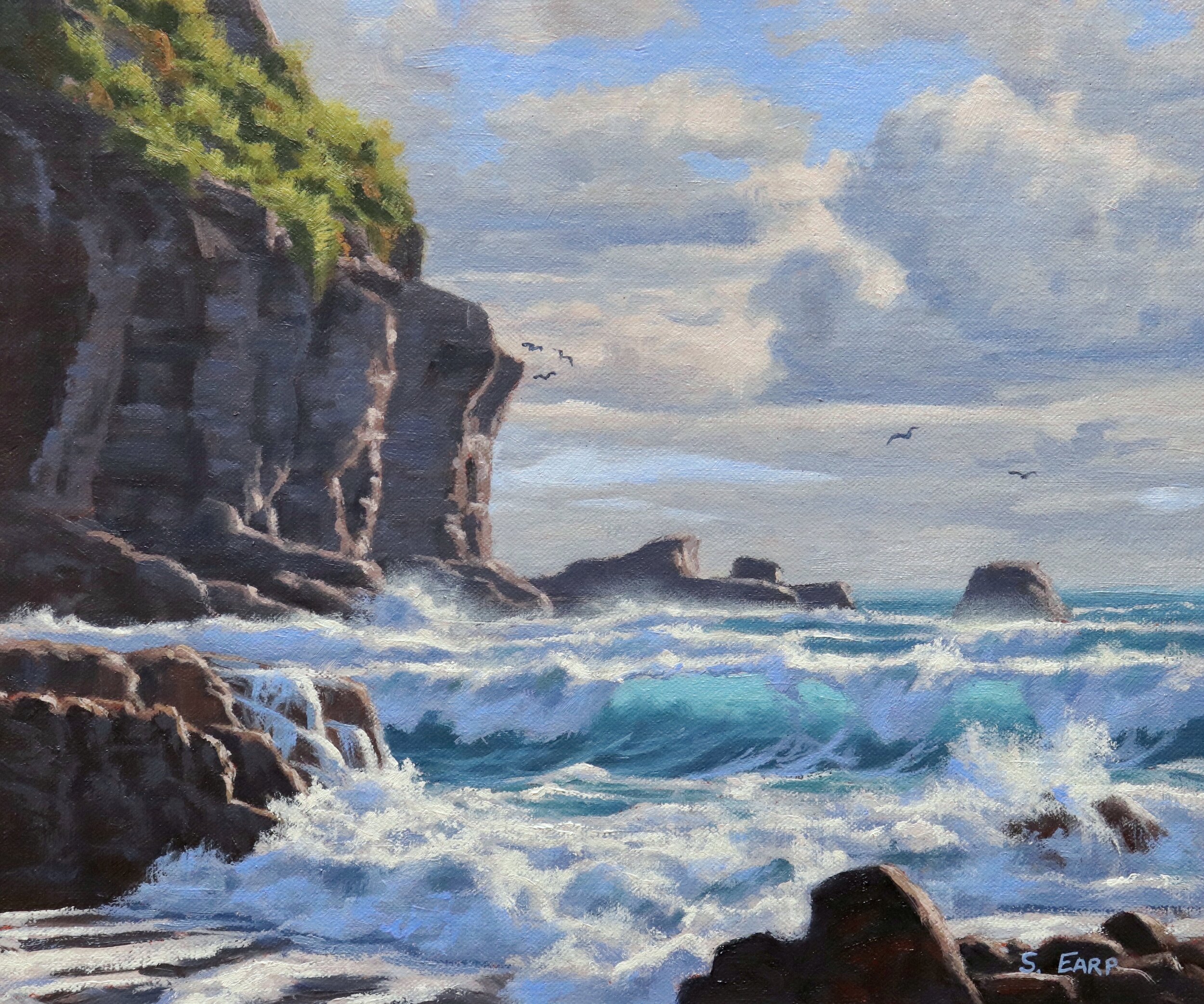
Painting Foam And Splash
Foam and splash bring life to your wave. They are not just white—they reflect the colors of the sky and water.
- Foam patterns: Use a small round brush to tap in clusters, not lines. Foam forms irregular shapes and trails.
- Mix white with a touch of blue for most foam. Pure white is for the brightest highlights only.
- Dry brush technique: Wipe most paint off your brush, then lightly drag it over the canvas to create mist or fine spray.
- Palette knife: For thick, textured foam at the crest, use a palette knife to lay paint over the darker underlayer.
Non-obvious insight: Adding a hint of yellow or grey to your foam makes it look more natural, especially in shadow.
Credit: samuelearp.com
Detailing The Translucent Wave
The most beautiful part of a wave is often the area where sunlight shines through the thin water.
- Layer thin glazes of cerulean, viridian, and a touch of yellow ochre. Use a soft brush and let each layer dry.
- Add curved streaks or lines inside the wave to suggest the movement of water and light.
- Highlight the edge where the wave curls with a mix of white and a tiny bit of yellow ochre for a glowing rim.
Pro tip: Glazing is a powerful oil technique. Mix a small amount of paint with medium and brush it over dry areas to change the color without covering details.
Common mistake: Overusing white makes the wave look chalky. Most “white” areas on a wave are actually colored by the water and sky.
Creating Realistic Reflections And Shadows
Every wave casts reflections and shadows. These add realism and help anchor the wave in its setting.
- Reflections: Use horizontal strokes beneath the wave, blending wave colors with a little more white and less contrast.
- Shadows: Paint the area under the wave with deep blues and greens, softening the edges as you move away from the wave.
- Don’t forget the wet sand or rocks, if visible. Reflections here should be slightly blurred and darker than the sky or water above.
| Feature | Color Mix | Blending Advice |
|---|---|---|
| Reflection | Wave Color + More White | Soft, horizontal strokes |
| Shadow | Phthalo Blue, Viridian, Burnt Umber | Blend outwards for realism |
| Wet Sand | Yellow Ochre, Blue, White | Keep edges soft |
Credit: samuelearp.com
Final Highlights And Finishing Touches
The last stage is adding those sparkling highlights and extra details that make your wave pop.
- Pure white highlights: Use sparingly, mostly at the crest and the brightest foam.
- Tiny flicks and dots: Suggest sun catching water droplets.
- Check your contrasts. Does the wave stand out against the sky? If not, darken the background or strengthen the highlights.
- Step back regularly to view your painting from a distance.
Non-obvious insight: Sometimes a painting feels “off” because the highlights are too strong or too many. Use them only where the eye naturally expects bright points, like at the very top of the breaking wave.
Common Mistakes To Avoid
Even experienced painters can make errors with waves. Here’s what to watch for:
- Symmetry: Real waves are never perfectly even. Add small variations.
- Overusing white: Most “white” in the ocean is actually blue, green, or grey.
- Ignoring reference: Don’t paint from memory—use photos or real-life observation.
- Flat forms: Always model the wave with light and shadow for depth.
- Hurry: Oil painting rewards patience. Allow time for layers to dry.
- Crowded composition: Focus on one main wave, not too many elements.
- Forgetting the background: The sky and distant water set the mood and influence the wave’s color.
Practical Tips For Better Oil Waves
- Use a limited palette: Too many colors can confuse the painting. Master a few blues and greens.
- Keep brushes clean: Wipe often to avoid muddy colors.
- Try painting studies: Practice small wave sections before starting a big canvas.
- Photograph your progress: This helps you see the painting with fresh eyes.
Experience-based tip: Sometimes, scraping off a mistake with a palette knife and repainting is better than trying to fix it with more paint.
Learning From Masters
Study works by artists who are known for their seascapes, such as Ivan Aivazovsky or Winslow Homer. Notice how they use color, light, and brushwork to create movement and drama. Museums and online galleries are great resources for inspiration.
For in-depth painting techniques, consider visiting Tate’s guide to oil painting.

Credit: www.youtube.com
Frequently Asked Questions
How Long Does It Take To Paint A Wave In Oil?
It depends on the size and your experience. A small study might take a few hours, but a detailed wave painting can take several days or weeks, especially if you let layers dry between stages.
What Reference Should I Use For Painting Waves?
Use high-resolution photographs, videos, or even sketch waves at the beach. Never rely only on memory—real waves have complexity and color shifts you might not remember.
Can I Use Acrylics Instead Of Oils For Painting Waves?
Yes, but oils blend better and allow more time for subtle transitions. Acrylics dry fast and are less forgiving if you want to adjust details.
How Do I Fix Mistakes In Oil Painting?
Let the paint dry, then paint over the area. For wet mistakes, gently scrape off with a palette knife or wipe with a clean brush and repaint. Oil paint’s slow drying is actually an advantage for corrections.
What’s The Best Brush For Painting Wave Foam?
Use a small round brush for tapping in foam patterns, and a dry flat brush for soft mist effects. Don’t use the same brush for both thick paint and thin washes—switch for best results.
Painting a wave in oil is both a technical and creative adventure. With practice, patience, and attention to light, color, and movement, you’ll soon be capturing the power and beauty of the ocean on canvas. Let each painting teach you something new, and enjoy the process as much as the finished result.