Painting with limited colors can unlock creativity and help artists master important skills. The Zorn palette is a perfect example of this approach. Named after Swedish painter Anders Zorn, this palette uses only four colors to create a wide range of tones, moods, and even the illusion of a full spectrum. Many artists admire Zorn’s paintings for their subtlety and harmony. But how do you set up and use the Zorn palette yourself? This guide will walk you through every step, from choosing materials to practical painting tips and common mistakes to avoid. You’ll discover how less can truly be more, whether you’re a beginner or looking to refine your style.
What Is The Zorn Palette?
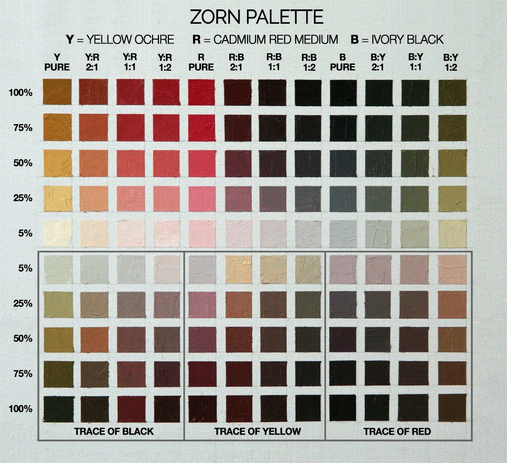
The Zorn palette is a classic limited palette made famous by Anders Zorn (1860–1920). He often used only four colors in his paintings:
- Yellow Ochre
- Vermilion (or Cadmium Red Light)
- Ivory Black
- Titanium White
Sometimes, Zorn swapped Vermilion for Cadmium Red Light, depending on availability. The magic of this palette is how these few colors can suggest a much wider range of hues, especially for skin tones and natural lighting. This palette is known for producing subtle, harmonious paintings with a warm, natural feel.
Why Use The Zorn Palette?
Limiting your color choices may seem restrictive, but it actually helps you:
- Focus on value (light and dark)
- Improve color mixing skills
- Create color harmony easily
- Reduce confusion from too many tube colors
Many portrait artists and students start with the Zorn palette to learn how to paint realistic skin without using many pigments.
Essential Materials For Zorn Palette Painting
Setting up the Zorn palette is simple, but the right materials make a big difference.
Paints
You’ll need four tubes:
- Yellow Ochre – a warm, earthy yellow
- Cadmium Red Light or Vermilion – a bright, warm red
- Ivory Black – a soft, almost blue-black
- Titanium White – a strong, opaque white
Oil paint is traditional, but you can use acrylics or water-mixable oils if you prefer. Just be sure you’re consistent with your type of paint.
Brushes
Medium-sized bristle or synthetic brushes work well. Flat and filbert shapes are most popular because they allow both broad strokes and details.
Palette And Surface
- Use a neutral-toned palette (gray or wood) to judge colors accurately.
- Canvas, linen, or good-quality paper primed for oil/acrylic is ideal.
Extra Materials
- Palette knife for mixing
- Rags or paper towels
- Odorless mineral spirits (for oil painting cleanup)
- Medium (like linseed oil or slow-dry medium), optional
Pro tip: Avoid bright white palettes or backgrounds. They can throw off your perception of value and color.
Arranging Your Palette
How you arrange paint on your palette affects your workflow. Place your four colors along the top edge, spaced out for easy mixing. Many artists put Titanium White on the left (for right-handed painters), then Yellow Ochre, Red, and Ivory Black moving right.
Leave space between each color so you can pull out small amounts to mix. You’ll be mixing a lot, so keep your palette clean and organized.
Example Palette Layout
| Color | Position (Left to Right) | Purpose |
|---|---|---|
| Titanium White | Far Left | Lightening, highlights |
| Yellow Ochre | Left Center | Warmth, ochre tones |
| Cadmium Red Light | Right Center | Reds, skin tones |
| Ivory Black | Far Right | Shadows, cooling |
Mixing Colors With The Zorn Palette
Many beginners think four colors can’t do much. But with the Zorn palette, you can mix a surprising variety of hues. Here’s how:
Skin Tones
Mix Yellow Ochre and Red for a warm orange. Add White to lighten. Touches of Black cool the mixture and create more natural shadows. You can get light peach, medium tan, and deep brownish shades, all from these four colors.
Cool And Warm Grays
Mix Ivory Black with White for a neutral gray. Add a little Red for a warmer gray, or Yellow Ochre for an olive hue. These grays are useful for backgrounds, shadows, and clothing.
Greens And Blues
Although there is no blue or green, Ivory Black in the Zorn palette has a bluish undertone. Mix it with Yellow Ochre for muted green. For cool blue-gray, blend Black with White. You won’t get bright, pure colors, but these subtle colors work well for realism and atmosphere.
Practical Color Mixing Examples
| Mixture | How to Mix | Resulting Color |
|---|---|---|
| Light skin tone | White + Yellow Ochre + touch of Red | Pale peach |
| Shadow skin tone | Yellow Ochre + Red + touch of Black | Warm brown |
| Cool gray | Black + White | Bluish gray |
| Muted green | Yellow Ochre + Black | Olive green |
Insight: Many beginners miss how much subtlety you can get by adjusting the ratios slightly. Even a tiny amount of red or black can shift the temperature and mood.
Credit: michaellynnadams.com
Step-by-step: Setting Up For Your First Zorn Palette Painting
1. Prepare Your Workspace
Choose a well-lit area. Natural north light is ideal, but a daylight lamp works too. Tape your canvas or panel to an easel. Arrange your paints, brushes, palette, and cleaning supplies within easy reach.
2. Lay Out Paint
Squeeze out small, equal amounts of each color. Too much paint dries out or gets wasted, but too little means you’ll need to re-mix often. For a small portrait (8×10 inches), a pea-sized amount of each should be enough to start.
3. Tone Your Canvas (optional)
Many Zorn-style paintings start with a toned background. Mix Yellow Ochre and a little Red with White for a warm beige, or use Ivory Black and White for a cool gray. Brush this thinly over the canvas and wipe off excess with a rag. This step helps you judge values and avoid the harshness of white canvas.
4. Make A Value Sketch
Block in the largest shapes using thin paint. Use a mix of Ivory Black and Red or Yellow Ochre for a warm brown. Sketch the main features with a brush or palette knife, keeping the drawing loose.
5. Start Blocking In Color
Work from dark to light. Block in major shadow areas first using mixes of Black, Red, and Yellow Ochre. Add White gradually for midtones and highlights. Focus on getting values and basic color temperatures right.
6. Refine And Add Details
Once the big shapes are in, start refining edges and adding subtle color shifts. Use smaller brushes for details. Adjust colors by adding tiny amounts of the warm or cool colors as needed.
7. Final Touches
Strengthen highlights with clean White. Add subtle color notes in the cheeks, lips, or background using thin glazes. Step back often to check the painting as a whole.
Common Mistakes And How To Avoid Them
1. Over-mixing
Trying to “find” the perfect color by mixing too much can make your colors muddy. Mix a small amount, test it, and adjust in small steps.
2. Ignoring Value
With fewer colors, getting the right value (lightness or darkness) is even more important. Squint at your subject to see the values clearly before mixing.
3. Using Too Much Paint
Beginners often use thick paint too early. Start thin and build up thickness in highlights or focal points.
4. Relying On White For Light
It’s tempting to use only White to lighten every color. Instead, try mixing lighter colors with more Yellow Ochre or less Black to keep colors lively.
5. Forgetting To Clean The Palette
Contaminated colors ruin your mixtures. Wipe your palette and brushes regularly to keep colors pure.

Credit: www.youtube.com
Advanced Tips For Zorn Palette Success
- Experiment with temperature: Even with just four colors, you can make both warm and cool variations by shifting your mixes. For example, more Red and Yellow Ochre for warmth, more Black for cool tones.
- Use edges for realism: Hard and soft edges are more important than color variety. Soften edges in shadow and sharpen around the focal point for a natural look.
- Glazing: A thin layer of paint (glaze) can shift the color temperature without repainting. For example, a warm glaze over a cool area adds life to the painting.
- Work from general to specific: Block in big shapes and values before focusing on details. This helps keep the painting unified.
Non-obvious insight: Even with so few colors, you can “suggest” blues or greens simply by context. If you paint a warm subject, a cool gray from Ivory Black and White will read as blue, especially if placed near warm flesh tones.
Comparing Zorn Palette To Full Palette
Some artists wonder if the Zorn palette is limiting compared to a full palette. Here’s a quick comparison:
| Feature | Zorn Palette | Full Palette |
|---|---|---|
| Color Harmony | Very strong, easy to achieve | Can be difficult with many colors |
| Mixing Difficulty | Simple, quick to learn | Complex, risk of muddy colors |
| Range of Colors | Muted, earthy, subtle | Wide, including intense colors |
| Best For | Portraits, studies, beginners | Landscapes, vibrant scenes |
Why Artists Still Use The Zorn Palette
Despite all the modern pigments available, many professionals return to the Zorn palette for its simplicity and beauty. It forces you to focus on the fundamentals—value, temperature, and composition—instead of getting lost in color choices.
Non-obvious insight: Limiting yourself can actually make you more creative. By working with what looks like a “weakness,” you discover new solutions and surprises in your work.
If you want to see Anders Zorn’s actual paintings, check out the Wikipedia page on Anders Zorn for more examples.
Frequently Asked Questions
What Subjects Are Best For The Zorn Palette?
The Zorn palette is famous for portraits and figures because it creates natural skin tones. But it’s also great for still life, interiors, and even muted landscapes. The limited colors give a unified, harmonious look to any subject.
Can I Add Blue Or Green To The Zorn Palette?
Traditionally, the Zorn palette does not include blue or green pigments. However, you can create the illusion of cool colors by mixing Ivory Black and White. If you add blue or green, it’s no longer the classic Zorn setup.
Is The Zorn Palette Only For Oil Painting?
No. You can use the Zorn palette with acrylics, gouache, water-mixable oils, or even digital painting. The concept is about color choices, not the medium.
How Do I Practice With The Zorn Palette?
Start with simple exercises:
- Paint a grayscale (black and white) study first.
- Then add Yellow Ochre and Red for color.
- Try painting a portrait or still life using only these four colors. Focus on matching values and subtle color shifts.
Why Do My Zorn Palette Colors Look Muddy?
Muddiness usually happens from over-mixing or using dirty brushes. Clean your palette and brushes often, and mix colors in small batches. Remember, a tiny amount of black or red can strongly affect your mix.
Painting with the Zorn palette is a classic way to learn color mixing and create beautiful, harmonious works. With practice and attention to value, you’ll find just how much you can do with only four colors.

Credit: michaellynnadams.com